
Najnovije izdanje zloglasnog niza o Lordu Horroru. Egzaltacija britanskog fašizma. Coulthart je ilustrator i crtač stripa (o Brittonu, autoru priče, uskoro više).
David Britton & John Coulthart, Lord Horror: Reverbstorm, Savoy Books (2012)
"Lord Horror was so unique and radical, I expected to go to prison for it. I always thought that if you wrote a truly dangerous book—something dangerous would happen to you. Which is one reason there are so few really dangerous books around. Publishers play at promoting dangerous books, whether they're Serpents Tail or Penguin. All you get is a book vetted by committee, never anything radically imaginative or offensive that will take your fucking head off. Ironically, I think it would do other authors a power of good if they had to account for their books by going to prison—there are far too many bad books being published! Prison just reinforced everything I already believed about society's lack of judgement—40% of the people in there shouldn't be there. Mostly they're there for misdemeanours like soft drugs, traffic offences, non-payments of fines, or because they're poor or mentally, badly parked.
Strangeways Prison was a truly terrible place, the equal in terror and intimidation of a prison in a corrupt third world country. When people are being burned alive in cells opposite, you get some hint of what Auschwitz must have been like. Prison didn't cure me. It just made me more bitter, and more determined to retaliate." (David Britton)


Reverbstorm: an introduction and preview
Apr 30, 2012
Reverbstorm: 1994–2012.
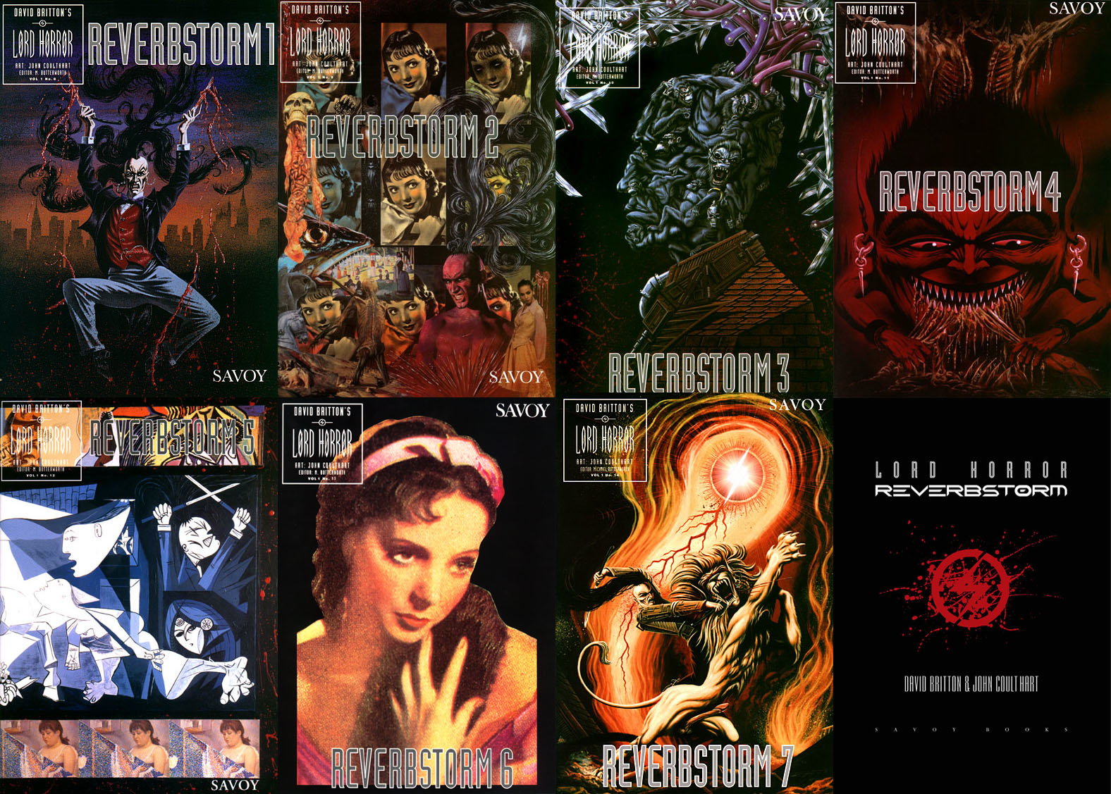
Art, intellectual pursuits, the development of the natural sciences, many branches of scholarship flourished in close spacial, temporal proximity to massacre and the death camps. It is the structure and meaning of that proximity that must be looked at. […] But there is a [...] danger. Not only is the relevant material vast and intractable: it exercises a subtle, corrupting fascination. Bending too fixedly over hideousness, one feels queerly drawn. In some strange way the horror flatters attention, it gives to one’s own limited means a spurious resonance. […] I am not sure whether anyone, however scrupulous, who spends time and imaginative resources on these dark places, can, or indeed, ought to leave them personally intact. Yet the dark places are at the centre. Pass them by and there can be no serious discussion of human potential.Reverbstorm is an eight-part comic series which I began drawing in 1990. Last week I finished work on the final section, and also completed the layout and design for the collected edition, a 344-page volume which Savoy Books will be publishing later this year. All the artwork has been scanned afresh, re-lettered and, in a few places, improved to fix compromises and print errors present in the published issues. This unfinished project has been hanging over me for so long that I make this announcement with some relief. The book will be published without a foreword so this post can serve as an introduction for the uninitiated. But before I get to the details, some history.
George Steiner, In Bluebeard’s Castle: Some Notes Towards the Re-definition of Culture (1971)

David Britton was the writer and instigator of Reverbstorm, the series being a continued exploration in the comics medium of his Lord Horror character. Lord Horror is an alternate-history equivalent of the real-life William Joyce, a member of the British Union of Fascists in the 1930s whose propaganda broadcasts to Britain from Nazi Germany during the Second World War led the press to dub him Lord Haw-Haw. The first five-part Lord Horror comic series, Hard Core Horror, showed the evolution of Horace William Joyce, aka Lord Horror, from charismatic politician to Nazi collaborator; the final two issues of the series concerned Horror’s involvement in the Holocaust. In Britton’s mythos James Joyce is the brother of Horace Joyce while Jessie Matthews, a popular British musical star of the 1930s, is Lord Horror’s wife. (Britton’s Lord Horror novels are examined in detail by Keith Seward in his Horror Panegyric essay.) My fellow artist at Savoy, Kris Guidio, drew the first four issues of Hard Core Horror; I drew issue five which was less a comic story, more a portfolio of static scenes of death-camp architecture. The series was well-received by regular Savoy readers but mostly ignored by the British comics world, with some justification: the comics were a glossy production but the narrative was very erratic, even technically inept in places. At Savoy the series was regarded as a failed experiment, Kris’s drawing style and flair for cartooning being more suited to the broad humour of the Meng & Ecker strips. But Dave liked what I’d done with the final issue and felt we could try something new that was also more original than a fictional skate through recent history.

In addition to producing comics in the late 1980s, Savoy had been recording a number of eccentric cover versions, most of them sung by PJ Proby. A music journalist, Paul Temple, came to interview Proby about the songs and stayed in touch. He subsequently approached the company with a song of his own entitled Reverbstorm, a bombastic number best described as “Wagnerian Northern Soul” which Savoy recorded in 1993. (Temple recounts the origin of the song here.) This gave a title to the new comic series that Dave was planning, the story outline being expanded from a scenario that he and Savoy colleague Michael Butterworth had sketched out when a film company showed some fleeting interest in Lord Horror. Kris Guidio and I worked on the opening pages, the initial idea being that Kris would continue drawing the Lord while I would do everything else. Once I’d convinced Dave that I could draw his Lordship to his satisfaction I took over the series while Kris carried on with the Meng & Ecker comics. I spent most of 1991–1996 drawing the first seven parts of Reverbstorm which were published as separate comics during that period. The first issue came with a CD single of Paul Temple’s song which was sung by Sue Quinn but credited to Jessie Matthews. (It’s now available on iTunes.) The last part of the series was always going to be something that differed from the preceding sections but I didn’t know how this might manifest until 1997 when I painted a series of monochrome double-spreads intended to form backgrounds for Dave’s text. That’s where the series stalled after the paintings had improvised themselves to such a degree of abstraction and incoherence that I didn’t feel able to continue. The breakthrough came a couple of years ago when I started scanning all the artwork into the computer and thinking again about the series. I realised I could complete everything now that my computer graphics skills were adequate enough to complement the earlier issues whilst also adding something new.

May it please Heaven that the reader, emboldened, and become momentarily as fierce as what he reads, finds without loss of bearings a wild and sudden way across the desolate swamps of these sombre, poison-filled pages. For unless he bring to his reading a rigorous logic and mental application at least tough enough to balance his distrust, the deadly issues of this book will lap up his soul as water does sugar.The opening words of Les Chants de Maldoror could well be applied to Reverbstorm, the collected edition of which many people will regard as a thoroughly indefensible book. Reverbstorm is indefensible from its opening pages which reprise the final issue of Hard Core Horror‘s death-camp architecture. These drawings project the mean and squalid actuality to a level of the sublime (in the Burkean sense) which few would argue is suitable treatment for such a sensitive subject. Reverbstorm is indefensible in then taking these renderings as a model for an invented city, Torenbürgen, which blends the architecture of Art Deco New York with the metropolitan speculations of Hugh Ferriss and Piranesian death-camp machinery: vast ovens, belching chimneys, furnaces that could reduce whole populations to ash. Reverbstorm is indefensible in presenting Torenbürgen as the stage for Lord Horror’s atrocities. The narrative opens with an epigraph from The Pilgrim’s Progress: “Delivered Under the Similitude of a Dream…”; what follows may be regarded as the central character’s dreamscape. Jessie Matthews and James Joyce are secondary characters so we have text from Finnegans Wake—another dream narrative—providing a continual background radiation throughout. Lastly, Reverbstorm is indefensible because it does all of this in the reprehensible form of a comic book. It doesn’t matter how many copies of Maus or From Hell or Joe Sacco’s Palestine you wave around, comics in the Anglophone world have always been viewed as the lowest medium there is, suitable only for trashy and garish adventure stories. That our book is in part a trashy and garish adventure story hardly helps matters.
Lautréamont

So Reverbstorm is Lord Horror’s dream of the ideal place to live: the whole world as a death-camp playground crawling with victims for his razors, all of whom he regards as Jews whatever their actual ethnicity. This last point—the up-front anti-Semitism of the central character—has always been the most contentious feature of the Lord Horror stories: take away the Fascist origins and few people would ever have complained about David Britton’s books or comics. Think for a moment of any well-known violent character whose speech and actions have become fetished over the years—Alex in A Clockwork Orange, Travis Bickle, Freddy Krueger, Hannibal Lecter, the countless gangsters in films and television—then consider whether these characters and their catch-phrases would be so readily adopted if they were wearing swastika armbands. People prefer their cannibals, murderers and psychopaths to be untainted by politics. Making a Fascist the central character isn’t an unusual move in literature—Jonathan Littell’s The Kindly Ones is only the most recent example—but doing this in other media is viewed with suspicion unless everything around the character telegraphs stern disapproval in the required manner.

I once described Reverbstorm somewhat facetiously as “a psychopathology of heroic fantasy”, and even though the series isn’t so coherent or analytical there is a strain of critique running through the narrative. Lord Horror was born out of David Britton’s enthusiasm for Tarzan, John Carter, Elric and other characters who rampage through their imaginary worlds hacking and slashing their foes with blades. Reverbstorm takes this hacking and slashing to outrageous, ludicrous extremes: I was inspired in this by Philip José Farmer’s reductio ad absurdum of the Tarzan and Doc Savage stories in A Feast Unknown, where the sex, violence and sexual violence are pushed to absurd levels. It’s no exaggeration to say Reverbstorm goes further than Farmer: it’s insanely violent, frenzied, hysterical. For my part I was only trying to match the frenzy and hysteria in much of Dave’s written fiction but the madness was also an attempt to create something in pictorial form that matched the unrelenting weirdness and outrageousness of Maldoror or The Naked Lunch. Whether I succeeded is for others to decide. We created the story in an improvised manner, following the vaguest outline and proceeding page-by-page. This meant that the series developed more organically than the usual process of comics writing in which a script is created screenplay-fashion before being passed to an artist. Consequently Reverbstorm could follow detours in a manner that would have been difficult or even impossible to plan beforehand. In drawing terms this book comprises the best black-and-white art I’ve done or am likely to do. It exceeds the work I did in the Lovecraft comics by taking my art into places I never expected to go.

Reverbstorm also features copious references to the art and literature of the first decades of the 20th century. As well as James Joyce, references are made to TS Eliot, a poet whose anti-Semitism remains problematic to this day, while Picasso’s paintings and drawings form an ironic counterpoint to many of Lord Horror’s speeches and activities, especially the recurrent anti-Fascist motif of Guernica. If you want a critique of the madness then this is it, although that critique only works for those readers who know something about Modernist art and literature. Reverbstorm is an allusive collage along the lines of Eliot’s The Waste Land but hardly any readers of the serialised issues noticed this or tried to make sense of the references. This seems to be a problem again with the Anglophone comics world: the medium is so glutted with superhero garbage (and so many comic shops fill their windows with toys) it drives away any audience who might be more receptive to ambitious work aimed at adults. For those who feel intimidated by the references, the book edition will include an appendix with several pages of notes.

Reverbstorm is at long last ready to be delivered to the printers but a release schedule hasn’t been decided yet so I can’t say when the publication will be. The printed volume will be a dust-jacketed hardback, price still to be confirmed. Any news will be announced here, of course. In the meantime, I’ve posted a preview of the interior which includes artwork from the end of the series being made public for the first time. This book isn’t for everybody: “only the few may relish this bitter fruit without danger”. George Steiner would hate it but then he hated The Naked Lunch as well. Bitter fruit has always been an acquired taste.
The Mystical Art of John Coulthart

Posted by John Wisniewski on 08 Apr 2011 /
0 Comment
The bizarre illustrations, designs and literature of John Coulthart have manifested themselves in our culture since the early 80’s. Coulthart has produced countless of fantastic book covers, CD covers, posters and is also the author of the critically acclaimed Lovecraft-inspired book The Haunter of the Dark: And Other Grotesque Visions.
 Beyond
the Dark Horizon: When did you begin drawing and writing-and what kind
of writing were you working on, in your early years?
Beyond
the Dark Horizon: When did you begin drawing and writing-and what kind
of writing were you working on, in your early years?John Coulthart: I’ve enjoyed drawing for as long as I can remember. The only thing I
recall doing on my first day at school in 1967 was sitting down and drawing a picture of Batman & Robin. (The Adam West TV show was running at the time.) When I was 10 or 11 I started to get a sense of
what you could also achieve with words after I made a basic technical discovery about using adjectives to give descriptions more weight. Not that I could articulate things in those terms, it was simply “if I use
these kinds of words, this happens.” That impressed the teachers and I had a little light bulb-going-off the moment when I realized that I enjoyed writing creatively. I was fortunate to be at a junior school that was pretty progressive in its attitudes with teachers who made a point of encouraging creative development. Secondary school was the complete opposite: uniforms, homework, lots of rules, and regimented, exam-oriented teaching. I hated it.
When I was still at school I was writing short surreal scenarios for a while then I started work on a juvenile fantasy thing inspired by Ursula K Le Guin’s Earthsea books. That kept me going for a few years
until I had the sense to abandon it. I also wrote a one-page science fiction piece which got printed in the school magazine. I never really wanted to write SF, however, fantasy and weird or horror fiction was,
and still is, more of an interest.
Beyond the Dark Horizon: What were the first magazines that published your artwork?
John Coulthart: If you can call them magazines, I was doing little illustrations for music fanzines in 1980, among them a Hawkwind fanzine which is how I came to have some Hawkwind-related work that caught the attention of the band. The first work that was professionally printed was for the Church of Hawkwind album in 1982.
Beyond the Dark Horizon: Who are some of your favorite writers and artists?
John Coulthart: These lists are always problematic; they sprawl too easily and can also change according to the weather. That said, for the writers I’d list (today) JG Ballard, Jorge Luis Borges, William Burroughs, M. John Harrison, Cormac McCarthy, Michael Moorcock, Alan Moore and James Joyce.
The artists I feel passionate about are predominantly Surrealists, Symbolists or any contemporary practitioners of fantastic realism such as HR Giger, the late Mati Klarwein, Ernst Fuchs and others. There are a number of younger women artists around at the moment producing some remarkable imaginative work; they’re very much the successors to the first wave of women Surrealists like Leonora Carrington, Dorothea Tanning and Leonor Fini. I’ve always liked to see drawing and painting put to the service of the deepest imagination. That doesn’t exclude a liking of contemporary artists of a different stripe–I enjoy what James Turrell and Olafur Eliasson are doing, both of whom use light in a very abstract manner–but imaginative work tends to be what captures my attention.

Beyond the Dark Horizon: Are you very interested in the writing of H.P. Lovecraft and Arthur Machen-any favorites of those writers?
John Coulthart: I admire Lovecraft and Machen a great deal but I’m less interested in their writing than I was in the 1980s when I was often reading little else. I went through a kind of “Weird Period” for a while when I was reading Lovecraft then backtracking via his ‘Supernatural Horror in Literature’ essay to earlier writers such as Machen, Algernon Blackwood, William Hope Hodgson, Robert W. Chambers and others. Hodgson is still a favorite, and a writer who’s inspired some of my own fiction recently. I think I feel these days that Lovecraft doesn’t need as much support as he once did, his reputation is established and even people who haven’t read his stories have heard of Cthulhu. Hodgson, on the other hand, was creating his own brand of cosmic horror before Lovecraft but his name is a lot less familiar to readers. I feel an affection for him because he’s British, he lived in my home region of the north of England for a time, and ‘The House on the Borderland’ is a solid masterpiece of Weird Fiction, one of those books which comes from a time before imaginative writing was stratified and fenced-off into genres called Horror, Fantasy and Science Fiction.
In recent years in place of a Weird Period I seem to have been going through a Queer Period. This is partly a consequence of Weird Fiction having less attraction as it’s become more familiar. But I’ve also had a growing fascination with the history of queer art and literature, and the web makes searching for this stuff a lot easier than it used to be. More things are documented now while other things are still coming to light. Lately I’ve been dissatisfied with the quality of contemporary gay fiction; too much of it seems to get a pass simply because it has a same-sex relationship as its focus. Works from less liberated times prove fascinating when people are having to write between the lines all the time, or convey their interests using euphemism and subterfuge.
 Beyond the Dark Horizon: Do occult subjects inspire you?
John Coulthart: Aesthetically, yes. There’s a famous Borges’ dictum that “metaphysics is a branch of fantastic literature” and that’s how I’ve regarded occult philosophy for, many years. That’s probably a little insulting to people who have a more practical interest but it’s a common thing with regard to religion, you can admire Dante’s Divine Comedy for its aesthetics without having to take it as a true picture of the Christian cosmos.
I was always fascinated by any kind of occult symbolism–alphabets, sigils, Kabbalistic diagrams, and so on. I love all those allegorical engravings you see in alchemical texts. Alchemy embodies more of the
aesthetic qualities than many other disciplines since so much of it was written in a highly developed coded language; without the code you’re left with an accumulation of strange symbols and metaphors. The books I’ve been working on for the past few years have my take on alchemy as a recurrent thread although it’s mostly background, I’ve no intention of boring a reader with real or invented magical systems. But if you’re inventing something like that it helps to be acquainted with occult history. The fantastic writing or art process is often about foregrounding the exotic; occultism has always had an exotic glamour which makes it an ideal subject.
Beyond the Dark Horizon: Do you like the films of Kenneth Anger? Did you ever meet with him?
John Coulthart: Kenneth Anger is very much a favorite filmmaker. It’s a shame more of his work hasn’t survived but what we have in his Magick Lantern Cycle I find endlessly fascinating for all sorts of reasons: he’s an avant garde pioneer and also a gay cinema pioneer; he’s one of the few overt occultists to have any substantial visibility which is always amusing when people who like to diss occult stuff are forced to look at what he’s doing; and he’s a connection between all manner of disparate people: Jean Cocteau, Marjorie Cameron, the Rolling Stones, Martin Scorsese (who was inspired by the use of music in Scorpio Rising), Charles Manson, Donald Cammell (the co-director of Performance who appears in Lucifer Rising) and others. The Magick Lantern Cycle implies a whole style of very personal, symbolic cinema which few people have pursued; everyone is always bending the medium towards the dramatic. Perhaps you have to be a unique personality to take this approach, the directors I regard as being similar to Anger are just as unique: Alejandro Jodorowsky and Sergei Parajanov.
I’ve never had an opportunity to meet Kenneth Anger. I wouldn’t say no but he has a reputation for being fractious at times. That surname “Anger” was of his own choosing and if you read the unofficial
biography by Bill Landis you find that it’s an apt choice.
Beyond the Dark Horizon: Could you provide us with some reflections on such filmmakers as Jack Smith, the film Pink Narcissus and Fred Halstead?
John Coulthart: I love James Bidgood’s work, both his photos and Pink Narcissus which was his micro-budget film made almost entirely in his New York apartment. Like Anger’s films it’s another pioneering piece of gay cinema, and like Anger’s work it’s also a very personal piece, being a series of luscious erotic dream sequences. Considering the constraints he was working under its remarkable what he achieved. It’s also notable for me for being erotic in a way which porn doesn’t achieve, simply because it works on the senses and the imagination a lot more. Porn just gives you the fucking whereas Bidgood’s film stimulates other areas of the erotic imagination. It also helps that Bobby Kendall was rather gorgeous!
I’ve seen Jack Smith’s Flaming Creatures, and while it’s interesting historically I prefer the aesthetics of Pink Narcissus.

Beyond the Dark Horizon: What attracted you to the writing of H.P. Lovecraft and how did you go about adapting his works?
John Coulthart: The principal attraction was that his stories seemed to conjure an intense atmosphere of horror. The first one I remember reading was The Colour Out of Space which was a good place to start since Lovecraft rated it as one of his best. I liked the way he combined horror with science fiction to create a kind of hybrid form. The Cthulhu Mythos was also an attraction, having stories loosely connected by an underlying but never fully explained mythology added to the weight of each individual piece in a way which made the work of other writers seem a lot less interesting.
As for the adaptations, the idea for these came about in 1985 when I felt I’d done enough work for Hawkwind and wanted to try something new. I’d really enjoyed the special Lovecraft issue which Heavy Metal magazine published in October 1979 and I always wondered why there wasn’t more Lovecraft-derived art around. This seems strange now with Lovecraftian art exploding everywhere but in the 1980s there really wasn’t much to be found at all, just book covers and a few old comics strips which mostly adapted non-Mythos stories. The idea was to adapt three stories as comic strips and then see whether anyone would be interested in publishing them as a book. In the end I did two-and-a-half stories (The Dunwich Horror ended up as a portfolio piece), while Alan Moore created a Lovecraft Kabbalah for me to illustrate. This last piece came out of Alan’s aborted Yuggoth Cultures book which Creation Books would have published, and which I was set to illustrate in 1994.
The main thing I tried to do with the stories was being faithful to their inherent seriousness, and also try to be true to their atmosphere. The earlier adaptations I’d seen in underground comics from the 1970s
tended to be inspired by the semi-humorous approach to horror common to trashy films and the EC titles of the 1950s. Whether you like Lovecraft or not you have to recognize that he means the stuff he
writes about so I felt you had to treat his work on its own terms. I also tried to be faithful to period detail since some of the stories, The Call of Cthulhu in particular, give a lot of attention to dates, places, and so on. I tried to do The Call of Cthulhu as though it was an RKO film of the 1930s, there’s even a couple of frames in there borrowed from the original King Kong. There’s a lot of sub-textual
reference for the reader to discover, little nods to Heart of Darkness, Apocalypse Now, Arnold Böcklin’s painting The Isle of the Dead (which features in at least two RKO films), etc. all of which I hope adds to the richness of the reading.
Beyond the Dark Horizon: You designed album covers for Cradle of Filth and Hawkwind. Could you tell us about working with these bands? Are you a fan of their music?
 John Coulthart:
I was very keen on Hawkwind when I began working for them, yes; Cradle
of Filth I knew only by reputation when they got in touch asking if I
could provide some artwork. But I did like CoF when I got to hear their
work, especially their Midian album. Their track Cthulhu Dawn is a great
Lovecraft-inspired song.
John Coulthart:
I was very keen on Hawkwind when I began working for them, yes; Cradle
of Filth I knew only by reputation when they got in touch asking if I
could provide some artwork. But I did like CoF when I got to hear their
work, especially their Midian album. Their track Cthulhu Dawn is a great
Lovecraft-inspired song.Working with CoF was more satisfying than with Hawkwind mainly because I was more involved, discussing each project with Danny and planning the entire album package, doing all the design work as well as the illustration. With Hawkwind I used to do a painting then send it into the void and hope for the best. I’d worked in an advertising place after I left school so I knew something about graphic design but trying to get the record company to design things with any care was impossible. Even communication was difficult at that time; I was living in a shitty flat-block with no telephone; using the public telephone meant going down several floors and crossing a road. It sounds like something from the 19th century describing this now but Dave Brock and I communicated mainly via hand-written letters or notes. Consequently things would go wrong now and then since I had no control at all once the artwork left my hands. The best cover I did for Hawkwind, The Chronicle of the Black Sword in 1985, was badly printed with a blue tinge to the front cover. On the back I’d hand-drawn the track list and credits only to have the band decide they wanted a different running order at the last minute so the
credits were printed with ugly purple boxes over my painted background. It was at that point I decided I’d rather be doing something else.
Beyond the Dark Horizon: Could you tell us about your collaboration with Alan Moore?
John Coulthart: There have been a few, actually, not all of them finished or shown in public. The Great Old Ones was Alan’s idea, created at a time (1999) when he’d just begun work on the Promethea series and was exploring the Kabbalistic view of the universe. Promethea goes into the traditional Kabbalah in some detail; what we had with The Great Old Ones was more of a Qliphotic work, the Qliphoth being the negative equivalents of the positive forces which comprise each Kabbalistic sphere. Alan is a pleasure to work with; he’s a visual artist himself so he gives his visual collaborators a lot of freedom. Even if he’s keen on something going in a particular direction he’ll say “maybe it could be like this…” then it’s up to you to follow that or not. With The Great Old Ones I’d already started on some of the pictures so Alan wrote things working off prints of those I sent him. The later ones were done while I was finishing the series. We were both surprised when Alan decided to place Yig at Tipheret on the Tree of Life, the sphere associated with the sun. I didn’t know this when I was creating the Yig picture yet it turned out to have a snake symbol surrounded by serpent tails which resemble solar rays; we took this as a confirmation that things were going in the right direction.
More recently, Alan asked me to create a cover for issue 4 of his magazine, Dodgem Logic. The only brief this time was for something “psychedelic”. What I ended up with was a combination of favorite designs styles with Art Nouveau motifs, butterflies and peacocks. So it’s Art Nouveau by way of the Summer of Love. A few months earlier I’d written something about Roger Dean whose artwork I was obsessed with when I was 15; that gave me the idea of doing the magazine title using his distinctive lettering style, the flowing nature of which owes something to both Art Nouveau and the psychedelic era. There was
also a bit of a political edge to the thing after I’d read a news story about readers of the Washington Post complaining when the newspaper ran a photo of two guys kissing following a marriage ceremony. For two men to kiss in public is still a radical and threatening act for many people, in some places you’d risk physical assault doing this. So I decided to make that very act the focus of the cover design. Alan’s publication is inspired by the underground magazines of the 1960s and 1970s, many of which challenged their readers in similar ways. Many of them also ran gay-themed issues at a time when gay people were still vilified in most western societies. My idea was to create something that was beautiful to look at (the printed version has a gold ink overlay) but which also forced some viewers to deal with their prejudices; you don’t get the beauty without a challenge to your preconceptions.
Beyond the Dark Horizon: Have you ever been involved with any occult groups?
John Coulthart: I’m not although I was one of the first members of the Temple of Psychick Youth for a while. They were mainly doing Austin Spare-derived sigil magic which I imagine was a new thing to many of the people who joined but I’d read enough about Spare at that point to know that stuff already. It was quite stimulating for a while (I still have letters from Genesis P-Orridge somewhere) but my interest drifted to other things.
http://www.johncoulthart.com/

Stimulating Juxtapostions: The Art of John Coulthart (Coilhouse)

Yog-Sothoth, from The Haunter of the Dark
Discerning seekers of rare or obscure artists will eventually stumble upon John Coulthart’s Feuilleton at some point in their virtual journeys. An artist himself, and a blogger “of some repute”, his site is a veritable Holy Grail treasure collection of luminous paintings, ornate illustrations & woodcuts, and salty vintage photographs that run the gamut from fin de siecle European art magazines to antique occult bookplates to queer themed eye candy from a bygone era for which to titillate our salacious modern sensibilities. One with an interest in such things could literally lose hours perusing his archives. It is with the striking of a dazed and dreamy midnight hour, head filled with inspiration and amazing discoveries, that one realizes where the time has gone.
John is perhaps best known for his own striking and complex “genre-defying” artistry; working with various styles and media in his singular, chimeric aesthetic, he is a successful graphic designer for a variety of mediums including album covers, book covers comic books and graphic novels.
“As a comic artist John produced the Lord Horror series Reverbstorm with David Britton for Savoy Books, and received the dubious accolade of having an earlier Savoy title, Hard Core Horror 5, declared obscene in a British court of law. … His collection of HP Lovecraft adaptations and illustrations, The Haunter of the Dark and Other Grotesque Visions, was republished in 2006 by Creation Oneiros.See below the cut for a Q&A in which John discusses fleeting fascinations, enduring enthusiasms, how the mystical and macabre manifests itself in his projects, and the mercurial nature of design.
As a book designer and illustrator John continues to work for Savoy Books, and in 2003 designed the acclaimed Thackery T Lambshead Pocket Guide to Eccentric and Discredited Diseases edited by Jeff VanderMeer and Mark Roberts.
John’s work has been showcased via Rapid Eye, Critical Vision, Clive Barker’s A-Z of Horror, EsoTerra, CNN.com and the Channel 4 television series Banned in the UK.”

The Thackery T Lambshead Pocket Guide to Eccentric and Discredited Diseases
COILHOUSE: Both the mention in your website bio, and the description in your personal blog, Feuilleton, refers to your cataloging of “interests, obsessions and passing enthusiasms.” What might those encompass right now?
JOHN COULTHART : I watched Visconti’s film Ludwig (about King Ludwig II of Bavaria) recently and was following up that viewing with some web research into his eccentric life. I usually disapprove of monarchs, especially our own dismal royals, but Ludwig is a fascinating and ultimately tragic character. A few months ago I ordered a lot of out-of-print books by the French writer and illustrator Philippe Jullian who wrote one of my absolute cult books, Dreamers of Decadence, a major study of Symbolist painting first published in English in 1971. Jullian was also something of an eccentric who wrote a number of biographies and art books, produced many Ronald Searle-like illustrations and also penned a few novels. Both Ludwig II and Jullian were homosexual and queer culture is an abiding fascination, not least because much of it prior to the 1960s remains little-known or discussed.
I find I spend a lot of time at the moment trawling library sites for interesting pictures. Many of the world’s important libraries now have browsable archives which give access to rare books and magazines. The best of the discoveries recently was the magazine archive at Heidelberg University which has scans of the early issues of Jugend and the entire run of Pan, two German periodicals which did much to promulgate the Art Nouveau style.
Blogging has turned out to be useful for the way it makes you realise you were more interested in something than you previously suspected. When that happens it can provide an element which may feed back into your work. An example of this occurred when I started collecting pictures from different sources and eras; I hadn’t noticed before that the peacock as a symbol connects three areas of interest: medieval alchemy (where its feathers represent a process of iridescence), fin de siècle art, and poster art of the psychedelic era which recycled many 19th century motifs. That’s probably a good example of a passing enthusiasm turning into an obsession.

Dodgem Logic #4

Psychedelic Wonderland
How often do these themes will their way into the projects that you are working on? Or do you try to “live in a bubble” while you are working on a piece? For example both your artwork for Alan Moore’s Dodgem Logic Issue #4 and 2010 Psychedelic Wonderland Calendar (which, by the way, I would love to see somehow expanded into a tarot deck) are possessed of a trippy, hallucinogenic brilliance – was that due in part to a “passing enthusiasm”, or just well, part of the specs for the project?
Well the peacocks were a good example of the enthusiasm affecting the work as I put a lot of peacocks on the Dodgem Logic cover. But generally it depends on the work at hand how much of your own interests feed it. As well as illustrative commissions I’m also employed a lot as a graphic designer and very often the brief for design projects is a strict one with no room required for deviation. In that case you just concentrate on working within the limits.
The calendar came about after I’d spent a summer listening to the British end of the psychedelic music produced in the late 60s. Everyone knows Jefferson Airplane’s White Rabbit is based on the Alice books but so too were a large number of obscure UK songs from around the same time. There’s an enormous amount of Alice-derived illustration out there but I hadn’t seen anyone take quite this approach visually. When a story has been worked over so many times it becomes a challenge to do something distinctive with it, in illustration terms it’s like adapting Shakespeare for the stage. So in this case it was an enthusiasm for the music which became the key to doing something visually. I’m still intending on making the calendar pages into a poster series when I find the time.
The Dodgem Logic cover came along when Alan Moore asked me to do something psychedelic in style for their summer issue. Aside from that vague description I had free reign. Butterflies were the other theme there. If I’d have had more time I maybe would have put some peacock butterflies into the design as well.
There is undoubtedly a vein of the weird and fantastical that runs throughout all of your projects. I am thinking of the Lovecraftian inspired The Haunter of the Dark book in particular, but it seems that great deal of your book cover art falls into the fantasy/horror genre…and then, there is of course, the work that you have done with Alan Moore. Did you start out looking for these types of projects? Or did they just somehow find you? Where does this attraction to the bizarre and lurid stem from? Have you always felt an affinity to the outré and uncanny? Or have your preferences and your style evolved to keep up with what’s required from your art?
I’ve always been interested in the fantastical and grotesque so it’s inevitable this will manifest in the work I produce. It’s never been an indiscriminate interest, however, I always seem to have been very choosy and opinionated. This goes back to an early age. When I was 10 I was reading a lot of Victorian ghost stories in Puffin Books reprints and I quickly became used to a 19th century prose style. A year later I was reading through HG Wells collected short stories and The War of the Worlds. When I started picking up later science fiction novels many of them I found impossible to read on account of what I snootily perceived as poor writing. Arthur C Clarke was fine but many of his “classic” contemporaries I found shockingly bad. It was a relief to find the so-called New Wave sf writers who were trying to do something more with the medium than create futuristic engineering manuals. More than anything I seem to like hybrid works, anything that mixes genres or styles in an interesting or surprising manner. Borders are where new styles emerge and the most stimulating juxtapositions take place. Where these core interests come from I couldn’t possibly say; they’re obviously innate but not something shared by anyone else in my family.
My work often seems to evolve to a certain point then I switch course in a new direction, mostly when I feel I’ve explored one area thoroughly. I spent most of the 1990s doing a lot of very dense, very dark black-and-white line drawing, a lot of which is so extreme in terms of content it became very difficult to push any further. The recent psychedelic-oriented work goes in an opposite direction and it’s one I’m liable to continue for a while since I feel there’s more to be explored in that area. It’s not a case of rejecting one style for another, it’s more that these are equal poles of interest that just happen to be diametrically opposed. This mercurial approach is probably a bad idea when you’re trying to cultivate an audience, people tend to prefer that you do the same thing indefinitely.
Illustration and graphic arts appears to be your primary medium, although I understand you do some writing as well. Are there any areas of artistic expression in which you wish to dabble or to dive?
On the writing front, I have thirty or so films reviews and a couple of essays in ‘Horror!: 333 Films to Scare you to Death’ which Carlton Books are publishing this September. I’ve been writing stories and the beginnings of novels since I was a teenager, and much of that early work was done with greater seriousness than any of the drawing or painting I was doing at the time. The drawing and painting came to the fore when I started to get my work in print but if I didn’t have that additional creative outlet I would have concentrated fully on writing. I’ve gone back to writing fiction as a means of mapping out a new area of personal work which can evolve in several directions, including art and design.
This goes back ten years to when The Haunter of the Dark was published and I felt a line had been drawn (so to speak) under that phase of horror illustration. At the same time I’d finished the Lord Horror comic series I was creating with David Britton and wanted to start something original that was also completely my own. That intention has evolved into a long-term project which now comprises one-and-a-half novels and also an idea for a third book which will combine writing, graphic design and illustration in a manner that I’ve barely begun to consider for the moment. One of the inspirations for this was the Obscure Cities created by artist François Schuiten and writer Benoît Peeters, a multi-media creation which ranges across many books and comic strips (and which, I should note, remains criminally underrated in the English-speaking world). I’ve been crafting an imaginary world of my own where I can do anything I wanted in any medium. For the moment the written fiction is charting the territory, and I don’t want to illustrate this too much–the words are the illustration–but it’s a very open project into which anything I do in the future could easily be integrated. Few people are aware that all the blogging I’ve been doing for the past four years is (among other things) the R&D area of this project, the place where I can follow areas of interest and bookmark things which may feed into something later.
Filmmaking used to be an attraction and I have done a couple of things in that direction, mostly abstract stuff like a 45-minute accompaniment for one of Alan Moore’s readings in 2001. I have a friend who’s directed a feature-length documentary and a number of shorts and I’ve seen how difficult he finds it chasing finance all the time. One of the things I like about creating books is that they’re relatively cheap to produce and you consequently have far more control over the end result.
What are your ideal/dream/pie-in-the sky collaborations? What
are some future projects coming up on the horizon that you are excited
to be a part of?
One of the reasons I forced myself to address my own work again was because I’d grown tired of collaborations! I’ve been very fortunate to work with the people I have, and collaborations have the value of creating that synergy that William Burroughs and Brion Gysin called “the Third Mind”, something that’s beyond the work either of you might create on your own. But I felt I’d done rather a lot of that and needed to concentrate more fully on my own ideas. Just now I’ll be happy if I can finish the long and ambitious novel I’m writing which has been in progress for the past four years. I have an agent touting the first novel at the moment so I’m obviously keen to see that published.
Coming up there’s a lot of steampunk-related things due to appear.
I’ve contributed to The Steampunk Bible, a big glossy guide which
Selena Chambers and Jeff VanderMeer have put together for Abrams; I’m
currently finishing the design for Steampunk Reloaded, a fiction
anthology from Tachyon edited by Ann and Jeff VanderMeer, and I also
have some steampunk cover designs on the go. Further down the line
there’s another VanderMeer project, The Thackery T. Lambshead Cabinet
of Curiosities, which I’ll be helping illustrate. I’m still on board
for the guide to the occult arts which Alan Moore and Steve Moore (no
relation) have been writing. And in the next month or so I’ll be doing
another Alice calendar, based on Through the Looking-Glass this time.
This last one I’m looking forward to a great deal.One of the reasons I forced myself to address my own work again was because I’d grown tired of collaborations! I’ve been very fortunate to work with the people I have, and collaborations have the value of creating that synergy that William Burroughs and Brion Gysin called “the Third Mind”, something that’s beyond the work either of you might create on your own. But I felt I’d done rather a lot of that and needed to concentrate more fully on my own ideas. Just now I’ll be happy if I can finish the long and ambitious novel I’m writing which has been in progress for the past four years. I have an agent touting the first novel at the moment so I’m obviously keen to see that published.
An Interview with John Coulthart (Crowsnbones)

John Coulthart’s illustrations and designs have haunted our culture since 1982. He has created artwork for Hawkwind, Craddle Of Filth, John Hassell and others. He has illustrated the work of Alan Moore and Steve Perkins and has provided iconic cover illustrations and designs for Michael Moorcock, Jeff VanderMeer, Philip Jose Farmer and Joe R. Lasdale. He worked on the notorious Lord Horror comic that was deemed obscene and was banned by a British court of law. He is perhaps more well- known for his bizarre, chaotic illustrations of various H. P. Lovecraft works, some of which can be seen in The Starry Wisdom short story collections and Haunter Of The Dark And Other Grotesque Visions. His website is http://www.johncoulthart.com/
Interview by Dimitris Kontogiannis

What were your influences when you first started?
When I was a boy it was all the usual stuff: science fiction and fantasy in books, film and TV. Then as a teenager I was greatly inspired by the proliferation of imagery on record sleeves and book covers in the 1970s. That’s the pop culture stuff. I was also interested in art from a very early age. My mother had been to art school so we had a few art books and magazines in the house. I was fascinated by contemporary art even though as a boy I didn’t really know why a lot of it looked the way it did. I liked the Pop Artists and Surrealists since their work was the most immediate and striking. And by the mid-Seventies, both those schools of art had been fully co-opted by advertising media and commercial graphics so they seemed familiar.

How did you end up designing artwork for bands like Hawkwind and Cradle of Filth?
I came into contact with Hawkwind when I met someone by chance who knew the band. I mentioned that I’d been doing some drawings based on their songs so he sent copies to Dave Brock. Cradle of Filth contacted me after Dani bought a copy of my book, The Haunter of the Dark, a collection of HP Lovecraft-inspired comics and illustrations.
Could you give us a 2-3 examples of albums whose artwork you consider to be perfect?
“Perfect” is a difficult thing to quantify, especially in design terms. I have favourites, of course, so I’ll pick out a few of those.
 Abraxas
by Santana (1970). Album art by Mati Klarwein, logo design by Robert
Venosa. Mati Klarwein’s incredible paintings were used on a number of
album covers, notably Bitches Brew by Miles Davis. Abraxas uses a
painting he produced in the early 1960s, The Annunciation, an exotic,
erotic hyperrealist psychedelic scene. It’s a world away from the often
sloppy psychedelic visions produced by The Fool and other artists for
psychedelic albums. The elegant band logo by Bob Venosa (also a
formidable painter) is the perfect complement.
Abraxas
by Santana (1970). Album art by Mati Klarwein, logo design by Robert
Venosa. Mati Klarwein’s incredible paintings were used on a number of
album covers, notably Bitches Brew by Miles Davis. Abraxas uses a
painting he produced in the early 1960s, The Annunciation, an exotic,
erotic hyperrealist psychedelic scene. It’s a world away from the often
sloppy psychedelic visions produced by The Fool and other artists for
psychedelic albums. The elegant band logo by Bob Venosa (also a
formidable painter) is the perfect complement.
Sticky Fingers by the Rolling Stones (1971). Design by Andy Warhol. I pick this for its audacity–a big close-up of Joe Dallesandro’s swollen groin–and also the gimmick, a real zipper was used on the early versions of the album. Andy Warhol produced more album cover designs than many people think, staring with jazz albums in the 1950s. Having worked in advertising, he knew how to use images in a very direct way. He also liked gimmicks, as he showed with the peelable banana skin on the first Velvet Underground album. The Rolling Stones were always lauding male sexuality in the traditional blues manner, so this isn’t so surprising in that context. But it also has a confrontational, homoerotic aspect–on the inner sleeve you get the same view of some guy’s underwear–running counter to the trend of Seventies rock which usually flaunted naked women on album sleeves. Jagger was never afraid of flirting with the gay side of life, as he showed when he wrote Cocksucker Blues.
Autobahn by Kraftwerk (1974). UK sleeve–designer unknown. The original German release of this album featured a painting by Emil Schult of cars going down an autobahn. For the UK release, Vertigo took the German autobahn sign (which is also the same bridge symbol as is used in Britain) and made that the entirety of the design. Its a very striking use of a pre-existing symbol and looked very different from everything around it at the time.

Do It Yourself by Ian Dury and the Blockheads (1979). Design by Barney Bubbles. I’d have to choose something by Barney Bubbles and picked out this because it was released thirty years ago and shows how Barney Bubbles could take an idea and run with it. The album art and the accompanying advertising campaign all work variations on a DIY home-improvement theme with the album sleeve being pressed onto genuine wallpaper stock; they used over thirty different paper designs. Barney’s title lettering is derived from those shop-bought letters people use to stick on their garden gates. You can even read advice to Dury fans in the album’s title: in the shop you’d see the same album in a range of sleeves so it was up to the purchaser make the final decision as to which they wanted to buy. Barney Bubbles loved this kind of playful, humorous approach to cover design.

Seven Songs by 23 Skidoo (1982). Design by Neville Brody. I’d also have to pick something from Neville Brody’s run of sleeves for the Fetish label in the early 1980s. I like the way with this one he conveys the band’s “modern primitive” concerns via a simple construction of chicken wire and plaster hands. And I also liked the hand-drawn lettering and the row of symbols which may or may not relate to each track. Designers often have a tendency to spell out everything in a design but Brody avoids that here. It’s up to the viewer to decide what connections there might be between the design and the music.
Storm Thorgerson of Hipgnosis has often discussed this possibility. Do you think that the downloading of music will eventually render album artwork obsolete?
I respect Storm Thorgerson a great deal but I can’t really agree with that. There’s a couple of reasons why.

First of all you have to ask what album artwork is for. Album art evolved originally as decoration but quickly developed into a part of the album marketing. One example would be Martin Denny’s Exotica albums in the late 50s and early 60s, many of them featuring suitably exotic photographs of the same attractive model, a woman far more attractive than Denny and his group. Using the same model gave the albums a kind of brand as well as signalling via styling and other visual cues that the music was “exotic” in a rather kitsch manner.
This kind of marketing hasn’t vanished simply because music is now available as sound files. Musical works are still sold as albums and those albums–whether seen online or not–need to be identifiable visually as belonging to a certain genre. Album art is reflected in web graphics–the new Grizzly Bear album art, for example, forms a pattern on the front page of their site, tying the two things together.

In addition to this, albums need to be easy to find when browsing web pages for shopping purposes or looking in music application lists. The iTunes music application is simply a music-oriented spreadsheet if you remove all the album graphics. If I have iTunes on random play–something I do quite often–and a track comes up that I don’t recognise, I can immediately identify the album when I see its cover art and usually don’t need to read the track name as well. This whole aspect of using visuals to identify music hasn’t lost any of its importance, if anything it’s more important now than it was in the past.

The other very obvious side of the question concerns the artists: they drive the development of the artwork since the artwork gives their music an extra quality; it can add to the music in numerous ways, something Storm Thorgerson knows very well. The artwork not only places the musical work in a particular genre but is a means for the artist to speak to an audience before they hear the music at all. The sleeve of Sgt Pepper by the Beatles announced to the world that this was a more colourful work than their previous album, Revolver, with its Aubrey Beardsley-influenced black & white graphics. Sgt Pepper showed the Beatles dressed as fictional characters, surrounded by a group of “people we like”. That cover photo explains some of the musical content–the group adopting fictional personas–in purely visual terms as well as adding to our store of knowledge about the band via the people in the background. That sleeve caused other groups to modify their own cover art and comment upon the Beatles’ sleeve. The Rolling Stones cover for Their Satanic Majesties Request was a visual response to the Sgt Pepper sleeve; the cover for We’re Only in it For the Money by the Mothers of Invention was a satirical poke at Sgt Pepper, just as the music was a satirical poke at hippies and flower power.

What has changed over the past decade is that we’re no longer in Storm Thorgerson’s unique era of huge audiences for rock albums and huge marketing budgets which could support designers like Hipgnosis flying to Hawaii to photograph a sheep on a beach. The music world has completely fragmented since the punk era and the rise of independent music; there are more genres and sub-genres and the audience for all these different kinds of music is smaller as a consequence. But all that’s really been lost is the money for very expensive design. Bands still want artwork attached to their albums.

What is it like, working with Alan Moore? His comic book scripts are famously detailed. Did he use the same approach when discussing your illustrations?
That’s an approach he uses for comics but it isn’t necessarily how he is with everything. The CD designs I produced were done after we’d had a phone discussion of the general themes of each work. Mostly with those he was happy for me to do whatever I thought best. With the Snakes & Ladders CD he asked if it was possible to design the insert as a sheet which opened out into a snakes & ladders board game showing some of the people mentioned in the reading. I loved that idea and managed to do a game layout which included more references than I would have thought possible over 100 squares.
6) You have illustrated the famously controversial Lord Horror project for Savoy Books. It seems strange to me that a book could still be banned, not that long ago. Why such reaction? Do you think that the work hit a nerve with authority at the time, or was it a case of the usual ignorance?
The answer is a complex one. First of all, Savoy had been harassed for a number of years by the local police force during the reign of Chief Constable James Anderton, a very religious man (claimed to talk to god) with a high moral agenda which included, for a time, raiding any shop in Manchester suspected of selling pornography. Savoy had two bookshops and these were raided on many occasions. One raid resulted in David Britton being imprisoned in 1981 for the sale of a handful of paperback books. This seems incredible now but the whole saga is well-documented on the Savoy website.

Dave began writing Lord Horror shortly after this episode and included a police chief based on Anderton among the characters. Lord Horror is a character based on William Joyce, aka Lord Haw-Haw, a man who broadcast propaganda in English for the Nazis during the Second World War. Anderton made public pronouncements when Aids was starting to seriously affect gay people that gays suffering from Aids needed to be put into camps. Dave took some of Anderton’s speeches and merely substituted the word “gays” for “Jews”. The book as a whole is a delirious blend of wild and unpleasant characters, meditations on art and philosophy and much satiric humour. The same applies to the comic books which myself and artist Kris Guidio were creating with Dave and which further extended the Lord Horror mythos. None of the fascist characters’ behaviour is coded as “bad” in the usual fictional sense, we see them acting a certain way and have to make up our own minds about the morality of these actions. Creating works of this nature in the 1980s might have been okay in London but in Manchester, with a police force already used to raiding the Savoy office, there was obviously going to be a problem.

Can you tell us a bit about The Soul, your new project with Alan Moore? The whole decadent occult investigator thing sounds awesome.
This evolved from a comic strip idea which would have originally been published in one of the ABC titles to a text-story-with-illustrations, which is how we now intend to do it. One part of this has already been completed for the forthcoming Moon & Serpent Bumper Book of Magic which Alan is writing with Steve Moore. In all there should be six parts, presented across the book. The idea is quite a simple one, taking the old idea of the “occult detective” but twisting it slightly by having a female character. Occult detectives were a minor spin-off from Victorian ghost story fiction: Sheridan Le Fanu had Dr Hesselius, Algernon Blackwood had John Silence, William Hope Hodgson had Carnaki the Ghost Finder; Weird Tales magazine had many more. With The Soul Alan wanted to use the weird fiction story to show various magical processes at work.

What music are you listening to these days? Are you still on a psychedelic mood?
I still am but that’s just a passing infatuation. I like the psychedelic era a great deal so recently I’ve been delving deeper than I had before via the numerous compilations you can buy. Generally my musical tastes range quite widely: I’ve got over 35,000 tracks in iTunes so it’s easier to say what I don’t like rather than what I do. I tend to like anything which blurs boundaries and mixes genres so I also tend to avoid the mainstreams of anything. I enjoy psychedelic music partly because the whole period fascinates me but it also catches music at a curious point, the crossover from beat music/rock’n'roll into what quickly became heavy and progressive rock from 1970 onwards. Musical movements are often most interesting when they’re developing in that way.

Aside from the psych stuff I’ve been a Krautrock fan since the late Seventies–Ammon Düül II, Can, Cluster, Faust, Neu!, etc. I also like all kinds of electronic music. I became a Kraftwerk fan as soon as I heard Autobahn. I’ve recently been doing cover designs for a number of the dubstep artists coming out of Bristol. One of my favourite contemporary electronic artists is Robert Henke who works under the name Monolake. Everything he does is worth hearing. Same with Paul Schütze whose works are being reissued in digital form via his website. Jon Hassell is a favourite artist I’ve been fortunate enough to also work with, having designed one of his CDs and also helped design his website.

You have illustrated many of the works of Lovecraft. What was your approach on illustration his “nameless horrors”? Is it difficult to illustrate entities such as Cthulhu and Nyarlathotep?
I’ve never found it difficult, in fact for some reason I seem to have an aptitude for illustrating this kind of thing. I actually think of Cthulhu now as the horror equivalent of a jazz “standard”, something you can pick up and improvise with in any number of ways. Cthulhu is more carefully described than most of Lovecraft’s other gods but even then he keeps things vague and we also see in The Call of Cthulhu that this monster can recombine itself after having been struck by a ship so it evidently has a mutable form. Many of his other creatures or gods you can either interpret as supernatural entities or alien organisms or a something which blends elements of both; this gives endless scope for invention and its one of the factors which contributes to Lovecraft’s enduring appeal.

You seem to be a big fan of weird literature (I am thinking of The House on the Borderland, A Voyage to Arcturus, not to mention Lovecraft of course). Do you have a personal favorite amongst such books?
I tend to prefer writers rather than individual works, so I like Lovecraft, Hodgson, Clark Ashton Smith and Arthur Machen a great deal. David Lindsay is an exception since A Voyage to Arcturus is easily his best work, a unique philosophical/metaphysical fable presented in the guise of a science fiction story.
The eye in the pyramid motif often appears in your work. Are you a fan of Robert Anton Wilson, is it a Crowley tribute, or do you just like the symbol?
Yes, its use comes partly from RAW since I was a big fan of the Illuminatus! books in the 1970s. I already had an interest in the occult prior to reading Wilson’s books, all that those did was push me faster towards areas I was already moving towards, including Lovecraft and Machen, both of whom are referred to in Illuminatus! When I started doing artwork based on Hawkwind’s songs I decided to try and use a symbol other than the ubiquitous hawk. Barney Bubbles had already established a precedent for this by putting an eye in a triangle on the cover of the Hawklog, the booklet which appeared in copies of the band’s In Search of Space album.

What are your plans for the immediate future? Is it true that you have a project with Grant Morrison in the works (I can’t remember where I read about that)? What’s that about?
There were plans to illustrate something Grant was writing based on the Cthulhu Mythos but that fell apart for the usual reasons, both of us being too busy with other things and a lack of a publisher to corral the project into physical form.
Right now I have more books of my own which I’m planning on seeing published. The first of these is the collected Lord Horror series, Reverbstorm, which was planned as an 8-part series although we only produced seven issues. I’ve scanned all the artwork and re-lettered all the pages and the whole thing is on the verge of being completed with a few pages for the end left to do. It’s been a source of frustration that this project which Dave Britton and I spent many years working on hasn’t been more widely seen. As a book it contains 270 pages of some of my very best black & white drawing. It’s also my goodbye to the comics medium; following this there wasn’t anything more I wanted to do with comics.

Reverbstorm is all old work, however, most of it was drawn in the 1990s. I also have a secret project of my own which I’ve been working on since 2001 and which currently comprises one finished book and a third of a second work in progress. I’ve been resolute in not discussing this in any detail, partly because I want to surprise people but mainly because I’m tired of the process whereby forthcoming works are trailed and previewed and dissected long before they see the light of day. All I’ll say is that this new work is the most personal of anything I’ve done to date, it’s also some of the best. Publishers are being approached and any news on that front will of course be announced on my website.

THE FIRST CLEAR COLA IN AN AGE
"Many will recall clear colas of the past with misty eyed fondness and now it is returned from the depths of history.
Professor Abundius C Plunkett's
Pellucid Aether Cola. The Prof. has traversed the far reaches of the
eolian aeriform in his purpose built steam powered "ballooncraft" in
pursuit of the purest aether distillate imaginable. To clarify the mind
and fortify weakened nerves we present Pellucid Aether Cola."

Nema komentara:
Objavi komentar