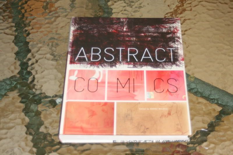
Prva antologija apstraktnog stripa (Abstract Comics, priređivač Andrei Molotiu).
Apstraktni strip je strip bez priče, sveden na svoje temeljne, vizualne jedinice. Ili gledano s drugog kraja, riječ je o slikama povezanima nekom sekvencijalnom progresijom.
abstractcomics.blogspot.com/

[for part I, see here.]
Abstract Comics: The Anthology is an impressive collection of old and new work with unique pages covering exactly what the title says. Fantagraphics’ bold book covers the years from 1967 to the present, with a selection of abstract comics from over 40 artists.
Now I think I’m a pretty open comics reader. Having primarily grown up on superheroes however, it’s only been the last 5 years that I’ve expanded my reading habits to include indie titles. It was Craig Thompson’s masterwork, Blankets that woke me up to the world beyond spandex and ever since then I’ve pretty much bought an indie title every week.
Abstract comics is a foreign concept to me though. I’m surprised that I’ve never thought of the genre before. It makes complete sense and after pouring through this hardcover from Fantagraphics I have a greater understanding and appreciation for the form. This intriguing 208 page tome includes some of the best work from pioneers in the field, as well as new work created for the anthology by artists including James Kochalka.
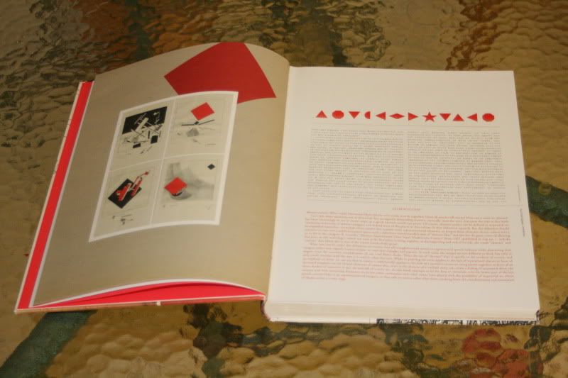
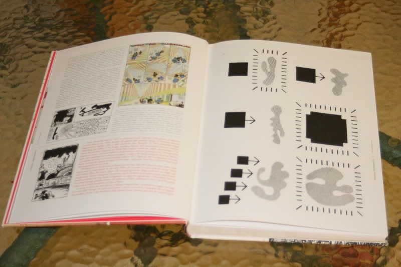
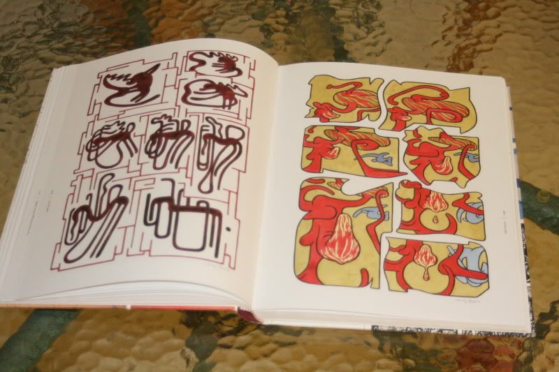
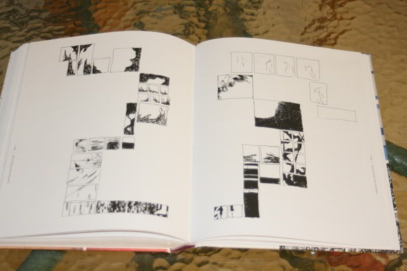
The introduction of the book is the only piece with words strung together that actually form an obviously coherent thought. Andrei Molotiu is the editor of Abstract Comics, and quite an authority on the subject. His work as an artist is reflected here and his introductory summary of what abstract comics actually are, as opposed to the use of the word in other art forms, is insightful. Even this obligatory introduction is treated with a loose abstract veneer, with plain text comprising the bottom half of each page, while above it sits the same words through the lens of simple shapes, which reminded me of the Kryptonese language. Yes, even with abstract comics, I can’t help but see things through my fanboy glasses. (There’s also a look at the history of abstract comics here). Molotiu defines the term thusly;
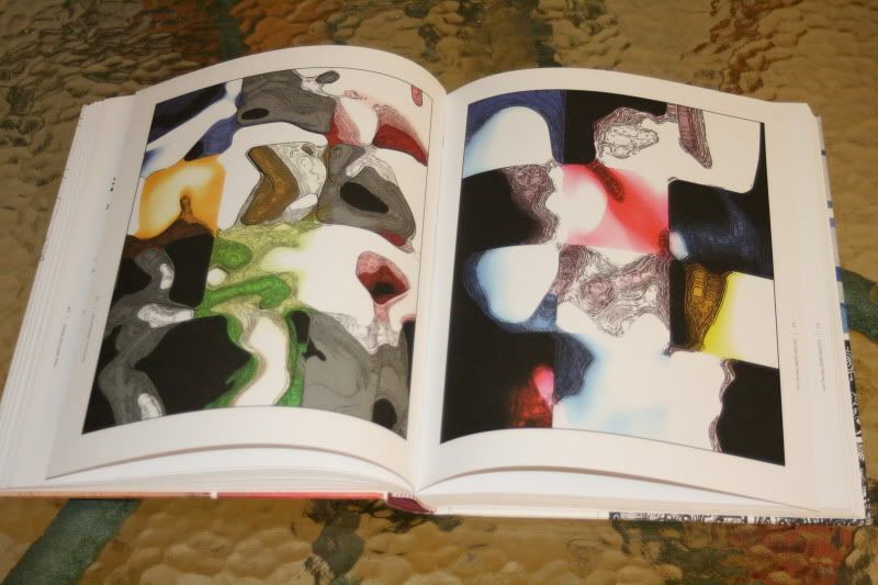
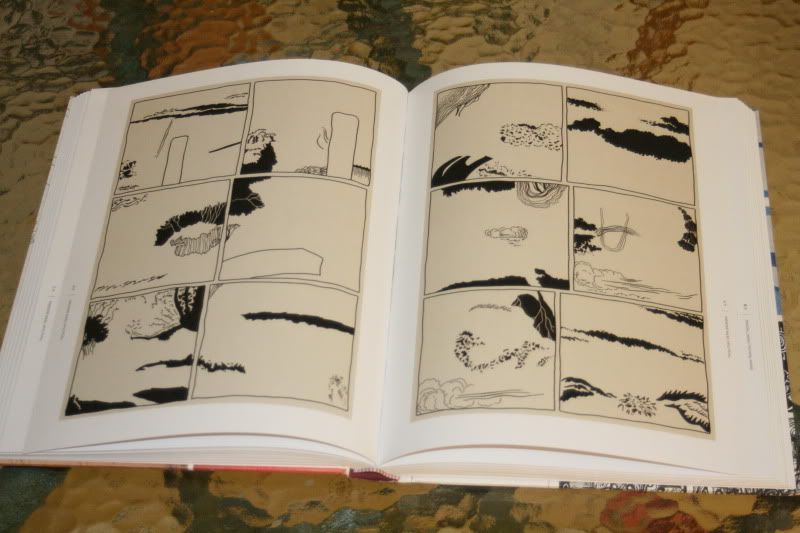
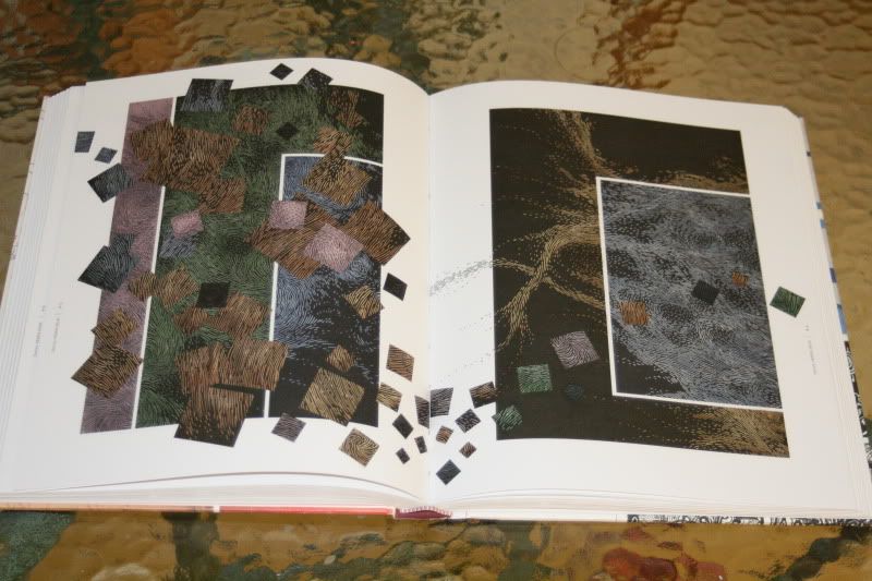
abstract comics can be defined as sequential art consisting exclusively of abstract imagery, and indeed most of the pieces in this volume fit that definition squarely. But the definition should be expanded somewhat, to include those comics that contain some representational elements, as long as those elements do not cohere into a narrative or even into a unified narrative space.Whew. It’s the kind of talk that gets art students all sweaty. His 8 page introduction is littered with great work as he shows us the history of abstract comics, with examples of a bunch of artists unfamiliar to me to those who I didn’t expect to see, such as Wassily Kandinsky, Willem de Kooning, Winsor McCay and Steve Ditko.
 Things
kick off with a great piece from 1967 by R. Crumb, as originally seen
in Zap #1. As you’d expect, it’s only 3 pages, but packs a lot of zest,
with rounded figures, cheeky expressions and wild imagery. For the next
200 plus pages I was bombarded (in a good way) with every form and
technique imaginable. I never knew what each turn of the page would
bring. Black and white, pencil sketches, colour paintings and more –
it’s all accounted for. Most of the works are only 3 or 4 pages long,
with little or no text and some semblance of structured panels. I found
myself treating the book like a portable art gallery as I let the images
wash over me and tried to grasp their meaning. With close looks, there
are stories of sorts to be told here, but as Molotiu mentions in the
intro, abstract comics don’t have a narrative. I couldn’t help myself
though and on some occasions examined the shapes in an attempt to form
one. However, like all art the point is the enjoyment of the work first
and foremost, rather than a desperation to cram it through out
structured reasoning.
Things
kick off with a great piece from 1967 by R. Crumb, as originally seen
in Zap #1. As you’d expect, it’s only 3 pages, but packs a lot of zest,
with rounded figures, cheeky expressions and wild imagery. For the next
200 plus pages I was bombarded (in a good way) with every form and
technique imaginable. I never knew what each turn of the page would
bring. Black and white, pencil sketches, colour paintings and more –
it’s all accounted for. Most of the works are only 3 or 4 pages long,
with little or no text and some semblance of structured panels. I found
myself treating the book like a portable art gallery as I let the images
wash over me and tried to grasp their meaning. With close looks, there
are stories of sorts to be told here, but as Molotiu mentions in the
intro, abstract comics don’t have a narrative. I couldn’t help myself
though and on some occasions examined the shapes in an attempt to form
one. However, like all art the point is the enjoyment of the work first
and foremost, rather than a desperation to cram it through out
structured reasoning. Molotiu’s
work, The Cave was definitely a “wow” moment for me with its bold
colours and gem like qualities, as was Andres Pearson’s work, with its
swirling organic structures. Through some pages I could see how the
panels, or the shapes within those panels, related to each other, which
gave clarity to Molotiu’s introductory definition as to why this is
different from abstract work done in other fields, such as cinema. James
Kochalka’s (American Elf) work is exuberant and playful, as is Mike
Getsiv’s. Blaise Larmee’s I Would Like To Live There is simple yet
elegant while Life, Interwoven by Alexey Sokolin is 6 pages of
increasing fury.
Molotiu’s
work, The Cave was definitely a “wow” moment for me with its bold
colours and gem like qualities, as was Andres Pearson’s work, with its
swirling organic structures. Through some pages I could see how the
panels, or the shapes within those panels, related to each other, which
gave clarity to Molotiu’s introductory definition as to why this is
different from abstract work done in other fields, such as cinema. James
Kochalka’s (American Elf) work is exuberant and playful, as is Mike
Getsiv’s. Blaise Larmee’s I Would Like To Live There is simple yet
elegant while Life, Interwoven by Alexey Sokolin is 6 pages of
increasing fury.It’s hard to describe the experience of reading this anthology, but it must have been that much harder to choose the artists whose work would be shown here, especially considering this is the first book of its kind and it covers 4 decades. Book designer Jacob Covey must also be mentioned as there’s an undeniable sense of purpose that holds these pages together, from the cover to artists’ credits to last few pages. It’s subtle which allows the abstract comics to own the spotlight.
The book concludes with handy artist biographies for those that would like to discover more about them, and there’s also a useful accompanying blog which features work from the anthology and elsewhere.
I’ll admit that it was sheer curiosity that made me read this, and after enjoying its diverse offerings it brought me back to my art school days when I was exposed to a wide array of artists. It’s obviously a difficult book to review as well, especially as there’s no Good Guy A punches Bad Guy B action, but it was a treat for my often superhero consuming eyes. This is a book for readers who like fine art or those who would like to expand their sequential art experiences. A hearty slap on the back for Fantagraphics for choosing to create this marvelous example of a widely unknown artistic expression.


comicbookjesus.com/
Molotiu on Fantagraphics' “Abstract Comics”
If the question of what precisely defines a comic book is complex, the question of what makes an abstract comic book is certainly more so. Drawing from the worlds of abstract painting, narrative comics, and other sources which serve to inspire the imagination, a select few artists have created works that defy convention yet retain some of the traditional characteristics of comics like panel borders, speech bubbles, and other less concrete aspects.
In June, Fantagraphics will present a collection of such works in “Abstract Comics,” an anthology edited by Andrei Molotiu. The book includes short strips by R. Crumb, Gary Panter, and Lewis Trondheim, and original pieces by James Kochalka and others, and is complemented by a blog, which features new work and experiments by anthology contributors. CBR News spoke with editor Andrei Molotiu about the book and blog, the traits of an abstract comic, and the dynamic elements of superhero comics.
Recognizing that it is important to define one's terms, Molotiu opens “Abstract Comics” by discussing the boundaries of what is and is not an abstract comic, recounting some of the principles and laying them out in the book's introduction. “The term 'abstract' has been applied in a variety of different ways to comics,” he told CBR. “On one hand, you could think of something like 'Beanworld' by Larry Marder as being an abstract comic, since it has very abstracted characters. Nevertheless, it still has a forward narrative. If you just have a story with abstracted characters—a story that is otherwise narrative and has straightforward storytelling—it's simply not different in kind but only in degree from reducing human beings to cartoon characters, anthropomorphic ducks [as in 'Uncle Scrooge'], or what have you. That’s not the kind of strip I was interested in for the anthology.
“I took my cue from several abstract comics of the past, specifically beginning with Saul Steinberg, who had a number of pages of abstract comics in his 1960 book, ‘The Labyrinth.’ Starting from such examples, we can define an abstract comic as a comic that does not illustrate a pre-existing plot and that has only non-representational images in the panels. We can even expand this definition to include comics that may contain representational images, so long as those representational images do not cohere into a straightforward illustrated plot or narrative, and do not create a unified diegetic space.
 |
| Page from "Abstract Comics" by Patrick McDonnell, of “Mutts” fame. |
Describing comics' place in the world of abstract art, Molotiu noted that there are affinities but only rare occurrences of the two media crossing over directly. “One can't really plot the evolution of abstract comics to the evolution of abstract painting, but there have been abstract artists in the past who became interested in the idea of doing some kind of sequencing,” Molotiu said. “This is somewhat connected to the notion of the series, as practiced by Mark Rothko or other abstract painters. What we call a series usually consists of a number of abstract paintings that are connected by similar formal concerns, but that don’t necessarily form a sequence. Often they are numbered, but that numbering tends to speak only to the order in which they were created, not to an order of reading that could hint at a definite sequence. However, some people become interested in exploring the connection of abstraction to sequence, possibly under the influence of abstract cinema, and the most important of those would be Kurt Kranz.”
Molotiu said that he was unable to include Kranz in the anthology (except as represented by a brief excerpt reproduced in the introduction) because he was not able to determine the copyright owner or representative, but is hopeful that Kranz's work will be included in a possible second volume. “Working at the Bauhaus from the late '20s to the very early '30s, when he was in his late teens, Kranz was inspired by the abstract cinema of Walter Ruttmann, Oskar Fischinger, and Hans Richter to make abstract art that progresses and changes from image to image to image,” the editor said. “The best work that he created at the time is a series of forty ink drawings titled 'Picture Sequence: Black/White.' In them shapes seem to grow from panel to panel—or, more accurately, from drawing to drawing. A circle, for example, multiplies into many circles, and you get a feeling of actual sequence developing from image to image.
 |
| Page from "Abstract Comics" by Ibn al Rabin |
Other than Kranz and his impact upon his teachers, Molotiu includes a few other major names from the art world in his analysis of abstract comics. “I reproduced a [Willem] de Kooning, one of the drawings he made around 1960 when he was living in a small apartment without a really big studio, when he began drawing on smaller sheets of paper that he then glued onto larger pieces of paper or canvas. The piece I reproduce consists of four such smaller sheets that are combined, and it's pretty clear he arranged them in such a way that they have a sequence. The first three have more movement, and the last one kind of stops, almost like a four-panel gag strip. The next step was taken when Pop artists became interested in the relationship of comics with high art. I’m not referring to Roy Lichtenstein who, rather than investigate sequence, instead took sequentiality away from comics by focusing on single panels. I’m thinking, rather, of Jasper Johns's 'Alley Oop' of 1958. This is the one where Johns took an 'Alley Oop' Sunday page, glued it to a canvas, and painted it over to leave visible only the major shapes. This way you still see the panels, you still notice the major changes in composition from panel to panel, without however being able to follow the story or even recognize the characters. So that's the opposite of what Lichtenstein did--it maintains the sequence, but does away with the figures. Saul Steinberg put a number of clearly abstract comics in his book 'The Labyrinth,' which came out in 1960. And those function almost like abstract parodies—they’re actually, perhaps surprisingly, very funny--of daily strips. They usually have four panels and end with something like an explosion, giving you the basic structure of a comic strip but in purely abstract terms. Not so far from what de Kooning had done, really.
“To put it in a context, I think that abstract comics—or at least what one might call abstract sequential art-- have been occasionally made by abstract artists, who included sequentiality either within a single work like in the Jasper Johns or de Kooning pieces, or in a series, such as Jackson Pollock’s ‘Red Painting, 1-7,’” Molotiu explained.
 |
| Page from "Abstract Comics" by Mike Getsiv |
Molotiu's introduction also implicates a legendary narrative comics artist, Spider-Man co-creator Steve Ditko, and briefly discusses the abstract elements of his Dr. Strange stories. “The reason I mention Ditko is that there are a number of superhero comics that become so graphically powerful, because there's so much movement in them, that even if you completely ignore the text and even the figures, the vectors of force in each panel will lead you to the next panel,” the editor said. “You have these very strong graphic sequences in works by Ditko, Kirby and many others where even if you blur the whole image and get rid of the words, you still see a strong spotting of the blacks, for example, from which you can construct wonderful abstract compositions.”
The editor noted that though abstract comics might appeal more to the indie comics base than superhero comics readers, the latter form is often better suited to the needs of abstraction. “A kind of party line has been predominant in portions of the alternative comics world,” Molotiu said, which leads them away from the graphic energy the editor sees as inherent in art by creators like Ditko and Kirby. “I think that, oftentimes, abstract comics do end up maintaining more of that graphic energy, and I think that they can draw attention to this very powerful tool in the vocabulary of comics that may have been lost in a number of art and alternative comics.”
Molotiu also cited Gary Panter's “Zomoid” as mostly abstract. “You kind of see the image coming to existence, or disappearing into pure graphic trace, or being formed into a figure.” The work also has elements of representation, places the dominant emphasis on the purely graphic component of the art.
On the “Abstract Comics” blog, and also in the book, there are several examples of artists adapting narrative comics into abstractions, such as Johns's “Alley Oop” and Mike Getsiv's “Kirbstract,” highlighting a phenomenon that Molotiu calls “sequential dynamism” which he defines as “the dynamics of forces that lead your eye across and through a sequence, beyond plot, the graphic element that leads you from one panel to the next.”
 |
| Page from "Abstract Comics" by Benoit Joly |
There are, though, different methods for different artists. “Derik Badman drew digitally over a 1950s 'Tarzan' comic, and just drew the main compositional elements but got rid of the figures and the words. I think it's quite powerful,” Molotiu said. “Noah Berlatsky has two pieces in the anthology based on, respectively, an 'Asterix' page and an 'X-Men' page. As far as I can tell, he just looked at the originals and redrew them by hand. In such cases, these artists attempt to maintain that abstract play of compositional forces from panel to panel that they see in the original pages they copy, while moving away from the representational aspect of the comics.”
Beyond offering promotion for the Fantagraphics book, the “Abstract Comics” blog has had the effect of creating a community for abstract comics artists and inspiring others to post their efforts online. “I wanted a place on the web to bring together a lot of the efforts in this genre, which have been very scattered,” Molotiu said of the blog's origins. “I've been working on this anthology for the past five years, and five years ago there was a lot less material than there is now. One way I found a number of contributors for the anthology was simply, once a week or once a month, Googling 'abstract comics' in English and in French. I actually never figured out how to Google it in German, I should find a way. But every once in a while someone new would pop up who had done something of the kind. They were so scattered that I thought having a single forum on the web where they can come and bring everything together would be very helpful. It has turned out, to some extent, to be--we've only been in existence since April and several other people on the web, inspired clearly by our blog, have begun trying their own hand at abstract comics. Which potentially gives me more material for a second volume of the anthology, which is great.”
The blog also serves as a place to suggest and post the results of abstract comics exercises, in the spirit of surrealist “exquisite corpse” collaborations or limiting experiments in the style of Oulipo (“workshop of potential literature”) and Oubapo (the comics equivalent). While this aspect is in its “infancy stage,” Molotiu said he hopes abstract comics artists will continue to explore similar themes in this way. “I think the most there has been so far is the emotion challenge, proposed by Alexey Sokolin. It’s quite fascinating to see not only how different people see different emotions graphically, but how their renderings fit together and the extent to which there are some common threads between conventionalized notions of how to represent an emotion abstractly.
 |
| Page from Molotiu's "Nautilus" |
Since “Abstract Comics” tackles a previously unexamined subject, it is perhaps not surprising that it will serve as an exhibition catalogue for a retrospective of abstract comics art. The exhibition, curated by Molotiu and Linda Norden, is titled “Silent Pictures” and will be on display from August 14 at the CUNY Graduate Center's James Gallery. “It's actually a double show: about half, or a little more than half in terms of works exhibited, will be from the anthology. We're going to represent every single artist in the anthology, I don't know if we're going to be able to get in every page, but every artist is represented,” Molotiu explained. “The other part is going to be a collection of silent sequential art and comic books in the woodcut style from Germany in the 1920s and 1930s, as collected by Art Spiegelman.”
In closing, Molotiu praised book designer Jacob Covey for his work on “Abstract Comics,” noting that his work complemented the anthology's subject matter. “I think it's his best work, and I think he might agree to some extent with that,” Molotiu said of Covey. “The overall graphic theme and design theme that goes not only through the plate pages but the introduction, the title page, the back matter, is quite fascinating. One of the things he's done is to base part of his design on the first plate in the introduction, which reproduces four pages from 'The Story of Two Squares' by El Lissitzky. Lissitzky's story is about a red square and a black square, and the graphic theme of the red square and the black square reappears throughout the book, both right before the table of contents, then leading into the plates, then the bibliography. There is constantly this design theme of red and black, and what might be seen as red and black triangles, functioning like arrows leading the reader to turn the page, but which are actually derived from half a square standing on one of its corners. Jacob basically picked up on the graphic theme of the first image in the introduction and disseminated it throughout the book, making the design itself Constructivist, in a sense. I thought it was a very great design idea and I'm very happy with it. The book becomes a powerful graphic design object in its own right. Jacob's notion was that--this being a book of abstract comics, not something you see every day, the first publication ever dedicated to the subject--we should do something more interesting, more out of the ordinary, to echo the book’s contents in the design itself.”
Molotiu also mentioned his own book of abstract comics, titled “Nautilus,” debuting concurrently with the anthology. “I'm pretty excited because I convinced my publisher to do it in the old fashioned European album format, like the hardcover ‘Asterix’ albums I grew up with,” he said. “It's being published together with a book, 'Reykjavik,' by another contributor to the anthology, Henrik Rehr, a Danish artist living in New York. We chose the titles advisedly, to be understandable in any language—just like the books themselves, being primarily silent, not to mention abstract, can be universally understood.”- www.comicbookresources.com/

Andrei Molotiu is an artist and art historian who teaches at Indiana University, Bloomington, and who recently edited Abstract Comics: The Anthology, the first collection devoted to the genre. Offering experiments by established cartoonists as well as new pieces by emerging artists, the book is available from Fantagraphics and will serve as the exhibition catalogue for “Silent Pictures,” which opens on September 1 at the CUNY Graduate Center’s James Gallery. Nautilus, a collection of Molotiu’s own abstract comics, has just been published by Fahrenheit Editions.
ABSTRACT COMICS ARE COMICS that have abstract forms instead of representational images in their panels—when they even have panels, that is. Now, comics are an art of reduction anyway, so it’s easy to conceive of a story in which squares and triangles function as traditional characters. In abstract comics, however, the “story” being told is primarily one of formal transformations and visual energy, not the depiction of a narrative that can be otherwise conveyed verbally. Words may play a part in abstract comics, but primarily as graphic elements, not to communicate or to further the plot. Some imagery can be there,too, as long as it does not form into a story and as long as it does not cohere into a unified space.
I first discovered the possibility of abstract sequential art in the work of the Belgian artist Pierre Alechinsky, who was closely associated with the Cobra group, as I discuss in the introduction to the book. Many of his paintings from the 1960s on have subdivisions and abstract panels that are clearly derived from comics. Some of them, to me, looked like comic-book pages, and they inspired me to make my own abstract comics, as well as to seek out more examples of such work from other artists—which led, down the road, to this volume.
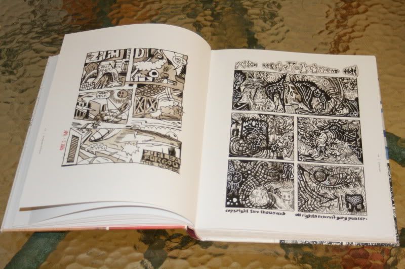
My first idea, in trying to survey abstract comics, was to create a wide-ranging anthology. I knew I wanted to include an important early work by R. Crumb––a piece from 1967 titled Abstract Expressionistic Ultra Super Modernistic Comics––and it opens the book. I also included a piece I commissioned a few years ago from Gary Panter. He has an ongoing project where you can commission drawings cheaply from him. It began at $100, and after every one hundred drawings, he bumps up the price by $25 (it’s currently at $225, so you can calculate how many he’s drawn so far). In terms of the commission, you give him three words and he draws whatever he chooses based on those words. The words I gave him were abstract, comic, and strip. As he had made only one other such piece previously (also included in the anthology), I suppose that I effectively helped double the quantity of Gary Panter abstract comics in the world.
One of my favorite aspects of working on this project was discovering the work of Benoit Joly, a lesser-known cartoonist from Quebec. In 1987, he drew an amazing abstract piece, a one-off that he did not really follow up on until I e-mailed him about the anthology. He drew another one for the anthology and has done a few more since. Another story like that comes from Mark Badger, who used to work primarily as an artist at DC and Marvel. When he was in art school in the early ’80s, he sketched out a two-page abstract comic, which he left unfinished. After he saw my own work on the Internet, he dug up the comic and put it on his website. I persuaded him to finish it and we ended up printing both versions, from 1980 and 2008, in the anthology.
Besides such hidden histories that I was able to unearth (another example is Patrick McDonnell, creator of the syndicated strip Mutts, who also drew abstract comics in art school but never published them), I also wanted to include several younger cartoonists whose work either had been going in that direction, even if it had not gone fully abstract yet, or had made use of graphic elements that I could see successfully working abstractly. I’m thinking here of artists such as Richard Hahn, James Kochalka, and Warren Craghead. So I invited them to try their hands at abstract comics.
Also included are people like J. R. Williams, who had largely given up comics and taken up abstract painting but had not thought of using his abstract style in a comic until I suggested he give it a try for the anthology. Conversely, there are artists such as Anders Pearson and Janusz Jaworski, who, independently of each other, began experimenting with abstract comics in the past few years. Coming out at this specific juncture, the anthology is fortunately able to capture all the recent creative ferment in the genre.
Abstract Comics: An interview with Andrei Molotiu
Monday, October 12, 2009 at 07:27PM
Andrei Molotiu co-curated the recent show Silent Pictures , is the author of the recently published anthology Abstract Comics, and of the equally recent Nautilus, a collection of his own abstract sequential art. This Spring ArtLexis
held an exhibition of his work. Taken together Molotiu’s activity adds
up to something like a campaign for “abstract comics” as a new and
specific genre of contemporary art. In the interview below Andrei and
I discuss what might be considered the rules of the game.

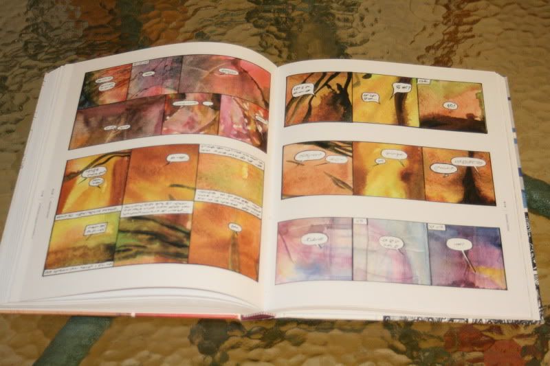
Ibn al Rabin, The Empire Strikes Back
CS: You express
disinterest in equating the abstract comic with abstract animated film.
And so I am looking at this image, Ibn al Rabin's The Empire Strikes Back, and noting how very different it is than your own work in that it moves from frame to frame quite legibly within a narrative.
AM: Well, yes, this kind of gradual transformation is one of the “established” (if we can call it that) modes of abstract comics, and people like Ibn al Rabin or Lewis Trondheim have done really fascinating things with it; personally, however, I am interested in different kind of effects in my own comics. Sometimes when you have only such gradual transformation in an abstract comic you may almost feel like you are dealing with storyboards for animation; the shapes go from point a to point b to point c and give the illusion that you are following them through time—though an abstract comic, by definition, cannot have a sense of diegetic time (because no representation means no diegesis, no fictional world in which time can have a meaning; because introducing a sense of represented time implies moving away from the simple presence of graphic events on a page). When you get a sense of represented time, a sense of illusion seeps in, and the comic becomes almost like a time graph, with the panels in the sequence showing events that take place some set time interval apart. So there is something a bit paradoxical about Ibn al Rabin’s comics, especially the ones in the book Cidre et schnapps, from which this page comes. They have titles that suggest a diegesis, a mimetic narrative, but on the other hand they are just blots on the page enacting that narrative—perhaps allegorically? I think they work better, for me at least, if you don’t give in to the mimetic temptation, if you actually see them as blots on a page.
AM: Well, yes, this kind of gradual transformation is one of the “established” (if we can call it that) modes of abstract comics, and people like Ibn al Rabin or Lewis Trondheim have done really fascinating things with it; personally, however, I am interested in different kind of effects in my own comics. Sometimes when you have only such gradual transformation in an abstract comic you may almost feel like you are dealing with storyboards for animation; the shapes go from point a to point b to point c and give the illusion that you are following them through time—though an abstract comic, by definition, cannot have a sense of diegetic time (because no representation means no diegesis, no fictional world in which time can have a meaning; because introducing a sense of represented time implies moving away from the simple presence of graphic events on a page). When you get a sense of represented time, a sense of illusion seeps in, and the comic becomes almost like a time graph, with the panels in the sequence showing events that take place some set time interval apart. So there is something a bit paradoxical about Ibn al Rabin’s comics, especially the ones in the book Cidre et schnapps, from which this page comes. They have titles that suggest a diegesis, a mimetic narrative, but on the other hand they are just blots on the page enacting that narrative—perhaps allegorically? I think they work better, for me at least, if you don’t give in to the mimetic temptation, if you actually see them as blots on a page.
 Andrei Molotiu, Realm of Coral in 24x24: A Vague Epic
To
see them as blots on a page also means, in a way, to see them as
simultaneous, and to realize that the perceived passage of time is a
construct, resulting from the visual juxtaposition of the panels. I
think it’s important—for abstract comics, and also for comics in
general—to not lose this sense of simultaneity, of the unity of the
layout, where you can see all the panels (on a page or a double page
spread) at once. If you do lose that sense, you end up conceiving a
comic as just a storyboard, and I think that does a disservice to the
potential of the medium; comics offer a complex reading structure that
suggests time differently than an actual time-bound reading or viewing
experience. You can contrast it to the reading of a (prose, as opposed
to graphic) novel, where the reader simply follows along a string of
words; and though many words do co-exist on a single page, you don’t
tend to think of their co-presence on the page as an aesthetic component
of the novel. Visual juxtaposition—and therefore, from one point of
view, simultaneity—is however an active aesthetic component of the comic
medium. One thing that is interesting to me about abstract comics is
exactly that they contain no preexisting narrative and therefore no
excuse for a sense of diegetic time. You’re not following a story, so
what you are left with are the actual visual elements on the page
(panels, shapes) that move your eye from panel to panel but outside of a
fictional time frame.
The other side of the equation is the
distinction between abstract comics and abstract painting. In the
Michael Fried/Clement Greenberg take on abstract painting you’re
supposed to take in the painting’s composition at once,
instantaneously. Well, abstract comics won’t let you do that either:
the juxtaposition of panels that suggests a kind of simultaneity
(therefore going beyond simple storyboard reading) at the same time
denies instantaneity: you can’t take in both the layout and each
individual panel at once, you have at least to keep transitioning from
one to the other, and from panel to panel in traditional reading order,
etc. So I think that comics work in between these two extremes, the
linearity of storyboards or prose, on one hand, and the instantaneity of
abstract painting, on the other. Rather they have more of a complex
tabularity, I guess, by which I means something like a table (say, the
table of elements), which contains both simultaneity and sequence. And
abstract comics, I believe, are especially well-placed to exploit this
complex structure. Does that make sense?
CS: Yes it does absolutely, I had a real appreciation for your use of Jackson Pollock’s piece in your anthology, recently in Third Mind,
but it appeared as an anecdotal aside and a failure if you will because
Jackson Pollock is doing “One” over and over and over again, very much
involved in that sense of an at-once-ness, and the painting by Jasper
Johns, Alley Oop, was a beautiful counterpoint to that. I’m going to quote what you say in an earlier interview:
“I think that, oftentimes, abstract comics do end up maintaining more
of that graphic energy, and I think that they can draw attention to this
very powerful tool in the vocabulary of comics that may have been lost
in a number of art and alternative comics.” It is almost an address to
action painting, only here most apparent through the lens of Jasper
Johns work, and what occurs in the Johns is an abstraction of narrative
as you move from left to right and frame to frame.

Jasper Johns, Alley Oop, 1958
AM: You're referring to my discussion of Pollock's Red Painting 1-7, from 1950. I
gave a talk at CUNY where I expanded on Jackson Pollock beyond what I
said in the introduction to the book. There is a Hans Namuth photograph
of his studio from 1951, in which you can see a number of his black and
white paintings that he painted side by side, on a single piece of
canvas, and that piece of canvas looks like nothing so much as an
abstract comic strip. Greenberg always discussed the importance of a
painting’s being aware of its edges, of the frame, but Pollock was doing
absolutely nothing of the kind; rather, he was just eyeballing it. He
would put about three different compositions on a single canvas,
sometimes side by side, in a row, sometimes in more complex arrangements
that look even more like abstract comics. The way they were originally
created they did not have the “instantaneity” or unity demanded by
Greenberg or Fried, the canvas was divided and you tended to focus on
one panel at a time, therefore needing time to explore the entire
piece. But usually he went on to cut them apart and then exhibit them
only one “panel,” so to speak, at a time. [I have, since the interview,
found a couple where he didn’t cut the panels apart, such as “Number 7, 1951” and “Untitled
(after CR # 328)”.] It’s interesting that his original impulse,
occasionally at least, seems to have been more towards this kind of
juxtaposition of compositions, because the side-by-sideness, if that’s a
word, was then completely negated in the cutting. From a Greenbergian
perspective such juxtaposition was unacceptable, because it fragmented
the overall composition, kept if from being unified. Furthermore, it
brought in a time element. The only [other] time he didn’t do that was
in Red Painting 1-7, from 1950.

Jackson Pollock, Red Painting 1-7, 1950
I’ve loved Pollock for a long time, and
surprisingly enough—because most people think it’s his poorer work—I’ve
always been partial to his black and white paintings. I’m struck,
whenever I see them in a museum, by the pure phenomenological experience
of the dried black pigment stuck to the fibers. There’s such a
tremendous energy in those paintings, and one thing I’ve tried to do
(not always consciously, but I can see it in retrospect) has been to
recapture this energy and put in the service of what I call sequential
dynamism—the visual forces, in a comic, that can lead you across the
page from panel to panel and that in a way create a different kind of
frozen moment, one in addition to an action painting’s frozen movement
of the brushwork, the artist’s hand that moved across the surface of the
canvas. In abstract comics you have the additional movement of the
juxtaposition of panels, the suggestion of reading direction that is
given by the composition, the vectors of force in each panel. And when I
say “frozen,” it is because the abstract comic sits there, as any comic
does, waiting to be put into motion by the intention of the viewer, of
the reader, and also to put into motion the visual attention of the
viewer. Comics, so to speak, both are awoken by the viewer and they
awake the viewer’s gaze and sense of reading.
CS: I was fascinated by the use of the word gutter to describe the space beteen frames and the difference between paintings and comics and films is that in the comic book the frame is in the picture and there’s something very important about that. The frame being in the picture is somehow the device that pulls in the attention of the viewer differently. An abstract comic can be very decorative and full as though they were all-over paintings in that about-to-become wallpaper sense of things. But then you might notice that there is an almost palpable mobility of the frames themselves. It makes me think of this toy by Dan Graham.

Dan Graham, One, found here.
So this gets me to your exhibition at ArtLexis. The piece was called 24x2: A Vague Epic, and
as 24 pages on the wall it covered the gallery. Since it is available
as a folio, there was for me an interest in shuffling, in my agency as a
viewer being such that I could actually control the narrative. But in
fact what I learned was that even though these arrived as a folio of
loose sheets there was a very definite narrative in that they were
pinned to the wall from beginning to end. There’s not the sense of
agency and chance that I was at first invited to consider. Can you say
something about the kind of agency that interests you, as something that
is appearing from beginning to end in a deliberate way without giving
someone the agency to actually shuffle?
AM:
Well, generally with regard to abstract comics, I’ve been interested not
only in creating panel-to-panel sequentiality, but also in placing
within each one of my pieces some kind of “narrative” arc, such as one
that might lead from a low-key beginning to higher intensity and then
ending low-key again. Not all abstract comics need to do this; for
example, the pieces in the anthology by Richard Hahn don't really do
this, they exhibit more of a pulse and rhythm that vibrates from panel
to panel, a movement in and out of the picture plane, but no arc per
se. But personally I’ve always been interested in the possibility of
still maintaining such an arc—let’s call it a “sequential arc,” maybe,
like a narrative arc but within abstract form. At the same time, in 24x24
in addition to this arc I was concerned with the unity of the layouts,
so in a way each page in that series forms a kind of hybrid picture that
can be read both as a unified layout with a grid imposed upon it and as
a sequential arc.

Andrei Molotiu, 24x24: A Vague Epic, installation view at Artlexis, 2009.
I should add that the
pages were created sequentially. They were laid out panel by panel, one
at a time, and the unified composition only appears out of the
juxtaposition of those sequential images. I only realized this was
going to be a series after I’d made the first three or four, and then I
said to myself, ok it has to be a series of twenty-four because that is
(more or less) the traditional number of pages in a comic book story,
and also because there were twenty-four panels in each strip. In this
series, probably more than I’ve done in other pieces, I started to put
more or less descriptive titles on each page that somewhat took them
beyond pure abstraction, as for example happens in—and this has always
been a huge influence on me—Jackson Pollock’s Full Fathom Five.
Once you contemplate the meaning of the title you begin thinking of
space in the sea, you begin thinking of coral, of seaweed, and therefore
it is not purely abstract, it becomes an underwater space. Obviously
not a perspectival space, but a space where everything is afloat at
every level; and such a “floating” space, if you will, itself tends to
become abstract inasmuch as it differs from the box space of the
Renaissance, where everything is weighed down to the ground.
As I began giving the pages titles, more or less akin to Pollock’s Full Fathom Five,
I realized that I was actually toying with images that were right on
the threshold of legibility—right beneath it, perhaps but which could
suggest to people this or that kind of representational shape. I was
reading recently a review in The New Yorker,
of the new Kandinsky show, and the reviewer said he could never enjoy
this one painting by Kandinsky because he always sees a football helmet
in it; and there’s also the story of Braque telling Picasso that he
could see a squirrel in one of his cubist paintings, and Picasso
basically going off and destroying his painting by trying to get rid of
the squirrel. But I don’t mind when people find such representational
elements in my pieces, especially in my 24 x 24 pages—as long
as this recognition remains vague and uncertain, more along the lines of
a Rorshach blot. I actually enjoy it when people interpret these
abstract shapes as figurative elements, even though they were not
intended as such. Anyway, to make a long story short, I found that
adding the title gave a kind of direction to the interpretation of the
piece, structured the viewer’s experience as to what he or she might
find in it; and when arranging the piece as a print series, with each
plate printed in a different color ink, I found that color suggested a
mood for that reading. I found myself trying to give the entire series
the feel of a barely remembered film from one’s childhood, like The Empire Strikes Back,
which I haven’t watched since I was twelve but still remember fondly
(funny, I wasn't even thinking of Ibn al Rabin's piece when I came up
with this notion!). Trying to recall that movie, I don’t remember
anything but my sensations, and tremendously vague memories of the
imagery, mostly moods. So, in a way, with 24 x 24 I was trying
to suggest in the present moment that vagueness of memory (through the
vagueness of abstraction in which one nevertheless may be able to find
some figurative shapes, and through the titles, which almost work like
chapter headings for some DVD of a long-forgotten epic film), the memory
of a story more as a sequence of moods than of events—and that’s why I
called it a “vague epic.” Admittedly, “vague” is also my own bilingual
pun, coming from Stéphane Mallarmé, my favorite poet (you can find my
translation of his Afternoon of a Faun here.) Mallarmé was always interested in an effect of vagueness in poetry, but for him vagueness, le vague, also related to the notion of the wave, la vague.
Same word, different genders. (And clearly, waves relate to my
underwater imagery.) Mallarmé is probably my greatest influence, when
he talks about the music underneath poetry. For him surface meaning in
poetry was only necessary so that poets don’t get stoned—I mean
attacked, reviled—by the public. The true meaning of poetry is the
abstract music under the words. In the same way, I’ve been trying to
get at the music underneath the images, the graphic music that underlies
sequential art.
CS: This is what I like about the introduction of that piece by Jasper Johns, and I was thinking very much of abstraction as a sort of unconscious moving through the narrative. I can tell you from a viewer’s experience what your work looked like in the gallery: My initial response was that this is very cool, as in that register of cool as opposed to hot. The gutter is now literally the wall, the abstraction is very decorative, and it took time. The colors became cues, spotting the wall as a kind of punctuation in time. For someone literally standing in the middle of the room and looking at everything from the distance, slowly - and I haven't yet even reached the point where I understand that there is a beginning and an end - I’m beginning to see what the gutter is doing - that it is in a very literal way creating a discretion between one thing and the next. I then began to see that there are different topographies, each page was giving me a view that was really quite specific, there are even different angles of viewing. It became clear that there wasn’t an homogenous space from one page to the next that had been simply sliced apart. This was not immediately evident but gradually evident. So the way that you’re talking abut the epic as something that can belong to a childhood memory, that earning of one’s way past some field and into another where sensations are evoked and specific but not articulated as though they belong to ... well in this case the fall guy is narrative but we don’t even need narrative anymore at this point. And it’s only after this point that I understand enough to ask the question “Can these be shuffled around?” can I arrange them at whim?, and there’s a clear narrative I’m told. It’s not until that point that I go up to them and I read the titles. I am moving around the room, checking back and forth, trying to ascertain with effort some sort of meaning that I’m being guided towards which ultimately fails. I don’t know if anyone has ever told you what it was like to look at that hanging in the gallery.
AM: I’m tremendously grateful to you for telling me all this. In many ways that’s how I wished it to be read. I don’t want to say you were “correct,” but it confirms that I was able to create them in such a way so as to convey the experience that I’d had myself and that I was trying to convey.

You mentioned Jasper Johns, and I hadn’t
quite put this together before now—but I think there is a connection
between what I do in 24 x 24 and what Jasper Johns did in his painting Alley Oop. There, Johns pasted a Sunday Alley Oop
page to his canvas and covered it with just blotches of paint, blotting
out the representational details but leaving in the larger shapes, so
that abstraction is revealed as a kind of unconscious of the
representation—he draws out the vagueness, the abstract wave of shapes
that’s underneath the narrative of the Alley Oop story. This is close to what I was trying to do in 24x24 and more generally in my abstract comics. One of my favorite comic artists is Jack Kirby,
who did a great amount of comics from the ‘40s through the ‘80s. You
can see a transformation of his work around the mid-sixties, and I
believe that at the time he is beginning to learn form Lichtenstein,
noticing the powerful abstraction of form had always been there in his
own work but becoming more and more self-conscious about it. Especially
in 1965 to 1975, his work becomes so graphically powerful and
intentional, and I find myself enjoying it not so much for the
storylines but for the unconscious abstraction underneath the story,
that gives the story its graphic weight. In a way, in 24x24 or in my piece Expedition to the Interior
I’m almost providing for the reader’s conscious experience something
that I experience, in other comics, as the unconscious. Of course,
abstract painting itself was trying to do that, with Kandinsky already
trying to provide harmonious compositions, like he had seen in earlier
art, but without the distraction of representational form. But abstract
comics do this for sequential art.

Andrei Molotiu, Expedition to the Interior
CS: This is really what
made me interested in Stanley Cavell and his thoughts about automatism.
He’s talking about film but he’s interested in the camera, and the
relation film has to what he refers to as the photograph’s automatism.
In The World Viewed,
published in 1971, he’s describing film as being in a situation in which
it hasn’t realized itself as a medium, and that it’s become a way in
which we look out at the world and we hide behind ourselves as we do
so.
AM: What does he mean by that?
CS: He says, and here is literally the passage: “Our condition has become one in which our natural mode of perception is to view, feeling unseen. We don’t so much look at the world as we look out at it from behind the self. It is our fantasies, now all completely thwarted and out of hand which are unseen and which must be kept unseen.”* Film hides us in the dark, as it were. And so he wants to fight for film’s potential, for film to fully realize itself as a medium, by leaving this place where we look out at the world from behind the self.
AM: So it’s referring simply to the notion of film as a voyeuristic medium, where the body of the viewer is hidden?
CS: Yes, and so he comes upon this word automatism as a way of, you were talking about energies as moving from frame to frame, and he’s speaking of medium-specificity as having this unconscious automatism, and of not being given a priori: “one might say that the task is no longer to produce an instance of an art but a new medium within it... The failure to establish a medium is a new depth, and absoluteness, of artistic failure.” He continues, “In calling such things automatism's I do not mean that they automatically insure artistic success or death but in mastering a tradition one masters the range of automatism's on which the tradition maintains itself, and in deploying them one’s work is assured a place in that tradition.” Because of your own resistance to film and interest in the dynamic sequentiality of the comic I’m drawn to the sense of this word “automatism” as a way of understanding the dynamics of the medium, which is now a growing international scene of abstract comics. You’ve shown that it is only the conditions of visibility, what I’m pointing to as automatisms that are already visible in the medium, which have to do with what you were referring to as their graphic energy. Cavell is putting pressure on film and narrative and still, much in the way that you want to be resistant ...
AM: I would have to go
back to Cavell’s text for a full understanding of what he means by
“automatism,” but one thing we might be saying here may have to do with
the subconscious ways of reading or scanning the page that are involved
in taking in any comic—does that approach “automatism” in the way you
are using it?
CS: Yes, and it is true that I may be pushing the word a little bit closer to you than it actually is. Another thing I can’t help think about is the little conversation we had about Bergson’s Matter and Memory, you were actually thinking of this quite seriously before you embarked on Abstract Comics.
CS: Yes, and it is true that I may be pushing the word a little bit closer to you than it actually is. Another thing I can’t help think about is the little conversation we had about Bergson’s Matter and Memory, you were actually thinking of this quite seriously before you embarked on Abstract Comics.
AM: Yes, I have something on Bergson
that was published in a web journal, actually, a good while ago. If we
are going to gather everything that I’ve done and look at what it has
to do with abstract comics, let me go back quickly and say that I did
study with Stanley Cavell. I was half film and half studio-art major
(fortunately they were in the same department), and there was an active
debate between my film-studies advisor, Vlada Petric, the curator of the
Harvard film archive at the time, and Cavell. Petric was always
concerned with identifying the specifically “cinematic” in cinema,
declaring some films not at all cinematic, inasmuch as they didn’t do
anything interesting with editing, camera angles, what have you. I’m
sure this influenced my notion of sequential art, wanting comics do more
than simply represent, narrate. But, on the other hand, Cavell’s
response was that the moment you put something in front of a camera and
film it, transferring an image of reality onto celluloid, it becomes
automatically cinematic; and so the debate was between the cinematic as a
kind of active intentional quality put into the piece by the artist,
and the cinematic as a preexisting condition of the medium itself.
Within comics such automatism may relate to the pre-set structures of
reading—from top to bottom, left to right—which already create a kind of
pre-existing dynamic of reading; but the visual experience of the comic
can be enhanced through the more active, intentional introduction of
sequential dynamism—which I suppose would correspond to Petric’s notion
of the cinematic.

Andrei Molotiu, 24x24: A Vague Epic, installation view
CS: Are the new pieces in which you are thinking of animation, is that a new step for you or have you been thinking about it for a long time?
AM: That goes back to
having done film and animation back in college. When I was 15, 16, like
everybody else I wanted to direct, to be a film-maker, but in college,
after having studied both film and studio, when having to make a choice
for my senior thesis I decided to go to studio. But I’ve always felt
caught between the two. More immediately, my recent flirtation with
animation started a couple of months ago when I simply couldn’t settle
on a color scheme for a comic I had created, and so I decided, why not
just try all colors, shift the color continuously? I thought I
remembered Photoshop has some animation capabilities, and it took me
about half an hour to figure out how it works. So, for that piece Flow,
I made the colors shift from top left to bottom right—enhancing the
direction of reading a comic—looping through the entire color spectrum.
When I finished it I thought that’s kind of cool, the design itself can
stay put but the colors can shift, and I thought that’s the only way
for an abstract comic to contain animation and yet still remain a comic,
not become animation. Then a Finnish visual poet who had found our
abstract comics blog back in April and discovered the notion of Abstract
Comics, she’s done a lot of them since, Satu Kaikkonen, posted a blog
entry saying she wanted to try animated abstract comics too, partially
because she found what I had done unsatisfactory, too limited. That got
me thinking about how far the notion of animated comics could go. This
is a debate not only in abstract comics, by the way, but even in
mainstream comics, you see some web comics from Marvel or DC containing
limited animation—and critics say that then they stop being comics at
all. The question, for me, is whether one can maintain the abstract
relationships of shape to shape, from panel to panel, across the comic’s
grid, once you’ve added movement inside the grid. If you add movement,
is it still a comic? To some extent I’m not sure it is. The thing
about comics is that still images create the illusion of dynamic
movement, so the moment you put an actual, time-based movement within
each previously static image, within each panel, it works against that
illusion of movement, that sequential dynamism born out of still images
which I see as the essence of comics—or at least of abstract comics.
Nevertheless, in some way I wanted to explore the edge between comics
and animation, and to some extent I don’t see this as a major direction
but a brief exploration; I’m not sure how far I will go into it, because
I really think of abstract comics, pure comics, as the main field I
want to explore. But I think also having done all these abstract comics
I needed a break, to clear my mind for a while. My most recent, For Bruce Conner,
is the one I’m happiest with. Yes, it is inspired by Bruce Conner’s
films but even more immediately inspired by Bruce Conner’s drawings,
which I’ve been utterly bowled over by—for example the little ink
drawing hanging as a scroll in the Third Mind show, which was absolutely
one of the most beautiful things I’d ever seen (the tiny reproduction
of it in the catalog is disastrously small and conveys nothing of its
effect). So the animation that I made started from a hand-drawn remix
that I had done about half a year ago of a Bruce Conner drawing, and it
somehow felt appropriate to animate it. I ended up cutting it up into
quarters and arranging it in four panels, and having each panel loop
through an animation cycle, so that it’s both static and dynamic, and
each cycle is a slightly different length. The movement in each panel
is from the top left to the bottom right, again to emphasize the
direction reading of a comic, but because they have different cycles the
overall composition of the four-panel piece changes gradually, as the
four panels start in sync, fall out of sync, then take a very long time
to fall back into sync—so that almost at no moment is the composition
ever the same. So I like the idea of a combination of the grid
structure of an abstract comic with movement, it becomes a kind of
hybrid medium, but I still think the animation makes it a unified image
more than a comic where you would read the panels in order, 1,2,3,4. On
the other hand I’ve found that, if I force myself to impose that
sequential reading, and, say, look at panel one for the duration of a
cycle, then shift to panel two and—if it’s halfway through a cycle—I
wait for a new cycle to begin and then watch that entire cycle, then
move on to panel three and so on, it is quite satisfying. It does weird
things to one’s sense of rhythm.
CS: I’m interested in how the animation is in
relation to the gutter and you mentioned that you were going to the
edges. What came up for me (and this is very opportunistic) is that in
JStor you can type up a name to see what happens and so I typed up Bruce
Conner as I was interested in the fact that you had chosen his work as
the vehicle with which you would step in to this new form - a
questionable form you’re saying. What came up was a pretty interesting
short little essay from October called “Observations on the
Long Take,” by Pierre Paolo Pasolini. He’s interested it seems in Bruce
Conner as someone who is really involved in montage and what it is that
montage does.** Here’s a nice little passage, "The language of action
is thus the language of non-symbolic signs in the present tense; but in
the present it makes no sense, and if it does, it does so only
subjectively, and in an incomplete and mysterious way." He is
interested in montage as opposed to the long take in that it is the cut
as the ending that produces meaning. I’m interested in thinking of these
abstract comics - and I’m coming at this from an art-historical
perspective, I don’t know anything about comic books, I never even read
them! - But I’m really interested in the fact that the page of the comic
book has frames that appear as the picturing. And it is not neutral in
that it even has a name, and that the gutter is actively producing
meaning. I like very much that Pasolini was thinking about the language
of action as a language of non-symbolic signs and what it means to cut
into that...AM: As I said, I was also a film studies major, and this goes back to the basic debate between the long take and montage, between André Bazin and Eisenstein. For Eisenstein the meaning of film comes from the cut, the edit. Bazin was more focused on the long take, and clearly this inspired the debate I mentioned earlier between Petric and Cavell (Bazin, like Cavell, was more interested in the phenomenology of film photography, which is better expressed in the long take); but in terms of the drawn medium of comics, there is a very close parallel between the way meaning arises between the panels, in the gutter, and the way that Eisenstein discussed the notion of the edit. Eisenstein started from a notion of dialectics—well, dialectical materialism, as he was supposed to say under the Soviet regime—and for him there was a dialectical relationship between the two shots united by a cut, with the resulting meaning being greater than the sum of the two parts. This is not really different from what Scott McCloud discusses, in his book Understanding Comics, with his notion of closure. For McCloud, comics are inevitably fragmented, but as we read them we effect this closure from panel to panel that makes us perceive continuity across each gutter, when in fact there is no continuity, there is only a cut. Sometimes closure can be achieved very easily, automatically, such as in what McCloud calls moment-to-moment transitions. On the other hand, there are transitions where closure is not so automatic, such as when two completely different things happen in the two panels, and you are the one who has to put the two things together, to find the continuity. The best example that McCloud gives—and the subject may seem rather cliché, maybe because he is so imbued with traditional comic-book narrative or maybe because he is doing it ironically—shows in the first panel a man yielding an axe, screaming “I’m going to kill you” as he chases another fellow; in the second panel all you see is a cityscape with a scream sound-effect rising over it. We automatically assume that the second panel is occuring immediately after the first, and the scream rising over the cityscape is the scream of the person who was killed by the axe murderer. But clearly a lot of assumptions on the part of the reader play a role in this act of closure, in order to unify the narrative—as McCloud says, it is the reader who decides to let the axe drop. To go back to abstract comics, this has been very useful for me to realize that abstract comics did not have to work only in the gradual transformation—apparently “moment-to-moment”—way we discussed earlier, when we were talking about the work of, say, Ibn al Rabin. Clearly the closure is effected there very easily. But in many of my comics I avoid such a gradual transformation and like to juxtapose images where you cannot see a clear transition the one to the other—but you are, ideally, effecting the closure abstractly. I guess I’m proposing that closure does not necessarily need story, representation, to function. It’s more like getting two very different sound events that still make sense rhythmically or even melodically, one after the other.
Erasing Dreamland, by Mark Charles Brown, 2006
CS: The interest in Bruce Conners is very specific in supporting what you said, and the background is that the film alluded to by Pasolini is Report, a film of Kennedy being shot. What I was noticing in the Mark Charles Brown's interpretation of Conners [above] is a similar but filmic interest in what happens when different frames are cutting into the movement of a scene.
AM: Well what it reminds me of is Abel Gance’s Napoleon,
1927 or so. The movie is mostly projected with only one projector, but
in the final sequence all of a sudden two more projectors kick in, and
the screen goes from being the traditional 3:4 ratio to a 1:4 ratio, an
incredibly wide screen. In this final sequence—the conquest of
Italy—the three screens sometimes are synchronized, sometimes are out of
sync, and it becomes an amazing visual experience, an ecstasy of
imagery. It’s done with tinted film, and to celebrate Napoleon’s
victory the left screen becomes tinted blue, the right red, transforming
into the French flag itself.
 Abel Gance, Napoleon, found here.
An effect of this is that it makes you
aware of film as a spectacle presented to you while you are in the
auditorium, as oppposed to allowing you to be a voyeur, in the dark, and
sucking you into the diegesis of the film. When you have only one
screen you get one diegesis to be sucked into, but having three side by
side you are too aware of the spectacle of projection to remain simply a
voyeur. I guess you get the same thing from Nam June Paik’s
installations—many TVs at the same time function very differently than
the fascination of a single one—or from Christian Marclay’s pieces with
three or four side by side screens, with montages of different music
clips.
CS: What happens when the shift is made as it has been from the frame by frame appearance of the comic book as it appears on a page, and a page that is going to be turned - which is a very specific thing - and referring to this thing called the gutter as what appears between each page when it is pinned to the wall?
AM: Well, beyond the gutter you have two more things in any comic, you have the little valley in the spine between two pages (is there a word for that?) and the rhythm of page to page turning, which is a very powerful tool in comics. Artists who have made longer abstract comics have taken into account the experience of the viewer upon turning the pages, not only from the point of view of shifting from one page to the next, but also knowing the impact of a shape or graphic event being on the right-hand or left-hand page, on the verso or recto. For the anthology I asked the contributors whether they wanted their piece to start on the left-hand side or the right-hand side, and most had clear preferences. This effect, this dimension is also currently used in conventional comics—for example in a superhero story you might have the big reveal of the villain as you turn the page, and therefore you get a kind of visceral experience of this revelation. Clearly this effect is not quite possible in an exhibition, because if you put the pages side by side on the wall you don’t get the experience of turning the page. The difference between a book experience and a wall experience, if I may say so, is if I may that a wall experience is a second-degree tabular experience—that is, not only are the panels side-by-side in the space of the page, but the pages are side-by-side in the space of the wall. On the other hand, this way on the wall you get a second degree gutter, so to speak, which for me becomes quite powerful, but in a different way. This issue—book versus wall—has been to some extent debated in the notion, and the movement, of gallery comics spearheaded by the artist Christian Hill, who has pushed for comics made specifically for the gallery. In the show, when we placed Patrick McDonnell’s pages on the wall, side by side, their compositions seemed to move up and down across the pages, almost in a wave. If you step back and see the whole comic at once you can get the feeling of the narrative arc in one glance, and then you can step closer and read it frame by frame.
Going back to our discussion of my animation, it would be interesting to begin questioning the use of the gutter in cinema and animation. We were drawing an equivalence between the comic book’s gutter and the film’s cut, when discussing Eisenstein and McCloud, but if you project two or more reels side by side, you really get a double gutter, in a way a gutter in space and one in time, and that deserves to be more explored.
CS: I would like for posterity’s sake to ask you about the show that was at MoMA, Comic Abstraction. You were just describing a real ambition to exhibit comics in a gallery context...
AM: What was funny about the show is that I was working on my Abstract Comics book when I learned that MoMA was doing a show called Comic Abstraction and I thought “Oh my god, I’m being scooped!” But their focus turned out to be really quite the opposite of mine, because abstract comics is about a series of juxtaposed abstract images, while Comic Abstraction turned out to be concerned with traditionally unified abstract works—paintings, mostly—which happened to contain rendering elements derived from comics. The only piece that might have had some overlap was by Rivane Neuenschwander. She colored in the pages of an old Uncle Scrooge comic, maintaining the panels and graphic rhythm of color from panel to panel, together with the empty word balloons. But overall they are two very distinct movements. My concern about the Comic Abstraction show at MoMA is that it continued the logic of their 1990 High/Low show, which is basicaly a logic of high art’s appropriation of popular, and supposedly anonymous, culture. To some extent, MoMA still seems to be able to enshrine “popular culture” only when it has been appropriated in high art. There was a good example of this in the Comic Abstraction catalog (which I don’t happen to have on hand right now), in the entry for an artist who made large murals by copying explosions from a comic book. The catalog showed the comic-book panel that had been copied, but only labeled it as the source for the painter’s imagery, giving it no other credits whatsoever. Clearly it was from a recent comic, written and drawn and inked and colored by somebody—by people who have names. The panel must have been scanned from the actual comic, so they could have easily found the names of its creators. Not labeling it as anything but a (apparently anonymous) source for the mural denies the agency of the comic artists, and suggests that such lowly imagery is only given merit through its appropriation in “high” art.
CS: It’s a curator’s sensibility to appropriate in such a way. As you began talking I had this strong reaction to the manner of appropriating, and thinking of Jasper Johns’s painting and how important Leo Steinberg’s essay “Other Criteria” was, or is for me, in finding another way to talk about early Pop Art paintings as flatbed picture planes.*** I like very much your efforts in all of this to have some integrity about what is actually visible in a medium, and this is what I was trying to get at with regard to automatism.
AM: The overall tendency in what I am doing is completely to ignore high and low hierarchies, and to realize that powerful formal developments have arisen with as much creative agency at every level of culture. Jack Kirby is as important for me as Jackson Pollock, and I draw no distinction between the two in the way that MoMA, for example, might.

Jack Kirby, Thor, found here.
* Stanley Cavell, "Automatism," in The World Viewed, Harvard University press, c. 1971, pp. 101-108.** Pier Paolo Pasolini, Norman MacAfee and Craig Owens, "Observations on the Long Take," October, V. 13, Summer 1980, pp. 3-6.
*** Leo Steinberg, "Other Criteria," published in Other Criteria, University of Chicago Press, c. 1972.
Catherine Spaeth, c. 2009 - /www.catherinespaeth.com/
20-page preview at Fantagraphics Books
Fanta preview on Flickr
Multi-part abstract comics feature at Action Yes online quarterly
Reviews:
First review of Abstract Comics: The Anthology at Comic Book Jesus
Blurb on list of "The Hottest Graphic Novels of Summer 2009" (Graphic Novel Reporter)
Review at The Walrus, "Canada's Best Magazine."
Jog's brief review
Douglas Wolk's brief review
Comicsgirl's review
Chris Mautner's review at CBR
Our first Spanish-language review
Review at Graphic Novel Reporter
Review at Comic Book Galaxy/ADD's blog
Review by Sara Cole at PopMatters
Review in Berlin daily newspaper Der Tagesspiegel and Iffy Google translation of same
Further blog post by writer of Der Tagesspiegel review
Review by Pedro Moura, in Portuguese
English translation of Moura at Succo Acido
Douglas Wolk in the NY Times Book Review
Book Soup blog
Thierry Groensteen at Neuvieme Art (January 19, 2010)
Charles Hatfield at Thought Ballonists
Craig Fischer and Derik Badman discuss the Anthology at Madinkbeard
Best of lists:
Eisner Award 2010 nominee for best anthology
Politics and Prose
Doug Harvey in LA Weekly
Design Observer
Reviews of "Silent Pictures" exhibition:
Review at Dart: Design Art Daily
Review on SVA Continuing Education blog
Japanese-language review of "Silent Pictures" and Google translation of same
Blog:
Prolifération des lapins
A little abstract comic de rien du tout I made few days ago :
 |
| Prolifération des lapins, Mattias-Fausse-Monnaie, october 2012 |
Tuesday, October 30, 2012
More pages and sequences from a work in progress
I'm currently envisioning it as a 200-page book, tentatively titled "A
Survey of the Territory." These pages will most likely be tweaked
and/or re-sequenced before publication.


Monday, October 29, 2012
The Last Vispo anthology

Closed Caption, visual poem by Damian Lopes, from The Last Vispo
Very soon, Fantagraphics will publish The Last Vispo Anthology: Visual Poetry 1998 - 2008 edited by Crag Hill & Nico Vassilakis. The editors' site. Fantagraphics page.
It includes 143 contributors from 23 countries. Many of the visual poems use elements of comics, or bear a family resemblance to comics: works by David Ostem, Bill DiMichele, Jim Leftwich, Gary Barwin, Serge Segay, & a collab between Marc Bell & Jason McLean come to mind.
Troylloyd/Troy Lloyd & I from the Abstract Comics anthology are also in this one.
Unlike comics, the majority of visual poems are single page works. Everything happens in the space of a single page. Sequence is the order of where you focus your eyes as you "drink" the contents of a visual poem.
I suggest that reading visual poetry is helpful to developing visual literacy.
Sunday, October 28, 2012


Friday, October 26, 2012


Saturday, October 20, 2012
comic rip/ rosaire appel

Wednesday, October 17, 2012


Monday, October 8, 2012
The Intercorstal: Page 60

Wednesday, September 26, 2012

Wednesday, September 19, 2012
graphic novel by Rosaire Appel
"an unauthorized account"
Continuing to be intrigued by the language of abstract forms and by the
possibility/ impossibility of narrative, I found myself entrenched in
this project called "An Unauthorized Account." It will have several
iterations based on the same imagery. Since it is 'unauthorized' who can
determine which is the definitive version? So far it exists as a
commercially printed book and as a book-collage, unique piece.
Eventually it will be a video and an abstract wall-comic with gigantic
speech balloons - or tiny ones.


commercially printed book, 9”x6”. 56 pages.
paperback $12
hardcover:: $20.00
Friday, September 14, 2012
books full of pictographic symbols


a few years ago, I posted about Wilfried Hou Je Bek's translation of parts of The Epic of Gilgamesh into the pictograms taught to Chimpanzees & Bonobos by ape researchers. The link to the complete PDF doesn't work any more, but there's an excerpt in here.
Album primo-avrilesque by Alphonse Allais
La BNF (French National Library) uploaded, in its website, gallica.fr, Alphonse Allais' Album primo-avrilesque
few months ago. This book collects all "monochromes" of the french
writer and member of Salon des Arts Incohérents. (You can see too inside
a musical piece without note, longtime before Erwin Schulhoff and John
Cage).
You can look or download the book here .
ps : Album primo-avrilesque = Album of first April.
You can look or download the book here .
ps : Album primo-avrilesque = Album of first April.
A Miracle

Big version here. A detail of the fresco "The Miracle of Saint Anthony" by Francisco José de Goya located at the Royal Chapel of St. Anthony of La Florida, Madrid, Spain. More information here.
Drawingsilence.com.
Tuesday, September 4, 2012
Playboy Centerfold

The shallow depth of field of the photo creates some interesting abstraction. I turned three pages from this pictorial into comics.
Drawingsilence.com
Thursday, August 30, 2012
The Intercorstal: Butcher's Park
Treize huit cinq
You can download my new abstract & aleatoric comic book, Treize huit cinq on my own blog (it's a pdf book)
edit :

edit :

Tuesday, August 28, 2012
AC before AC
In the comments to Tim's latest post, reader Juicy contributes the following:
"After I first read the anthology,I used to look for other AC in past and contemporary artist, with many interesting results.
There is a nice piece by Max Ernst."
Here is the image that Juicy links to, "Etching for Tristan Tzara--L'Antitete - Monsieur Aa l'Antiphilosophe," 1948-49:

While we're at it, I'll add a couple I've been meaning to post for a while. To start with, Andy Warhol's "Oxidation Painting (in 12 Parts)," 1978. (Feel free to Google how it was made.) While it can be just seen as a basic multi-field painting, looking at the tiers of panels it looks to me like Warhol arranged them with some kind of sequence or, umm, flow in mind:

And here is a print by Jacques Callot, from "La Guerre de l'Amour," 1617.

Well, actually there Callot is just recording the choreography for a festival dedicated to love--festival that took place in an oval-shaped arena. Here is another one of the formations:

Still, it's pretty striking, isn't it?
Oh, and hi again! Long time no see. I know I've been pretty lax in posting here over the summer, but I will try to be more assiduous about it now that school has started again.
composition by Paul Klee

scanned from a Thames & Hudson book titled Klee.
Thursday, August 23, 2012


Sunday, August 19, 2012
Tuesday, August 14, 2012
About Artchéolologisme 1 & 2
I wrote here a short text, in french, about my series Artchéologisme.
For reminder :
artchéologisme 1 and artchéologisme 2 .
edit hs : I found, there was one month or two, a obscur french abstract comic published in a old issue of french magazine Pilote (n° 708, mai 1973) : Dom Chrysopée by Amat (I know nothing about this guy…). Maybe I will post one page or two…
artchéologisme 1 and artchéologisme 2 .
edit hs : I found, there was one month or two, a obscur french abstract comic published in a old issue of french magazine Pilote (n° 708, mai 1973) : Dom Chrysopée by Amat (I know nothing about this guy…). Maybe I will post one page or two…
Thursday, August 9, 2012


The Intercorstal: Demos Pages 1 and 10


Thursday, August 2, 2012

Monday, July 30, 2012
The Intercorstal: "Epic" Page 8

A month on from my last post and I've finally finished this page from the still to be retitled 'Epic'. A good part of why it's taken so long has been that the day after I posted page 6, my wife went into labour and I'm now a father for the second time. Things have settled relatively quickly and the break away from drawing has done me good -- already have a few projects on the go, one of which is finishing 'Epic' and also finally sorting the 'collected Intercorstal', Eplises, which I've been talkngi about for at least the past six months.
Saturday, July 28, 2012


Monday, July 23, 2012
asemic editions: my small press for abstract graphic novels & similar
here's a page from my new edition of Michael Jacobson's The Giant's Fence, which he describes as a visual novella... written in a trans-symbolic script:

Asemic editions is a small press with a tiny budget, devoted to publishing novel-length works of asemic writing, abstract comics, Lettrisme & so on.
Currently available:
The Giant's Fence (large format edition), by Michael Jacobson [view sample]
100 Scenes, by Tim Gaze [view sample]
written in prose, by Alain Satié [view sample]
with 2 more in the pipeline. I'm not looking for submissions at this time.


Saturday, July 21, 2012
San Diego wrap-up: Kirby, Modernism and Abstraction
The session that Mark Badger and I gave at Comic Con on "Jack Kirby,
Modernism, and Abstraction" went really well, and we got some excellent
feedback on it. (Unfortunately, we blabbed on for too long--my
fault!--to take questions from the audience, but many came up to discuss
it with us afterwards).

The session was covered (though without mentioning our names! Grrr!) in two paragraphs of one of Seth Stevenson's dispatches from SDCC. As you'll be able to guess once you read it, I find his take rather problematic. Fortunately, I was also interviewed, on the same subject, by the San Diego Union-Tribune's Susan Myrland, and I'm quite proud of our exchange, I must say: Susan's sensitivity to comics and her knowledgeable questions place it head and shoulders above most newspaper comics coverage. I think we should get more art critics out there to write about comics! Also check out the rest of Susan's pieces on comics; I especially like her interview with Scott McCloud, and her post, "Is Comic Con our Art Basel?"
Since the interview is largely a follow-up to my presentation, I should briefly summarize my argument here: I analyzed, through a variety of comparisons, the formalizing/abstract aspect of Kirby's post-1965 art, and I argued that Kirby may have been prompted in that direction (among other causes) by his competition with and artistic dialogue with Roy Lichtenstein. I already have publication plans for the piece (though it might take a while for it to come out), but this together with the interview should give you the basic traits of the argument. See the relevant comparisons here and here.
Tuesday, July 17, 2012
pages from Apeiron, by Miroljub Todorović


a couple of pages from Todorović's unfinished verbo-visual novel (verbalno vizuelnog romana) Apeiron or Apejron, created from 1973 to 1975. In an email, he told me that some pages had been published in literary magazines in the 1970s & '80s. 2 more pages are visible here & here (12th one down).
Miroljub was the founder of the Yugoslav avant-garde movement Signalism (or Signalizam), & was active as a visual poet, mail artist & publisher, as well as other artistic hats. More information: >>>***>>>.
I'm interested in the idea of a visual novel, which is a cousin of the graphic novel, but emerging from somewhere other than comics.
Saturday, July 14, 2012

Wednesday, July 11, 2012
A reminder to attend our Comic-Con panel
... on Kirby, Modernism, and Abstraction, Friday at 2:30 pm in room 26AB. If Heidi at the Beat tells you to go, you know you ought to go.
Sunday, July 8, 2012
Updates: Kirby and Abstraction at Comic-Con, new strip at Carousel, etc.
Ok, so I know I've been MIA off this blog for the last six weeks or so.
Sorry! (I'm sure you don't want to hear my excuses, but rest assured
that I have them if needed.) But I have some news:

The San Diego Comic-Con is almost upon us. If you are attending, please come to my session on "Jack Kirby, Modernism and Abstraction," Friday 2:30-3:30 pm. AC anthology contributor Mark Badger and I will discuss--well, we'll discuss what it says in the title of the session, plus we'll show a number of published and unpublished abstract comics, by the two of us and by others, influenced by the King.


The San Diego Comic-Con is almost upon us. If you are attending, please come to my session on "Jack Kirby, Modernism and Abstraction," Friday 2:30-3:30 pm. AC anthology contributor Mark Badger and I will discuss--well, we'll discuss what it says in the title of the session, plus we'll show a number of published and unpublished abstract comics, by the two of us and by others, influenced by the King.

(Shown above: two Kandinsky/Kirby comparisons. Think of them as addenda to my earlier "Kirby slash" post.)
Also, I have a

Tuesday, June 26, 2012
The Intercorstal: "Epic" Page 6

This whole 'Epic' project is taking far longer than I expected it to.
Plus, I'm about to slow down even further, at least temporarily, as I've
got a daughter due to be born any day now.
Sunday, June 17, 2012
Eyeballs Minus Eyeballs
Words Composition Three C

Sunday, June 10, 2012


Saturday, June 9, 2012

Friday, June 8, 2012


Wednesday, June 6, 2012

Monday, June 4, 2012
Abstract comic by Mark Beebe


Abstract Sonnet
Over a year ago, I posted part of a sonnet. I ended up scrapping that one, but I have a finished one that I have posted below.


Wednesday, May 30, 2012

The Intercorstal: "Epic" Page 4

Saturday, May 26, 2012
Reconstitutions by Lucas Taïeb
With the last numeros of his fanzine Reconstitutions, the french comics author Lucas Taïeb goes to abstract comics.
In Reconstitutions, L. Taïeb iterates the same event, panel by panel ; but atoms, which form this one, seem unstable from a panel to a other : the event recompose itself. Like if atoms was subjected in invisible strengths, a sort of clinamen.
You can see more Reconstitutions or can buy numeros on the Lucas Taïeb' s blog : http://petitstotems.canalblog.com/
ps : the last "planche" posted here looks like krazy kat by Henry Moore…
edit : oups, it's reconstitutions and not reconstruction… (Merci à Lucas Taïeb de me l'avoir signalé).
In Reconstitutions, L. Taïeb iterates the same event, panel by panel ; but atoms, which form this one, seem unstable from a panel to a other : the event recompose itself. Like if atoms was subjected in invisible strengths, a sort of clinamen.
You can see more Reconstitutions or can buy numeros on the Lucas Taïeb' s blog : http://petitstotems.canalblog.com/
ps : the last "planche" posted here looks like krazy kat by Henry Moore…
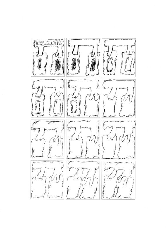 |
| Lucas Taïeb, Reconstitutions n°3, planche 2 |
 |
| Lucas Taïeb, Reconstitutions n° 3, planche 5 |
 | ||
| Lucas Taïeb, Reconstitutions n°4, planche 2 |
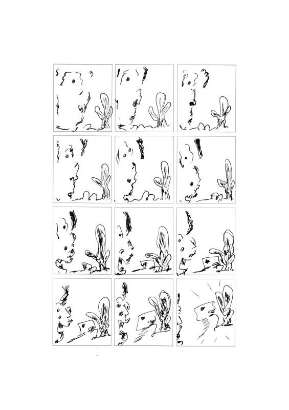 |
| Lucas Taïeb, Reconstitutions n°4, planche 5 |
Thursday, May 24, 2012
The Intercorstal on display, ft 3D Batman

The idea of a cardboard Batman costume had been floating around for a while, and by chance I was landed with the space, materials and purpose I'd need to make it. You can see from the photos, by comparing it to the door in shot, how big it is.
The insides are lined with print-outs of pages from The Intercorstal (my abstract comic) which have been cut up either into individual panels, or selections of panels. These were then pasted on according to where they'd fit, rather than through any more elaborate, conscious system. (by coincidence, I'd just finished this when Andrei posted on Facebook that Bulletproof Coffin had just used cutup techniques in one of their issues). The comics sections on the 'fists' were drawn on by hand.
Apparently the worst person to interpret a piece of art is the artist, but I'm going to stab at it anyway. I'd intended it to serve more than one purpose. One was to take the comic 'off the page' somehow. Another was to force myself and/or the audience to question and compare 'traditional' comic (i.e. Batman) with the work I've been doing. It was also intended to be viewed as a 'ceremonial' item, that could be used in some kind of ritual attached to the 'world' of The Intercorstal.
I've written a seperate post about the show itself on my blog and have also created a facebook album of photos from the rest of the show, if you're interested.
If any of you happen to be in the area, Heads Up is on in the old Barclays Building, end of Chelmsford high street, closing on May 27th

Sunday, May 20, 2012
"sond" / two frames of maybe 16

The time I was in a show with Maurice Sendak

If you look to the bottom right of the picture, you will the the original art for all eight pages of my piece, "Expedition to the Interior." If you look right around the corner from it and a foot or so up, there are several illustrations of Wild Things by Mr. Sendak. This was in the NeoIntegrity Show at MoCCA in 2010. Richard Hahn and Mark Badger also had abstract comics in it (not to mention Peter Halley). I wish I knew whether Mr. Sendak saw our works, and what he thought of them.
Higglety pigglety pop.
Thursday, May 10, 2012
1981 abstract/experimental comics by Manfred Sommer
Friend-of-the-blog Alvaro Pons (Check out his website: http://www.lacarceldepapel.com/) writes: "I've found these pages from an old spanish comics magazine of 1981, Comix Internacional (#10, 1981, Toutain Editor). It's a narrative experiment signed by Manfred Sommer, a classical spanish author, famous for his series Frank Cappa. Sommer left the comics at the end of the 80's, with a succesful career as a painter until he died in 2007. http://manfredsommer.


Tuesday, May 8, 2012
Susan Sontag on the novel in 1965, and comics today
This rant might belong here as much as anywhere else.
In a recent discussion (on the comics scholars list) of an article on Dan Clowes, someone objected to the writer's claim that "in fact, [Clowes'] art has gotten so serious that his work is now in a museum."
Now, I'll be the first to say that that is, indeed, a totally fatuous
sentence. But in reply to my interlocutor's questioning of how
contemporary gallery art can be considered "serious," I first gave the
rather wise-ass reply, "They mean 'by comparison with comics.'
Then it all makes sense." After a few more ripostes, I felt I had to
explain myself: "I am, admittedly, feeling rather cynical about our
chosen medium
of interest these days, but maybe that's a discussion for another time.
Read Susan Sontag on the situation of the novel in 'Against
Interpretation' (the book, not the essay). That's about where we are
now with comics, and I thought we'd be well further than that."
Since
I guessed I might be called to account on this, I went looking for the
book and the passages I was thinking about. Here is Sontag writing about the situation of the
avant-garde in the various arts circa 1965:
Compared with music and painting, the novel, like the cinema, lags well to the rear of the battlefield. A body of 'difficult' novels comparable to Abstract Expressionist painting and musique concrete has not overrun the territory of critically respectable fiction. On the contrary, most of the novel's few brave ventures to the front line of modernism get marooned there. After a few years they seem merely idiosyncratic, for no troops follow the brave CO and back him up. Novels which, in the order of difficulty and of merit, are comparable to the music of Gian-Carlo Menotti and the painting of Bernard Buffet, are garnished with the highest critical acclaim. The ease of access and lack of rigor that causes embarrassment in music and painting are no embarrassment in the novel, which remains intransigently arriere-garde....Every art form works with some implicit standard of what is elevated and what is vulgar--except the novel. It could accommodate any level of language, any plot, any ideas, any information. And this, of course, was its eventual undoing as a serious art form. Sooner or later discriminating readers could no longer be expected to become interested in one more leisurely 'story,' in half a dozen more private lives laid open for their inspection.... While music and the plastic arts and poetry painfully dug themselves out of the inadequate dogmas of 19th century 'realism,' by a passionate commitment to the idea of progress in art and a hectic quest for new idioms and new materials, the novel has proved unable to assimilate whatever of genuine quality and spiritual ambition has been performed in its name in the 20th century...[I]t is hard not to conclude that what the novel has lacked, and what it must have if it is to continue as a generally (as opposed to sporadically) serious art form, is any sustained distance from its 19th century premises....This coming-of-age of the novel will entail a commitment to all sorts of questionable notions, like the idea of a 'progress' in the arts and the definitely aggressive ideology expressed in the metaphor of the avant-garde... But the price must be paid...For until we have a continuous serious 'modern' tradition of the novel, venturesome novelists will work in a vacuum... We shall continue to have monstrous hulks, like abandoned tanks, lying about in the landscape. An example, perhaps the greatest example, is Finnegans Wake--still largely unread and unreadable, left to the care of academic exegetes who may decipher the book for us, but cannot tell us why it should be read or what we can learn from it. (pp. 101-104)
I
guess I began thinking of this from seeing, in recent days, a few
examples of recent work in comics praised to high-heaven, work that
seemed so mediocre to me--that could only dream of being on the level of
Buffet or Menotti--as to feel the various encomiasts and I were coming
from different planets. Sontag's mention of Finnegans Wake makes me think of Martin Vaughn-James' The Cage,
equally abandoned, lying about in the landscape of today's comics (and,
if you've read it, you'll see that the book already contains that
metaphor, perhaps as its guiding metaphor). I guess I dream of a
landscape where something like The Cage finally
fully makes sense. But we are even further away from a cultural
climate where the myths of progress in the arts, etc, (which Sontag
clearly knew were myths) have any power, so I don't see how such a
landscape could ever come about. (In the afterword to the late '90s--I
can't find an exact date--edition of the book, Sontag speaks of a time
when "the modern was still a vibrant idea... before the capitulations
embodied in the idea of the 'post-modern.'" Maybe, from the other side
of that capitulation, we can't find our way back to that vibrancy--but
that's a tragedy.)
In the meantime, I'm tired of having to make do with half-measures. I'm tired of well-told stories, of being "expected
to become interested in one more leisurely 'story,' in half a dozen
more private lives laid open for [my] inspection." If that's what you
like, fine, there's a lot more work that can be done in that direction.
But I would like to see the medium of comics be much more than what it
is. As I often say, it's the only art form I know whose potential is
immensely greater than what any single work made in it has yet
accomplished.
Sunday, May 6, 2012


Saturday, May 5, 2012

Thursday, May 3, 2012

Wednesday, May 2, 2012


Sunday, April 29, 2012

Saturday, April 28, 2012


Thursday, April 26, 2012
My introduction to "Party Crashers" exhibition, Arlington Arts Center, Nov. 2010-Jan. 2011
This is my introduction to the catalogue for Party Crashers: Comic Book Culture Invades the Art World,
an exhibition at the Arlington Arts Center in Arlington, VA, in
November 2010-January 2011, curated by Jeffry Cudlin. If you know my
earlier writings you may find it a tad repetitive (I'm making some
points that I've made, for example, in my article on original art for
IJOCA and in some posts on this very blog), but I tried here to give a
synthetic view, aimed at a wider public, of the situation of art comics
at the time (and still now, I think). I'm posting it here because I
just saw the announcement for yet another show on "real art" influenced by comics, which largely repeats the rhetoric of the High and Low and Comic Abstraction shows I mention in my first paragraph. I thought we were beyond that point, by now...
I should add that Party Crashers included a section specifically labeled "Abstract Comics," featuring my work and that of Warren Craghead, Rosaire Appel, Blaise Larmée and Derik Badman.
I should add that Party Crashers included a section specifically labeled "Abstract Comics," featuring my work and that of Warren Craghead, Rosaire Appel, Blaise Larmée and Derik Badman.
PARTY CRASHERS: IntroductionAdditionally, when I first wrote the text, I added a few paragraphs on individual artists (including some members of this blog), paragraphs which had to be excised for reasons of space. Here they are seeing the light of print for the very first time:
While the display of comics, either in printed form or in their prior incarnation as original art, on gallery walls is not a recent development (the earliest show I know of is Bande Desssinée et Figuration Narrative at the Louvre, in 1967), the last half decade or so has seen a definite rise in the acceptance of the comics medium in the institutions of the art world. Exhibitions such as Masters of American Comics (2005-2006), Out of Sequence: Underrepresented Voices in American Comics (2008-2009), or the tireless activity of the Museum of Comics and Cartoon Art in New York have highlighted comics as a visual medium in its own right, worthy of the kind of close attention usually devoted to painting or sculpture. The situation, in North America at least, is very different from what it was as recently as two decades ago at the time of the Museum of Modern Art’s High and Low exhibition of 1990. That show included comic books and strips primarily based on their value as inspiration to artists more acceptable to the fine arts establishment such as Joan Miró or Roy Lichtenstein. (This gesture, strangely, was reprised in the same museum’s Comic Abstraction show of 2007, which felt very retardataire as a result.) Despite some lingering resistance, comics and paintings now can stand side by side as equally worthy varieties of visual art, without the kind of hierarchization that had long cast the sequential medium to the bottom of the pile (and whose reverberation can still be felt, for example, in the meager to non-existent holdings of comic art in most major museum collections).
This situation is the result of a number of evolutions, a number of stories. One of these stories has been the rise of curators conversant in detail with the history of the art form, and who have believed in it strongly enough to overcome institutional prejudices and inertia. However, resistance was sometimes also felt on the part of comic artists and cartoonists themselves, reluctant to throw in their lot with a world whose perceived elitism was often seen as inimical to the populism of the comics medium. Such resistance was largely overcome through generational transformation. While the first wave of comic-book artists (not to mention the several generations of comic-strip creators that preceded them) were largely self-taught, by the 1950s many of the artists associated with EC comics, for example, were graduates of college-level illustration programs; however, those programs still provided primarily vocational training that in its insistence on craft distinguished itself from the more theoretically-involved education in “purer” programs such as painting and sculpture. An important breakthrough was the rise of artists coming from art-school fine-art programs, artists trained in the complexities of recent critical theories and unafraid to combine the medium of comics with the sensibility of contemporary art. Most important in this respect has been the work of Gary Panter, perhaps the single most significant figure in bridging the comics/gallery-world gap. While Panter was working in both worlds as early as the 1970s, his influence was felt primarily through the followers he belatedly acquired in the late 1990s and 2000s, from the Fort Thunder and Paper Rad groups to artists such as John Hankiewicz, Kevin Huizenga and a number of abstract-comics creators, all of whom helped found and develop the art-comics movement.
Art comics—comics with the sensibility of, or with full awareness of contemporary developments in, the art world—arose in part as a response to an earlier attempt at the legitimization of the medium of comics, an attempt that involved the critical over-exacerbation of the textual and consequently a certain repression of the visual. I am referring, of course, to the tendency to value comics as literature, tendency which had its greatest success in the creation of the graphic novel format and its acceptance in bookstores as well as in the weekly book-review sections of major newspapers. This development is still very much with us, as evidenced, for example, by back cover blurbs for many alternative comics that often seem to know no higher praise than “literary”. The tendency has been particularly marked as comics have gained acceptance as objects of academic analysis, and especially as such analysis has been carried out mostly in English, literature, and cultural studies departments. The beginnings of academic acceptance coincided with the moment of fame of star writers, such as Alan Moore and Neil Gaiman, whose work lent itself ideally to complex literary or symbolic analysis. Alan Moore’s scripts especially are legendary, demanding a greater wealth of detail than any poor illustrator could ever render; the art’s role in such instances—one can think for example of Watchmen—was to obediently depict the writer’s creations, then get out of the way. Clearness was the most important value; verbal—or illustrative—meaning was all, and the image was barely sufficient before such a wealth of meaning, its quality as graphic inscription actively denied.
A similar situation developed at the same time—the 1980s and ‘90s—in the context of the alternative comics community’s attempts at mainstream acceptance: As graphic novels were promoted as valid alternatives to traditional literature, “good storytelling” was seen as the primary goal of sequential art, and the quality of the art was judged almost exclusively on the way it reflects or enhances the narrative. This ideology had strong effects upon the autobiographical cartoonists of the period. To give you just two examples: Joe Matt, in a panel from a 1989 strip in which he showed himself tortured over his drawing style, repeated the mantra: “But I’ve got to draw minimally to serve the storytelling! The writing always comes before the art!” In Lowlife #1, from 1991, Ed Brubaker showed that he had internalized this new orthodoxy: “I’ve always felt that the writing was far more important than the artwork…As long as the art supports the story…”
It was against such a repression of the visual by the verbal, against the reduction of comic art to purely subservient illustration, that Gary Panter and his art comics followers reacted. The graphic trace was liberated from a requirement for timid, unobtrusive representationality; narrative sequentiality resulted no longer primarily from just the script, but as much from the formal enchainment of the panels; and story arose as much from the act of drawing as the other way around. In the process, the aesthetic qualities foregrounded by the new movement were revealed (as often happens with experimental developments in any art) to have already been present in earlier pieces: Jack Kirby’s superheroes or George Herriman’s Kat and Mouse could be seen to be as much embodied out of brushstrokes, and to inhabit as rigorously modernist a space, as any figure by Picasso or de Kooning.
If not noticeable before (though, for many of us, it was), this recasting of comic art as visually potent above and beyond its illustrative powers was made clear in shows such as Masters of American Comics. As any visitor to the exhibition could feel, the simple experience of having to confront a comic—and especially a piece of original art—on a museum wall completely changed the paradigm for how one approaches a comic strip or comic book, how one pays attention to it, and what kind of aesthetic satisfaction one gets out of it. When hung on a wall, a comic page’s very temporality changes: it lasts before one’s eyes; it cannot be flipped to go on with the story or to move on to the next gag. It therefore transforms the viewer’s attention from one that scans the art for easily digestible, sequenced nuggets of narrative information to the presence of the ink marks, the inescapable quality of the page as object, the materiality of what might have previously been taken as a simply disembodied visual-verbal text. In the act of confronting the unmoving work in a gallery space, our approach to the comic’s sequentiality is also transformed. Rather than following it from top right to bottom left in the prescribed direction of reading, we tend to approach it more with the perpendicular gaze of a viewer looking at a painting, focusing on the center panel first perhaps, but in any case taking in at a glance the page’s layout prior to scanning it for the storyline, and considering it as a unified but complex composition, one that subsumes the diagonal directionality of reading but is not limited to it.
In its very title, Party Crashers: Comic Culture Invades the Art World is a witness to these transformations, as well as an active participant in them. In her or his own way, each of the artists included in these two sister exhibitions has responded to the developments I have mentioned, and to the two movements of legitimation of comics—first as literature, then as art. Together, they offer a panorama of the possibilities available—to sequential art, but also to the art world in general—after the advent of art comics, after the legitimation of the comics medium as visual art. Despite all the powerful work on exhibit, this is only a beginning, and a very recent one at that. What next? Now that comic culture has invaded the art world, how will each of them be transformed? Stay tuned.
... each of the artists included have responded to the developments I have mentioned, and to the two movements of legitimation of comics—first as literature, then as art. Discussing every single one of them here would be tedious, but I would like to address at least those with whose work I’m best acquainted, so as to suggest the wide variety of approaches on view.
Warren Craghead has forged in his comics an innovative mixture of drawing and poetry, filtered through the sensibilities of installation and conceptual art. His books Jefferson Forest and Thickets form a a pointilistic vocabulary in which drawn objects—a window, a door, a garden hose—are rendered equivalent to the written words that inhabit the space of the same page; words and images come together to form one of the most moving, and dare I say optimistic, renderings of American suburbia as pastoral dream. Craghead used much of the same technique, in this case recast into the space of analytic Cubism, to re-tell the life of the poet Guillaume Apollinaire in How to Be Everywhere, which must be considered one of the masterpieces of the graphic novel form of the last decade.
Rosaire Appel comes more from the world of visual poetry and experimental writing than that of comics, yet has fashioned an almost purely visual approach to sequential art. In her abstract comics, digitally transformed shapes enact obscure dramas that are just below the threshold of representation, leading the viewer through the piece not based on a pre-existing narrative, but on the strength of their mystery.
Joshua Cotter has created both more traditional, narrative pieces—such as his series Skyscrapers of the Midwest, which acknowledged comics conventions through its anthropomorphic protagonists—and experimental work, particularly his graphic novel (if that is still the right word), Driven by Lemons. In that extraordinary comic, the art fluctuates continuously between cartoony representation and pure abstraction to create a picture of mental torment and disequilibrium—as experienced by Cotter’s bunny-shaped protagonist—worthy of a Bergman movie, if only Bergman had dabbled in funny-animal art.
Blaise Larmée brings an awareness fully informed by the current discourse of the art world (as can also be seen in the deadpan commentaries he posts on his blog, Co-Mix) to the depiction of belated teenage and early-twenties angst; if Marcel Duchamp had drawn emo comics, this may very well be what they would have looked like.
Cover to "Epic"

Normally with this type of project, where I overlay an existing image to work on, I use the stickers as the panels, but for this I'm working panels into the image -- this page has two panels, running veritcally from the top, but other pages in the book have a far more complicated panle layout. I'll post new pages as they get finished.
Sunday, April 22, 2012
artwork by Yuichi Yokoyama

"This is the artwork Yokoyama created in the exhibition "'I am drawing the Time.' by Yuichi Yokoyama, all archive of Neo-Manga" at Kawasaki City Mueum, right in front of the audience. The base of this artwork is from the proof copy for his book "BBF (Baby Boom Final)" which comes with this artwork and Yokoyama added lines, pasted pieces or draw characters on each sheet. He has create 100 patterns of this series as a total. Each artwork is unique and shows his fantastic world of creation to us."
His books of experimental manga include New Engineering, Travel, NIWA/Garden, Outdoor and Baby Boom. Author page at his US publisher Picturebox. Derik Badman's reviews of Travel & Color Engineering (1/3 of the way down).
Thursday, April 19, 2012


Wednesday, April 18, 2012
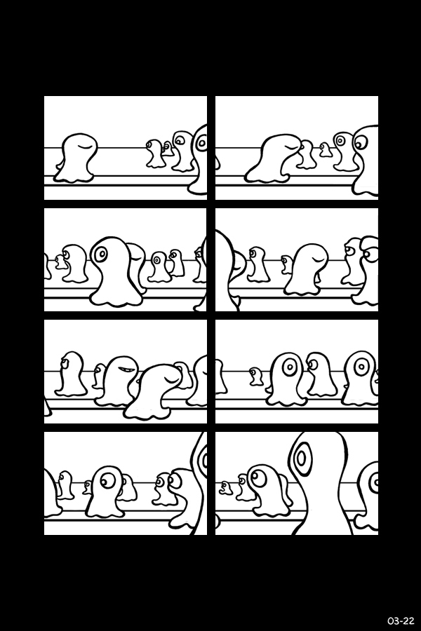
Sunday, April 15, 2012
Kron's Tensor Analysis


A few days ago I got in the mail a package from England that was supposed to contain an out-of-print book of German Romantic literature that I had ordered. Didn't turn out that way. Instead, the package contained a volume titled Gabriel Kron and Systems Theory, edited by H.H. Happ (Schenectady, NY: Union College Press, 1973), the proceedings of a 1969 memorial symposium dedicated to the life and work of Gabriel Kron (1901-1968). I fully expected that I would have to mail this tome back to the U.K., but, after apprising the seller of their mistake, they let me know that unfortunately they did not have in stock the book I had ordered so they would refund my money--and, by the way, I could keep the book they had sent me as their complimentary gift. Well, fancy that! Now, as I know, or care, little about systems engineering (let alone the late 1960s configuration thereof), I could either recycle the book, try to resell it (not that, I imagined, there would be all that many takers)--or adopt it, as it were, and thereafter do the only logical thing, which was to illuminate it. Here is the first result of my efforts, an entire essay decorated over the last couple of days. Consider it my very belated memorial to Dr. Kron, of whom I never would have heard had it not been for this contretemps. The entire book will follow, after which I may even try to read bits of it and find out more about who Dr. Kron actually was.
(Note: the book was slightly bigger than my scanner, so some of the edges of the pages unfortunately are cut off.)
Saturday, April 14, 2012
My Life in Records Kickstarter Project
I know this isn't abstract comics, but if any of you are interested in
finding out more about my non-abstract work, you should check out my
latest book on Kickstarter:
My Life in Records is a comic book series that tells the story of three brothers who are obsessed with music. Into My Heart
is the second issue of the series and begins with Tom’s brush with
death in a swimming pool. This experience combined with a kiddie gospel
record gets Tom asking lots of questions.
For instance:
What is the difference between the Holy Ghost and Scary Ghosts?
And:
Does Jesus stick out of people if He comes to live inside the heart of a person who is shorter than Him?
If you contribute to this project, you will have your name printed in the back of the book. For a little extra, there are lots more goodies like original artwork, silk screened prints and other comic books by me.
"One of the things instantly recognizable about My Life In Records is that it captures, in visual language, the magical crackle and pop of a vinyl record being played. There are also some early snippets of song lyrics, those types of generational songs that define us. So, for all those people who say that music doesn’t work well in comics, this one proves them wrong. Thomas displays the lively colorful reds of guitar strings humming, and builds a tale about childhood memories, music, art, and pop culture like Sesame Street being the ephemeral soundtrack to a person’s life." Poopsheet Foundation
So what are you waiting for? Be part of this project!"It’s always a little tricky to pull off music in comics, but I think Grant nailed it here." Optical Sloth
Tuesday, April 10, 2012
Carousel Magazine four-panel strip
My (very silly) first four-panel strip (ever!), for the Canadian
literary magazine Carousel, has just been posted online a few months
after appearing in the print version. It's currently at the top of this page. (The second installment will be a bit more serious...) Also scroll down for a comic by fellow AC Blog member Derik Badman.
EDIT: I see there's a direct link too.
EDIT: I see there's a direct link too.
Monday, April 9, 2012

Saturday, April 7, 2012


Friday, April 6, 2012


Thursday, April 5, 2012
We all go down
I just bought 4 mainly abstract minicomics from Belgium, published under
the name We All Go Down. There are 13 of them, each one drawn by a
different artist that remains anonymus (though I am sure I know who did
number 12), "under the same obscure restriction", as they wrote on
their site (in french, my translation).
http://weallgodown.tumblr.com/wagd
They can be ordered and paid with Paypal, are quite cheap and worth a look, though on the site only the covers are shown. I have the last four, and quite liked number 10 and 12.
http://weallgodown.tumblr.com/wagd
They can be ordered and paid with Paypal, are quite cheap and worth a look, though on the site only the covers are shown. I have the last four, and quite liked number 10 and 12.
Sunday, April 1, 2012
Kirby slash
A stroll through art history with the King.
Kirby/tomb slab of K'inich Janaab' Pakal:

Kirby/Giovanni Battista Gaulli:

Kirby/Giovanni Battista Piranesi:

Kirby/John Martin:

Kirby/Pablo Picasso:

Kirby/Lyubov Popova:

Kirby/Aleksandr Rodchenko:

Kirby/Hannah Hoch:

Kirby/Jackson Pollock:

Kirby/Franz Kline 1:

Kirby/Franz Kline 2:

Kirby/Roy Lichtenstein 1:

Kirby/Roy Lichtenstein 2:

Kirby/Roy Lichtenstein 3:

Kirby/Hubble:

Sunday, March 25, 2012

Saturday, March 24, 2012
Abstract comic by a student of Brandl's

As I wrote below, I have some new Abstract and Gallery Comics from the Art Academy of Liechtenstein Foundation Course class students who study with me (Mark Staff Brandl). I'll put a few up directly as there was only a link before.
This one is by Rebecca Ospelt.
Abstract Photo Comics by James Mahan: The Darkness


Tuesday, March 20, 2012
David Greenberger Tuesday (Secret Origins edition, part II: Dogs)
All drawings from 1977
 "Dog Movie"
 "Dog Geometry"
 "After Gainsborough's White Dogs"
 "Dog Movie"
 "Dog Geometry"
 "After Gainsborough's White Dogs"
Wednesday, March 14, 2012

Tuesday, March 13, 2012
David Greenberger Tuesday!
 "Air Running Backwards"
 "Before the Invention of Color"
 "Surprise to the Minus, Surprise to the Plus"
No theme this week, I just liked how these three looked together.
Abstract and Gallery Comics by one of my art classes in Liechtenstein
Here are some new Abstract and Gallery Comics from the Art Academy of
Liechtenstein Foundation Course class who study with me (Mark Staff
Brandl). You have to scroll through to find one type or the other as
they are mixed together.
Link: http://gallerycomics.blogspot.com/2012/03/abstract-and-gallery-comics-from.html
Link: http://gallerycomics.blogspot.com/2012/03/abstract-and-gallery-comics-from.html
"Taking Advice From Bryan Lee O'Malley"

The advice referenced in the title is this, which O'Malley posted on Twitter in February:
"rules are made to be broken, but 1 full body, 1 closeup, 1 wide shot w/ a background is a good rule of thumb per page.
I'm not sure whether I followed the advice or not, but I am pretty happy with the movement up through the page as well as inside each panel, and the paint's worked pretty well with my usual ink work.
Saturday, March 10, 2012
R.I.P. Jean Giraud, a.k.a. Moebius, 1938-2012


Two more from Chaos, 1991. I scanned them at the same time as I did this earlier piece, not knowing that I would be using them for his obit. I wanted to use a piece by Moebius in the anthology, and from what I heard he was quite willing, but we were never able to reach a deal financially with his management. In any case, among all his other achievements, about which you can read many other places on the web today, he was also a pioneer of abstract comics. I wish we could have acknowledged him as such by including him in the book alongside Crumb, Moscoso, Bill Shut, and all the other early experimenters in the form.
Here is another post about Moebius and abstraction.
Oh, and here is a good soundtrack for his comics:
And a documentary, with soundtrack by Karl Bartos (ex-Kraftwerk):
Thursday, March 8, 2012


Wednesday, March 7, 2012
Seizure
 An animation of this six page comic.
The original comic was an experiment in exploring several ideas.
Breaking up and spreading out the elements of a comic over several pages.Seeing if people would use these elements to create narrative.How viewing these pages on the Internet would effect how people viewed these images.I wondered whether looking at the images would create any visual illusions or patterns.
Tuesday, March 6, 2012
David Greenberger Tuesday! (Word space edition)
 "The Moon Is Covered By the Sky (Walter Kieran 1895-1987)"
 "How Maps Are Made"
 "75% Erie, 25% Spaghetti"
Sorry for not doing a David Greenberger Tuesday last week--I got really busy. I'll try not to let it happen too often.
The Intercorstal Page 59

Sunday, March 4, 2012
"just because" (digital print)

Abstract Photo Comics by James Mahan


Tuesday, February 28, 2012
Peter Schwenger's new article in Horror Studies on abstract comics
Peter Schwenger writes on "Abstract Comics and the Decomposition of Horror" in the most recent issue of Horror Studies (vol. 2 no. 2, 2011), in which he discusses my and Alexey Sokolin's pieces in the Ab Cmx Anthology, as well as Henrik Rehr's Rejkjavik, part of which was also published in the anthology. The magazine's website is here,
but I see they haven't yet updated to the new issue. In case you're an
academic, I should warn you the journal is unfortunately not on JSTOR
(unless I'm completely clueless at searching), but you may want to see
if your school library is subscribed to it. (Or, you know, contact
me...)
Schwenger's article adds to the growing mass of articles on our favorite subject here. In the last few months (and I don't really know which came first!) there have also been Jan Baetens' article in Substance, a chapter on abstract comics (not to mention further discussion throughout the book) in Thierry Groensteen's new book, and my own article on abstract comics and Ditko's Spider-Man in Randy Duncan and Matt Smith's new collection, Critical Approaches to Comics. I agree with some more than others (ahem...), but I love Schwenger's approach and his conclusions. I'll try to blog about them in more detail soon.
Schwenger's article adds to the growing mass of articles on our favorite subject here. In the last few months (and I don't really know which came first!) there have also been Jan Baetens' article in Substance, a chapter on abstract comics (not to mention further discussion throughout the book) in Thierry Groensteen's new book, and my own article on abstract comics and Ditko's Spider-Man in Randy Duncan and Matt Smith's new collection, Critical Approaches to Comics. I agree with some more than others (ahem...), but I love Schwenger's approach and his conclusions. I'll try to blog about them in more detail soon.
Friday, February 24, 2012


Thursday, February 23, 2012
Moebius, from "Chaos," 1991


Drawn/painted 1989. Described in the back matter as a "non-figurative" story.

Wednesday, February 22, 2012

Tuesday, February 21, 2012
David Greenberger Tuesday (color-coordinated album edition)
 "Real Gone"
 "Big Time"
 "To Bring You My Love"
See if you can figure out the letter code!
Monday, February 20, 2012

Sunday, February 19, 2012
Aquamorphoses, by Christophe Macquet
Hello,
Not really comics, not really abstract, but tending in both directions. Christophe Macquet has a book named Aquamorphoses consisting of a sequence of photographs of a water fountain, more precisely of the water itself taking quite amazing forms that only a camera can make aparent, since the falling water moves too quickly for the naked human eye. The book can be ordered and previewed here:
http://fr.blurb.com/bookstore/detail/2410987
Being print on demand, the price is unfortunately very high, but it is worth a look.
Saturday, February 18, 2012
AC Film Festival: voyage into the Mandelbrot set
Many of you are familiar with the Mandelbrot set, I imagine. For those who are not, though, a couple of words: the set is the plotting of an iterative equation that results in a graph with the quality of self-similarity at different levels of magnification. What this means is that, no matter how close you get to it, no matter how small a portion of the plane you choose to study, it will maintain the same level of complexity. What this means is that, essentially, you can "zoom in" on it forever, and it will never resolve into simple homogenous areas. This video claims to be the deepest "zoom" into it yet.
I recommend viewing it in full screen mode (and preferably with the sound off, because, really, the chosen soundtrack adds nothing to the experience), getting really close to your screen so that it occupies all or most of your field of vision, and staring fixedly at the center of it for the duration of the clip. Trippy!
(found via Jim Woodring's Facebook page)
PS--also found via Jim, this neat, though more "representational" (of what?) variation:
Thursday, February 16, 2012
The Intercorstal Page 58

Here's Page 58 of The Intercorstal. I was having a really hard time
deciding where to add ink to next -- after a while I realsied that I was
having a hard time because it was pretty much finished (adding the
borders to the panels highlighted a couple of extra areas which needed
work, but not much).
The idea of repeating a shape each panel was inspired by a page from The Sandman: The Kindly Ones.
Nema komentara:
Objavi komentar