
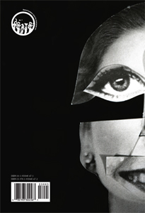
Kako se suvremeni umjetnici i dizajneri koriste časopisom/magazinom/zinom kao eksperimentalnim prostorom? MoMA izlože časopise iz kolekcije svoje knjižnice. Fantastičan pregled (s linkovima na same časopise).

| Throughout
the twentieth century, innovations in international
avant-garde visual arts and design were often first expressed in the
informal context of a magazine or journal. This exhibition,
drawn from the holdings of The Museum of Modern Art
Library, follows this practice into the twenty-first
century, exploring the various ways in which contemporary
artists and designers use the magazine as an
experimental space. The works on view, all published since 2000, represent a broad array of international titles—from community newspapers to image- only photography magazines to conceptual design projects. These publications illustrate a diverse range of image-making, editing, design, printing, and distribution practices. There are connections to the past lineage of artists’ magazines and the little architecture and design magazines of the twentieth century, as well as unique applications of new image-editing and printing methods. Assembled here, these contemporary magazines provide a firsthand view of the latest practices in art and design in print and represent MoMA Library’s sustained effort to document and collect this medium. Organized by Rachael Morrison and David Senior The documentation below is a compilation of editorial statements by the artists, designers and publishers of titles in our Library exhibition. We intend for this space to record the authors’ strategies and motives in creating these publications, and to exist as a research resource for those interested in this genre after the show has ended. |
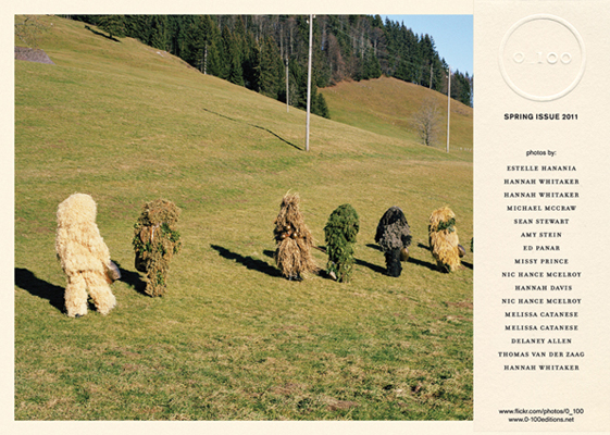 |
| 0_100, spring issue 2011 |
| 0_100 |
| 0_100 focus on contemporary photograph 0_100 is a strictly limited edition of 100 copies, each numbered 0_100 is an independent project 0_100 is out every season 0_100 is published in Milan, Italy |
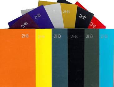 |
| 2HB |
| 2HB |
| Now in its fourth year, 2HB is a quarterly publication dedicated to creative and experimental writing in contemporary art, edited by Jamie Kenyon and Francis McKee, with Louise Shelley as Editor-at-large. A journal for experimental art writing, 2HB facilitates a discursive space for writing in contemporary art practice and creates a platform for artists, writers and theorists to realise work that might not otherwise be published. |
 |
| 2-UP, no.9, January, 2012, Doug Ashford and Chip Hughes |
| 2 -UP |
| 2-UP is a collaborative, cooperative poster
project, funded entirely by modest contributions from its members.
Comprised of 14 artists and writers, each edition of 2-UP pairs two of
its members together to produce a double-sided newsprint poster,
packaged in twos. Posters are distributed for free at 2-UP events
(poster launches, exhibitions, performances), and available as a
mail-order subscription for a small donation. The financial
independence of the project and distribution model for the posters are
meant to ensure the creative freedom of the participants and the
accessibility of the work to its audience. Central to the project is
the idea that the value of art can exist independently of money and
irrespective of rarity. |
 |
| A3 Series |
| A3 Series |
| A3 is a series of free poster-booklets that each
feature one image from what we consider some of the worlds most
interesting young photography-based visual artists. They are risograph
prints in edition of 300, measuring 29.5 x 42 cm (the european
paperformat A3). We focus on dynamic lens based art that is not subject
to rules and regulations and that does no disappear in pointless
discussions about Photoshop manipulation. |
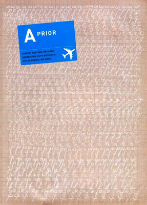 |
| A Prior, no.20 |
| A Prior |
| The publication A Prior Magazine developed — initially as A-Prior —
in 1999 out of the Brussels based artists’ collective “Etablissement
d’en Face”. From the outset, it has been the magazine’s aim to emphasize
close collaboration with artists and authors and to create unique
moments and documents, so as to bring forward the depth and breadth of
artistic practice, rather than publishing short reviews or brief
descriptive articles. The publication has continued to expand its
focus internationally, even if attention for ‘local’ artists (living
and working in the Low Countries) always remains part of its focus.
This internationalisation has in turn required an enlargement of the
editorial board. Els Roelandt is editor in Chief of A Prior Magazine since 2002. A Prior Magazine currently engages authors and curators from many parts of the world, it is based at School of Arts, Ghent (Belgium) since 2007. |
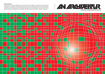 |
| An Architektur, no.23, July, 2010 |
| An Architektur – Production and Use of the Built Environment |
| An Architektur is the exercise of
discursive architectural practice. For us, both the critical
analysis of spatial relations and the visualization of their
inherent socio-political conceptions offer a possibility of
political agency. In monothematic issues, socio-political criteria
are applied to concrete examples and questions of space and
architecture. An Architektur exposes the wider social and
political implications of topics which tend to be discussed too
introspectively only within the domain of architecture as well as
their effect on and relevance to everyday life. |
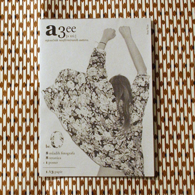 |
| aTree zine, no.0, 2009 |
| aTree zine |
| aTree is a free small-format bimonthly
magazine printed in Croatia. It promotes young and up-and-coming
artists from the filed of analog photography. The concept of the aTree
exhibition project it to display works of young photographers on a
single A3 sheet. The format symbolizes a tree that branches into various
ways of seeing the world, while the same time the publication of this
format represents different perspectives on everyday life. This is an
international project and is available to artists from all over the
world. aTree product and concept by Sara Perovic. |
 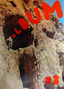  |
| ALBUM#, nos.2-4 |
| ALBUM# |
| ALBUM# is a zine made by E.Mugaas and E.Storsveen
in Oslo Norway. The zine is entirely made up of found images with
scissors, tape, xerox and staples as the only technical assistance.
Every issue is printed in a limmited edition of 200 ex. The Images are culled from books and magazines found at fleamarkets in and around Oslo, and reflect the type of popular imagery found in typical Norwegian households during the early 1960's through 2000's and beyond. Materials were sourced from books and magazines focusing on etiquette, medicine, cooking, crafts and travel. And of course, being from Scandinavia, sex education manuals (and the odd porn magazine, if lucky) is also included. Our main project is to see if it is possible to take images out of its original context and force it to say something different, preferably something a bit more radical. We try for no words. Each issue has a theme, although we do not advertise this. So far we have covered, Gender (ALBUM#1), Still life (ALBUM#2), The Lonely Man (ALBUM#3), Representations of Femininity (ALBUM#4) and The Genius of the Sleeping bag also known as On Architecture (ALBUM#5). |
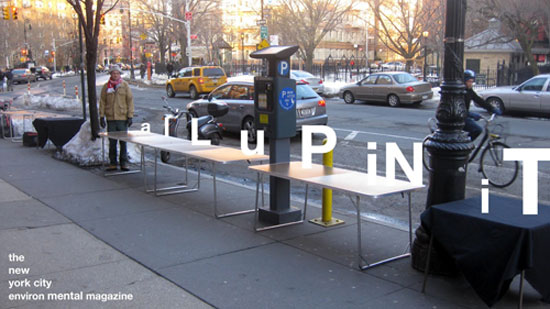 |
| aLuPiNiT Street Vendor Table, New York City |
| aLuPiNiT |
| Ours is the journey to be... ever-present. DEATH TO
THE PRESENT !!! Ours is the work of memory and ceremony... the work of
the camera, the phonograph, and the page. Ours is the work of Nature -
ALL - revealed to the senses... And ALL forms are to serve BEAUTY with
our BODIES towards a perfect THEATER. Our colors are tickled by brushes.
LIFE TO ALL THAT LIVE !!! Ours is the work of loss, the work of ghosts,
the work of fire. Of this we are sure. We are THE SONG !!! As Night’s
indifference to the star is the work of our joy. Complete... Nothing.
RELEASE !!! The grip of gravity. RELEASE !!! The grip of our flesh.
RELEASE !!! The grip of what is known. The smell of dust... so we LOVE.
For ours is the work of poetry... and the work of others... the work of
the street... and the garden.... Indeed, as spirals are to the winds and
silence is to rain, we are Cahun’s bell jar at Ghibertti’s door.... For
ours is the work of children with guns. Rafael Sånchez Kathleen White UNIFESTO Nov. 2 0 0 6 alLuPiNiT the new york city environ mental m a g a z I n e |
 |
| ANP Quarterly, no.10, 2008 |
| ANP Quarterly |
| ANPQuarterly is an arts magazine published by RVCA
that focuses on a broader sense of art and community. The idea behind
this endeavor is to make a magazine that will educate and inform
openly and without the social or financial restrictions that plague
many publications today. Our goal is not to focus on current events or
“who’s hot” but rather to bring forward people and phenomena that
deserve acknowledgment and coverage regardless of their place in time. |
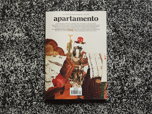 |
| Apartamento, no.7, April, 2011 |
| Apartamento |
| Apartamento first issue was released in April 2008 as a magazine interested in homes, living spaces and design solutions as opposed to houses, photo ops and design dictatorships. The magazine is a logical result of the postmaterialist mind shift. People are bored with ostentatious and uber-marketing. There is a real quest for identity in the midst of mass production and globalization, and that quest leads to what is personal, what is natural, what is real. "For too many people, being happy at home is pretty much an abstract idea, something they can’t know or imagine, until it appears on some taste maker’s must-have list, or in a magazine, or reposted on Tumblr. A home sweet home is not curated or produced by acquiring a perfect arrangement of chairs, lamps and friends. A real living space is made from living, not decorating. A bored materialist can’t understand that a house has to become a home. It happens, not through perfection but by participation." Andy & Elsa Beach Apartamento issue #07 |
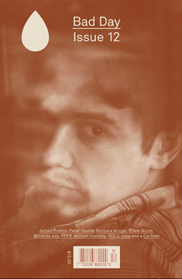 |
| Bad Day, no.12, 2011 |
| Bad Day |
| Bad Day is a new arts and cultural magazine,
focusing on direct dialogue with today’s international artists.
Disregarding boundaries between film, fashion, visual art, music, high
and low—categories that are becoming increasingly irrelevant in
understanding culture today—Bad Day showcases some of the commonalities
we all share in our routines, perspectives and working practices.
The magazine is printed in one Pantone ink on colored paper—a combination which changes with every issue. |
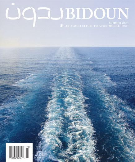 |
| Bidoun no.11, summer, 2007 |
| Bidoun |
| Bidoun Magazine is devoted to introducing new ideas
and images from the Middle East region and its diaspora. Bidoun
Projects, its umbrella organization, tends to educational and curatorial
projects around the world, including the peripatetic Bidoun Library
Project. |
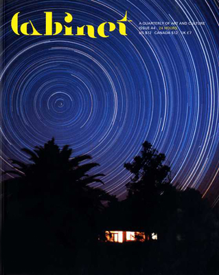 |
| Cabinet, no.44, winter, 2011/2012 |
| Cabinet |
| Founded as a non-profit in 2000, Cabinet
is an award-winning quarterly magazine of art and culture based in New
York that confounds expectations of what is typically meant by the
words “art,” “culture,” and sometimes even “magazine.” Its hybrid
sensibility merges the popular appeal of an arts periodical, the
visually engaging style of a design magazine, and the in-depth
exploration of a scholarly journal to create a sourcebook of ideas for
an eclectic international audience of readers, from artists and
designers to scientists, philosophers, and historians. Using essays,
interviews, and artist projects to present a wide range of topics in
language accessible to the non-specialist, Cabinet is designed
to encourage a new culture of curiosity, one that forms the basis both
for an ethical engagement with the world as it is and for imagining
how it might be otherwise. In an age of increasing specialization, Cabinet
looks to previous traditions of the well-rounded thinker to forge a new
type of magazine designed for the intellectually curious reader of the
future. |
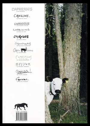 |
| Capricious, no.7, 2007 |
| Capricious |
Our mission is to provide a solid platform for the
work of emerging and underrepresented fine art photographers, thereby
helping them to gain greater visibility and career
opportunities. Swedish photographer Sophie Mörner founded Capricious Magazine in
2004. It is a biannual publication dedicated to showcasing emerging
fine art photography. Its contributors and subject matter span the
globe and it is comprised almost entirely of images. Capricious collaborates
with guest editors and chooses a new theme for each edition, so the
material is never lackluster. And while constant change is a primary Capricious trait, there are also definite common visual threads running throughout its 8-year history. Capricious has
an affinity for things like animals, androgyny, opposition, reclaimed
life, lust, natural as well as urban life, intimacy, revolution and
nostalgia. Hanna Liden, Ryan McGinley, Esther Teichmann, Nick Haymes,
Olaf Breuning, Melanie Bonajo and Skye Parrott are just a few of the dozens of photographers whose early work has been promoted by presence in Capricious. As a leading fine art photography journal, Capricious Magazine occupies
a rare and whimsical space between commercial and fashion
photography; it operates as both a tool for discovering new talent and
as an artists’ oasis.
|
 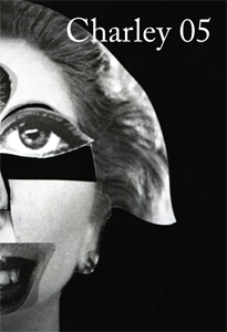 |
| Charley, no.5 |
| Charley |
| Charley is a contemporary art publication
series edited by Maurizio Cattelan, Massimiliano Gioni and Ali
Subotnick. A do-it-yourself magazine, Charley is an inclusive publication relying on assimilation, rather than on selection : Charley
is a machine for redistribution, a mechanism for spreading and
exploiting information, rumors, and communication. Like most
information, it is partial, unstable, and untrustworthy. There are no
hierarchies and no favorites in Charley : it flirts equally with celebrity and failure. Charley is a multiform creature, bound to transform with each issue. Charley
is a pre-digested combine, with pages assembled from catalogues,
brochures, press clips, postcards, and other visuals. But what is Charley really? Charley
is a new publication on emerging artists. Prominent curators, writers,
artists, and other arts professionals from around the world were asked
to suggest up to 10 up-and-coming artists and/or submit materials on
the artists for inclusion in Charley. 400 art makers from around the globe responded, and each of them is represented by one page of Charley. |
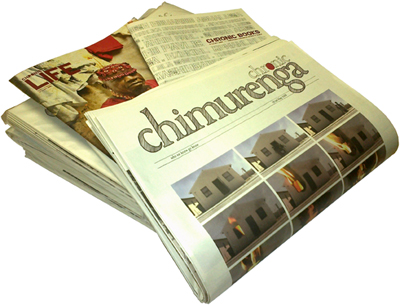 |
| Chimurenga: Chronic, v.16, October, 2011 |
| Chimurenga |
| Chimurenga
(‘Struggle for Freedom’) is a Pan-African publication of culture, art
and politics based in Cape Town. Founded by Editor Ntone Edjabe in 2002,
it provides an innovative platform for free ideas and political
reflection by Africans about Africa. Its titles include, amongst others, Music is The Weapon, Futbol, Politricks and Ostentatious Cripples, Black Gays and Mugabes, Dr Satan’s Echo Chamber (a double issue on African science fiction), The Curriculum is Everything and most recently ‘The Chimurenga Chronic‘, a once-off edition of an imaginary newspaper. The magazine has featured work by emerging as well as established voices including Njabulo Ndebele, Lesego Rampolokeng, Santu Mofokeng, Keorapetse Kgositsile, Gael Reagon, Binyavanga Wainaina, Yvonne Adhiambo Owuor, Boubacar Boris Diop, Tanure Ojaide, Dominique Malaquais, Goddy Leye, Zwelethu Mthethwa, Mahmood Mamdani, Jorge Matine, Amiri Baraka, Akin Adesokan, Ed Pavlic, Neo Muyanga, Johnny Dyani, Achal Prabhala, Olufemi Terry, Koffi Kwahule, Parselelo Kantai, Billy Kahora and Greg Tate, among others. |
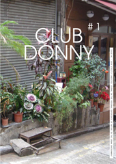 |
| Club Donny no.1, 2008 |
| Club Donny |
| CLUB DONNY is a strictly unedited journal on the
personal experience of nature in the urban environment. It was
established in 2008 by Samira Ben Laloua, Frank Bruggeman and Ernst
van der Hoeven and is published biannually. The editors invite
participants to share their personal experience on nature in cities
from all over the world. Club Donny offers a platform that aims to
bring into the limelight observations, coincidences, stories and
encounters of the obvious and sometimes endearing or absurd existence
of nature in cities. |
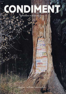 |
| Condiment, no.1, autumn/winter, 2010 |
| Condiment |
| Condiment – Adventures in Food and Form is a publication and project-base exploring the relationship between food and creativity and food and community. |
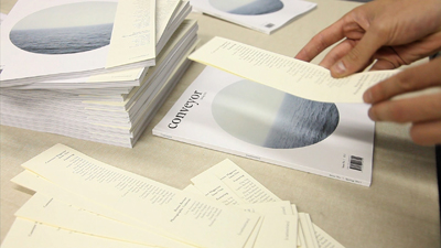 |
| Conveyor, no.1, spring, 2011 |
| Conveyor Magazine |
| Conveyor Magazine is a semi-annual publication
dedicated to eliminating the hierarchy between emerging and
established artists. The magazine includes a series of new photography
projects, interviews, articles, and essays by writers and artists who
strive to bring new ideas on photography to light. Conveyor is
devoted to all aspects of the medium, embracing digital technologies
while maintaining the unique dialogue that exists between a printed
photograph and its viewer. The publication is lovingly printed and produced in-house at Conveyor Arts. |
 |
| Copenhagen Free University, no.9, no.3, no.1, and no.4 |
| Copenhagen Free University |
| The occasional journal of the Copenhagen Free
University relating to the research developed by the community of this
self-organised institution. The Free University was an artist run
institution dedicated to the production of critical consciousness and
poetic language based in a flat in a working class district of
Copenhagen: "We do not accept the so-called new knowledge economy as the
framing understanding of knowledge. We work with forms of knowledge
that are fleeting, fluid, schizophrenic, uncompromising, subjective,
uneconomic, acapitalist, produced in the kitchen, produced when asleep
or arisen on a social excursion - collectively." The Copenhagen Free
University was active from 2001 to 2007. Contributions by Emma Hedditch,
Anthony Davies, Henriette Heise, Jakob Jakobsen, Mikkel Bolt, Simon
Sheikh, Carolyn Faber, et al |
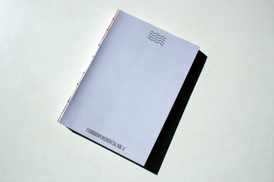 |
| Correspondencia, no.2 |
| Correspondencia |
| Correspondencia is a bi-annual literary and arts magazine published in Buenos Aires, Argentina. The concept is the double meaning of the word "correspondence": 1. Communication by exchanging letters, with someone. A printed message. 2. To have a close similarity, connection, or empathy with someone. |
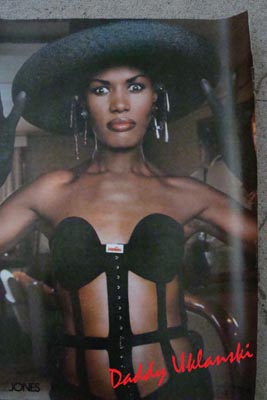 |
| Daddy no.8, 2008 |
| Daddy |
DADDY, the magazine,
was a project of Javier Peres that was active from 2007 till 2009.
DADDY was published quarterly in limited editions of 2000 and
included contributions from artists and others working in creative
fields. Each issue focused on a topic of Peres´ choosing and he built
the issue around the topic, including what was contributed by his
invited guests.
|
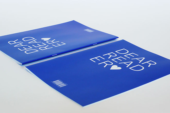 |
| Dear Reader, v.1 |
| Dear Reader |
| A collection of obsessions, oblique references and footnotes of design processes — though not necessarily texts about design. The layout is appropriately diverse and eclectic for the bandwidth of texts, layering different formats and texts, as a tongue-in-cheek reference to the design shtick of publications with different paper formats. Here we present three iconic formats in emphasized-as-fake three-dimensionality, on four different papers and more inks than you would think. Dear Reader was created partly from a primordial graphic designers’ urge to publish, and to share texts that are dear to us and as a vessel to showcase our type design work in a manner that circumvents the conventions and the visual clichés of the type specimen. |
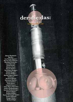 |
| der die das, issue d, winter, 2010/2011 |
| der die das |
| der:die:das: Is a mono thematic magazine based in Zurich. It draws its inspiration from objects of everyday life. Our relationship with the mundane is put to question and deconstructed through the investigation of objects, ideas and stories. The familiar is staged in an unfamiliar way while the alien in the usual is discovered. der:die:das: Is a platform where ideas can unfold, coherences be discovered and fresh viewpoints can be taken. The “thing” is portrayed in a playful way with a mixture of visual works and text-based pieces, that allow for a new perspective. Each issue is based on an object following the letters of the alphabet. der:die:das: Is published every six months in German with an English translation. It is distributed worldwide and available in selected book shops and galleries. |
 |
| Le Dictateur, no.3 |
| Le Dictateur |
| Le Dictateur is the highest
expression of the dominion of personal will: the magazine is to be
thought of as a state, a space where artists, photographers, fashion
world protagonists live together, arbitrarily selected and invited.
Some are famous, some are extremely famous, some are totally unknown:
they earned their citizenship because they have been wanted there, and
they each became dictators of their own pages. In total freedom and
lack of rules they were called to present a new or custom project for
"Le Dictateur": the result is a magazine with an extreme spirit. Le Dictateur is a proposition, not a critique: Le Dictateur is not very fond of the sophisms of those who use thought and words as alibi and not as support to action. Confrontation, dialogues can only exist after one's creative freedom has been freely expressed."Freedom of choice and movement is fundamental. For certain things—Le Dictateur affirms—democracy is useless, it actually weakens in proportion to how many people have decisional power". Therefore, to maintain the vitality of one's creation at its highest, it needs to be as personal and subjective as possible. It must not undergo the gauntlet of suggestions, hints, evaluations, amputations. Le Dictateur is a figure which has power, but also for a kind of philanthropy: people want to rebel to the authority principle, but when someone actually takes responsibilities for all the decisions, they are happier and quieter. |
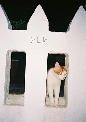 |
| F. Elk Tag and cat, Lantau Island, Hong Kong, 2008 |
| Elk |
| Elk started as a black and white
photocopied serial publication with a color cover in June 2003. There
have been 23 issues so far, usually running to about 60 pages each.
They are collections of paired-off images and a little bit of text
that relate to each other in sometimes literal and other times wholly
inscrutable ways. Picture-poems, with some words included to balance
things out. |
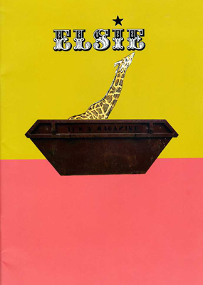 |
| Elsie, no.1 |
| Elsie |
| Elsie Magazine is new. It’s the work of one person...his name is Les Jones, he’s Welsh.
Elsie is all about design and photography, people and
culture. It’s based on a series of themes, many of which are quite
random. It’s about trying stuff out and seeing where it leads. There
is no big agenda, no fundamental message, Elsie is produced for the
sheer joy of doing something creative. Have a mooch around, kick the
tyres and if you feel the urge... |
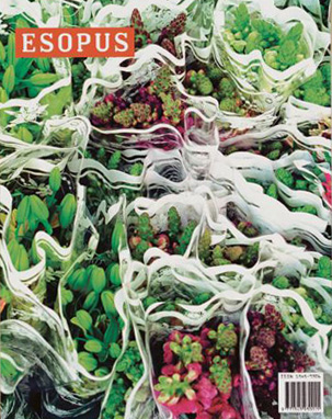 |
| Esopus, no.2, spring, 2004 |
| Esopus |
| Each issue of Esopus includes three
long-form contemporary artists’ projects—one by an established artist
(past contributors have included Richard Tuttle, Jenny Holzer, and
Robert Therrien) and two by emerging figures. Previous projects have
taken the form of removable posters, booklets, foldouts, and
hand-assembled sculptures, and have often utilized complex printing
processes, unique paper stocks, and specially formulated inks. Issues
also typically include personal reflections on various creative
disciplines by practitioners. So far, these have included film
composer Carter Burwell, choreographer Christopher Wheeldon, and
lighting designer Jennifer Tipton. among many others. Also featured in
nearly every issue is a portfolio of work by an undiscovered artist,
such as the riveting battle drawings of 13-year-old student Alex
Brown, the WWII–era gouache portraits of Holocaust survivor Samuel
Varkovitsky or the stunning mixed-media collages of the severely
autistic 24-year-old Alex Masket. Along with a sampling of short
plays, visual essays, film excerpts, poetry, and fiction by
never-before-published authors, issues contain new installments of two
regular series: “Modern Artifacts,” for which undiscovered treasures
from the Museum of Modern Art Archives are reproduced in facsimile,
and “Guarded Opinions,” which features museum guards’ commentaries on
the art they oversee. Each issue concludes with a themed audio CD, for
which musicians are invited to contribute a new song based on a
particular subject. |
 |
| The Excuse, no.6, no.5, no.7, 2010 |
| The Excuse |
| THE EXCUSE is a weekly fanzine that was
released each Tuesday over a period of three months. Each Tuesday, a
new image was chosen as the starting point and cover of the following
issue. After a thirteen-issue venture in the exhausted and exuberant world of weekly magazines, THE EXCUSE comes back occasionally as a more natural, whateverly fanzine. |
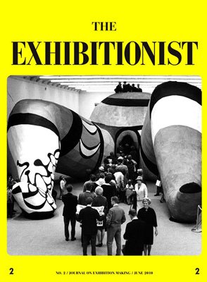 |
| The Exhibitionist, no.2, June, 2010 |
| The Exhibitionist |
| The Exhibitionist is a new journal
focusing solely on the practice of exhibition making. The objective is
to create a wider platform for the discussion of curatorial concerns,
encourage a diversification of curatorial models, and actively
contribute to the formation of a theory of curating. The journal is a publication made by curators for curators and understands itself as a site for critical debate in regards to the practice of exhibition making. The Exhibitionist will be published twice a year and will follow a strict editorial structure that revolves around the analysis and examination of past, present, and future exhibitions and other curatorial ideas. Under the title Curators' Favorites each issue will present three texts for which three curators will write a personal essay about an exhibition, contemporary or historic, that has impacted them.This will be followed by an in-depth look at a historically important exhibition in the section Back in the Day. Assessments will comprise the core of the journal. Here four curators will focus on reviewing one significant contemporary exhibition from different points of view. Typologies opens up the debate around specific exhibition formats. The section Attitude will feature a text by a member of the editorial board reflecting on the current state of exhibition making while Rear Mirror invites a curator to reflect upon an exhibition s/he has recently curated. Every fourth issue a conversation about past contributions, the content and the form of the journal between some of the past contributors will offer a forum for self-reflexivity. |
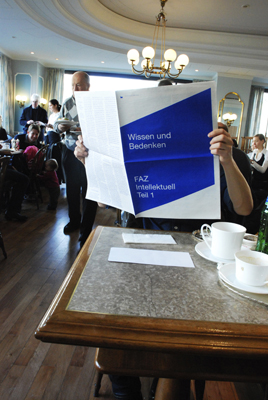 |
| Fabrikzeitung, Wissen und Bedenken, no.246 |
| Fabrikzeitung |
| Fabrikzeitung is a monthly newspaper, published
by the Zurich based cultural centre «Rote Fabrik». It is financed with
the help of the city council of Zürich and has a circulation of 3500
copies that are mainly distributed in Switzerland, the german speaking
countries and to international subscribers. The content of the issues
vary from politics, media- and cultural studies, pop-culture, arts,
theatre etc. Since 2007 the responsibility for both content and design of the newspaper lies with Gregor Huber & Ivan Sterzinger. The cultural centre «Rote Fabrik» has its roots in the leftist-movements of the early 1980s and is an important subcultural location in Zurich since then. Aware of those fundaments, the newspaper tries to avoid to apply a fixed definition of leftism in content and representation. The identity of the newspaper is constantly shifting with the various contents, editions and searches in order to find a unique critical position for each of the different topics. The concept is based on the idea of an evolving "alternative" culture, which we believe continuously needs to reflect and rework its position as well as its tactical methods. The newspaper therefore functions as a room for experiments and ongoing discourse. |
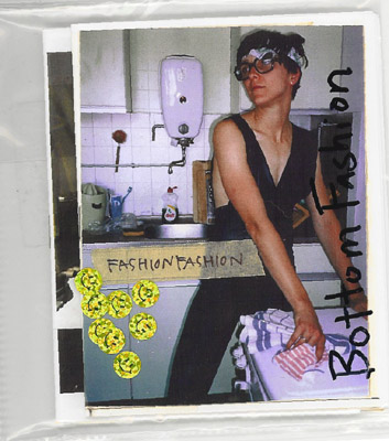 |
| Fashionfashion, no.1, 2003 |
| Fashionfashion |
| Fashionfashion is a zine made by artist K8 Hardy. |
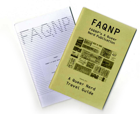 |
| FAQNP, no.2: Computer Camp and no.3: A Queer Nerd Travel Guide |
| FAQNP |
| FAQNP (FAQNP's A Queer Nerd Publication) is a
non-ironic occasional publication for queer nerds and their admirers.
The magazine is created by and for queer nerds who feel outside the
mainstreaming of queer culture. It covers the ordinary lives and
interests of queers, because the ordinary is often quite interesting.
Ray Cha is the Editor in Chief, and Erich Nagler is the Creative
Director. |
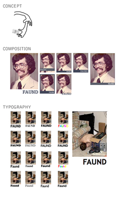 |
| Faund |
| Faund |
| Through a selection of finders presented in a printed album, Faund aims to highlight the value of internet-found images. I really just don’t think imagery should be owned, including my own. If it’s part of our world…– it’s like owning words…how can you own words? It’s stuff to use! —Baldessari |
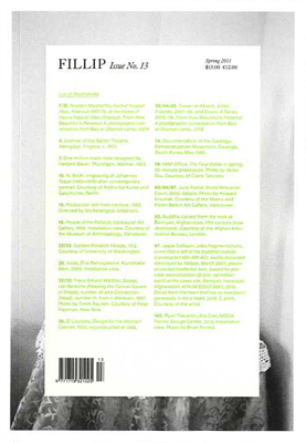 |
| Fillip, no.13, spring, 2011 |
| Fillip |
| Fillip is a publication of art, culture, and ideas
released three times a year by the Projectile Publishing Society from
Vancouver, British Columbia. |
 |
| Foerster |
| Foerster |
| I started making zines when I was 15. They’ve all been connected through auto biographical narratives using photography. |
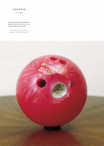 |
| Gagarin, v.11:no.1, May, 2010 |
| Gagarin |
| GAGARIN: the Artists in their Own Words is
a recent artist’s magazine (°2000), entirely dedicated to the
publication of especially written and unpublished texts by artists who
are now working, anywhere in the world. Each issue contains a
number of artists’ writings, if possible from an equal number of
countries. The texts are published in their original language and
alphabetical writing, with unabridged translations in English
added. Advertising and visual material are deliberately kept out.
In collaboration with the Research Centre for Artists’ Publications
/ Archive for small Press & Communication (ASPC) at the Neues
Museum Weserburg in Bremen (Germany), GAGARIN features a
supplementary Index of Artists’ Writings published world wide.
GAGARIN is indexed in Art Biography Modern ABM by Cambridge
Scientific Abstracts, Oxford, UK. GAGARIN is aimed at those who do not
tend to wait until everything is accepted and synthesised and those
who are prepared to leave the road to search for stimulating art
and ideas while they are still fresh. GAGARIN does not restrict
itself to a particular period or import and runs trough the codes
that are applied in the world of art. Its orientation is artistic,
documentary and historical. GAGARIN also aspires to provide an
accurate source of information about the collaborating artists,
using their own words. |
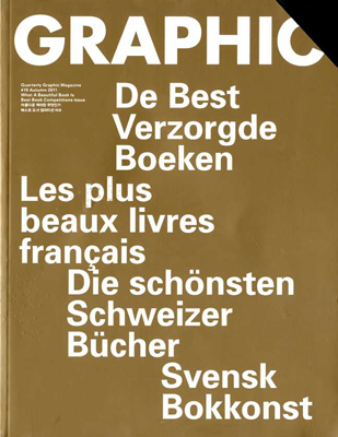 |
| Graphic, no.19, autumn, 2011 |
| Graphic |
| GRAPHIC is a quarterly magazine published in
Seoul, Korea. GRAPHIC, which was first published in January 2007,
focuses its attention on the other trends of graphic design which is
different from the mainstream of it and on the phenomena thereof. It
has a characteristic of in-depth approach for one theme with the
editorial policy of one issue-one theme. GRAPHIC is an independent magazine which does not depend upon sponsors or any governmental organizations for financial help but rather aims at more creative and independent journalism by emancipating its own editorship from them. GRAPHIC has been written and edited in Korean language from the first issue to 8th but from 9th issue, it is being issued in both Korean and English. GRAPHIC is currently being circulated in Korea and Europe, and it's expected to extend its area of circulation toward America, Asia and so on. |
 |
| The Happy Hypocrite, multiple issues |
| The Happy Hypocrite |
| The Happy Hypocrite is a bi-annual journal led by artists’ writings. Inspired and informed by avant-garde magazines such as Bananas, Documents, The Fox, Merlin and Tracks,
it includes new writing and research-based projects from artists,
writers and theorists expressing experimental ideas. The design of the
journal has a strong bias toward typography, to reflect the written
nature of the contributions, and as an element which illustrates the
diversity of the works included. |
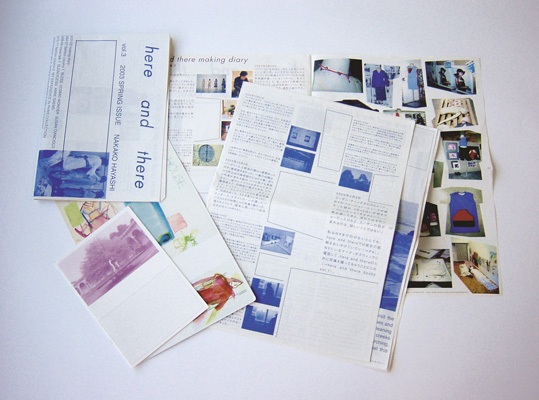 |
| Here and There, v.3, spring, 2000 |
| Here and There |
| Here and There is a documentation of my personal meetings and personal life, emotions. My spirit which longs for editorial freedom is reflected in the ever changing content and form. Especially in the first 5 issues it becomes apparent how the magazine changes all the time. Since issue #6, we try to keep the A4 format (with little interventions) and focus on its content. Here and There is made by artist Nakako Hayashi. |
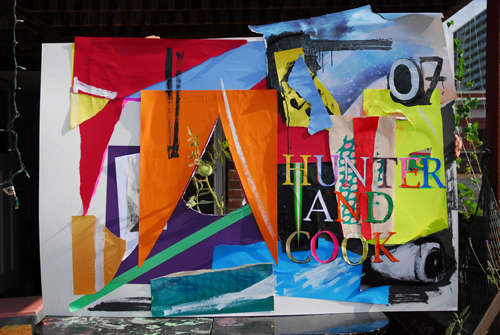 |
| Hunter and Cook, no.7 |
| Hunter and Cook |
| Hunter and Cook is a Canadian arts and culture
magazine produced by artist Jay Isaac and Tony Romano. As an artist run
magazine, our intention is to solidify and publicize like-minded
contemporary art communities in Canada, while presenting artists in an
impactful, straightforward way. In addition to curated projects made
specifically for each issue, Hunter and Cook presentsin-depth articles
and interviews with emerging and established contemporary Canadian and
international artists. |
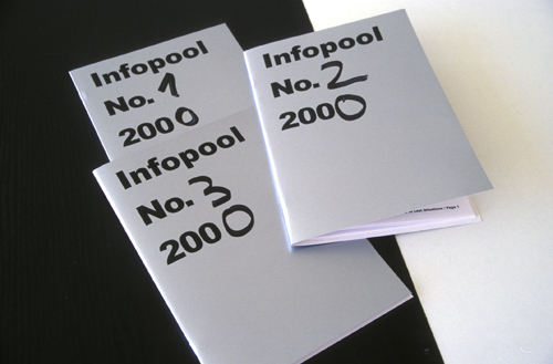 |
| Infopool, nos.1-3, 2000 |
| Infopool |
| Based in London, Infopool was a collaborative
writing, print, and Internet project established in 2000 by Jakob
Jakobsen. It follows a general commitment to self-publishing as “a
vector of activity and thought — usually fueled by
pleasure/disgust/lack,” and an investment in the wider processual and
associational properties of media across the boundaries of art and
politics. Infopool has sometimes intersected with the research,
exhibition, and social spaces in London. The pamphlets themselves are
approximately A5–size with metallic- silver covers that are uniform except for the number and date of the issue written in hand. Contributions by Howard Slater, Stewart Home, Emma Hedditch, Anthony Davies, Jakob Jakobsen, Mikkel Bolt et al |
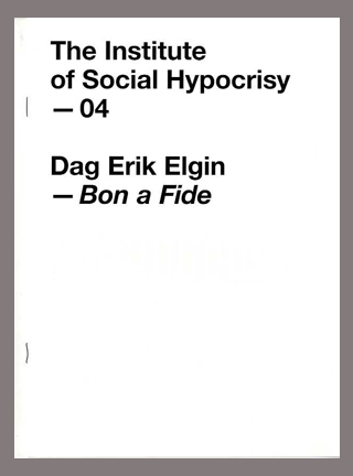 |
| The Institute of Social Hypocrisy, no.4, 2010 |
| Institute for Social Hypocrisy |
| Twice a year, The Institute of Social Hypocrisy
publishes a fanzine. These publications serve as a tool with a dual
purpose. Primarily they are a means to put out developing art projects
by a range of invited artists and contributors, throughout the
duration of the ISH project. They also play another role, and via their glossy design and print production they function as a vehicle to put the featured work and the existence of the Institute out into a new arena. To bring awareness to the project within a domain that is often restricted and to create a physical manifestation that will endure after the life of the ISH is extinguished. These fanzines are neither publications for reference, nor books of completed projects. They are a means for artists to put their work in front of new audiences in order to invite input and discussion, thus helping the project to develop. They allow the artist to take a level of control and give a certain independence with regards to the traditional scope of the distribution of their work. |
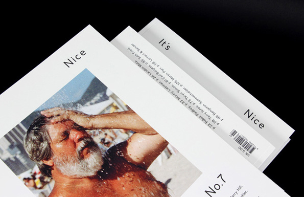 |
| It's Nice That, no.7, 2011 |
| It's Nice That |
| It's Nice That magazine is a place for informal
conversation about contemporary art, culture and design – a quarterly
collection of interviews, stories, art work and photography with and
by artists, writers and designers, both emerging and established. |
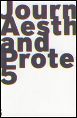 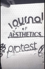 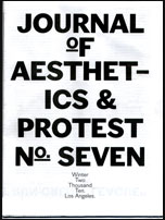 |
| Journal of Aesthetics and Protest, nos.5-7, 2007-2010 |
| Journal of Aesthetics and Protest |
| We are interested in cultural production towards
justice, equality and a more fun world. By focusing on the
intersection of fine art, media theory and anti-authoritarian
activism, we elucidate clues towards creating
liberatory culture machines. We are a collectively run project that
has been publishing since 2001. |
 |
| Journal of Radical Shimming, no.10 |
| Journal of Radical Shimming |
| The Journal of Radical Shimming is,
apart from a means of documenting "radical" histories, a tool in
print-form in which to instigate discussion on how we encounter and
define these histories; accepted, or otherwise. As well, the JRS is a
forum in which to propose simple tools to instigate possible future
histories in the making. The JRS covets immediacy, relegating dominant modes of production - such as "spell-checking," and "editing" - into the dustbins of history. The idea is to think and produce simultaneous. Transparency is key, along with an openness towards the discussion of ideas, and the reformatting of previous considerations in public. The JRS exists as friendly provocation in paper-form. The Journal of Radical Shimming finds its home in North Portland, Oregon and resides within the House to be Named in the Future. |
 |
| Junk Jet, no.5 net.heart. |
| Junk Jet |
| Junk Jet is a zine-jet started in
2007 by m-a-u-s-e-r, dealing with new media, internet art, delirious
design and anti-architecture. Released irregularly, it is an
unforeseeable work in progress. Junk Jet has a big but erratic heart,
and the same is true for its appearance. For each issue, it changes
all its design characteristics: its format, paper, layout and the
small gifts like tatoos or audio CDs.
For the current issue, N°5, the net.heart issue, Junk Jet has developed an archive impossible that transports, in print format, net based works, or fragments of works, showing collections, series, animations, applications, and reflecting anti-heart texts on the net and its new forms of art, design, and architecture. N°5 has transferred internet things from their digital space into a paper jet. |
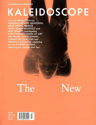 |
| Kaleidoscope, no.13, winter, 2011/2012 |
| Kaleidoscope |
| Kaleidoscope is an international quarterly of
contemporary art and culture. Distributed worldwide on a seasonal
basis, it offers a timely guide to the present (but also to the past and
possible futures) with an interdisciplinary and unconventional
approach. |
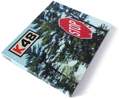 |
| K48, no.1, 2000 |
| K48 |
| K48 is a hybrid fanzine/magazine/artist's book
founded by artist Scott Hug in 1999. It covers art, music and
contemporary culture and boasts an impressive list of contributors
including both emerging and established artists, photographers,
fashion designers, musicians and writers. Each issue is accompanied by
shows and events internationally. |
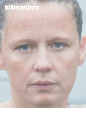 |
| Kilimanjaro, no.13 - 'A Love Letter to Roni Horn' |
| Kilimanjaro |
| “Kilimanjaro is something to be seen with” — Vogue One of Esquire’s “50 Most Influential Things In The Media”, Kilimanjaro Magazine is a vibrant printed space, dedicated to visual culture and editorial experimentation. Its carefully-curated mixture of high aesthetics and respected contributors make it unlike any other independent publication in the world; within Kilimanjaro, art, style and culture are brought together in the medium of avant-garde printed matter, ideas are presented in a unique visual language, and the expected forms of magazine publishing are disregarded, in favour of a new and innovative style. The winner of D&AD’s “Outstanding Achievement In Photography And Magazine — New Print” in 2006, Kilimanjaro is designed to appeal to a consumer whose desire for refined aesthetics is twinned with a passion for ‘art, love, and everyday life’. Featured contributors, writers and collaborators, both past and present, come from the worlds of art, fashion, culture, architecture, design and photography. |
 |
| The Kingsboro Press, no.7 |
| The Kingsboro Press |
| Publishing banner the Kingsboro Press began in New
York in 2007. Anchored by a twice-yearly journal dedicated to raw
art, literature, and thought, Kingsboro is a rigorously non-thematic,
independent project that, in the words of it's critics, "is winding
through a certain underground path..." Bibliography includes 7
complete journals, various artists' books and cassette tapes, and one
12" vinyl record. The Kingsboro Press issue 8 will be released in
Spring 2008. |
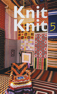 |
| Knit Knit, no.5, 2005 |
| Knit Knit |
| KnitKnit, an artist's publication dedicated to
the intersection of traditional craft and contemporary art, was
founded in 2002 by artist Sabrina Gschwandtner. KnitKnit was published
in limited editions with handmade covers that were stenciled, laser
cut, crocheted, knitted, felted, and spray painted. KnitKnit produced
exhibitions, film and video screenings, salon-style art shows, and
other kinds of events to celebrate the contents of each issue. |
 |
| Lay Flat: 02, Meta |
| Lay Flat |
| Lay Flat is an independent publisher of limited
edition photography books and multiples. Founded in 2009 by
photographer Shane Lavalette, Lay Flat works collaboratively with
emerging and established artists to produce books that both express a
vision and exist as artful objects in themselves. In addition to
artist books, Lay Flat publishes an annual magazine devoted to
contemporary photography in which each issue takes on a new theme and
format. |
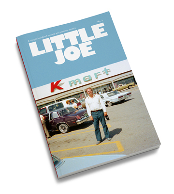 |
| Little Joe, no.3 |
| Little Joe |
| Little Joe was founded in 2010 with the aim to
produce an essential, intelligent, inspiring, community-defining
publication that provides a forum for discussions on film around
subjects of sexuality and gender within a queer historical context.
With its quality content and design, Little Joe has quickly become an
important and relevant place for stimulating and valuable discussions
on film, leading the way in queer analysis of cinema, whilst providing
a platform to celebrate films that inspire alternative discourse. The
magazine is published on a biannual basis to an expanding
international readership. Little Joe has also launched A Little Film
Club, a monthly screening programme in London with the support of Film
London's Community Pilot Fund. |
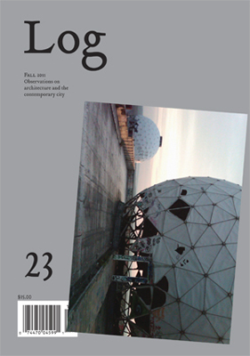 |
| Log, no.23, fall, 2011 |
| Log |
| Log is an independent journal on
architecture and the contemporary city that presents criticism and
commentary in a literary format designed to resist the seductive power
of the image in media, while identifying and elaborating the central
concerns of architectural thinking and production today. A carefully
crafted compendium of essays, interviews, and brief “observations,” Log provides
an ongoing international platform for the exchange of ideas, both
bearing on and emanating from architecture and the city, among a
curious audience of readers, including architects, designers,
students, scholars, and artists. Published three times a year, general
“open” issues are punctuated by occasional thematic issues on prescient
topics. Founded in 2003, Log is a project of the Anyone
Corporation, a non-profit organization in New York City devoted to
advancing architectural thought and writing. |
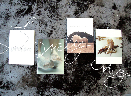 |
| Lovely Daze, issues no.1-no.4 |
| Lovely Daze |
| Lovely Daze is a curatorial journal of artist's
writings and artworks published by artist Charwei Tsai twice a year in
limited editions. The publication aspires to provide a platform for
artists to present, first hand, their writings and artworks. In addition
to the journal, Lovely Daze has produced artist's talks and
performances at museums, libraries, book stores, art fairs and
participated in numerous exhibitions world-wide. |
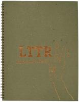  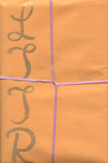 |
| LTTR, issues no.5, no.4, and no.3 |
| LTTR |
| LTTR is an annual independent gender queer
feminist art journal. Each issue is initiated by an open call that is
circulated internationally via the world wide web and interpersonally
amongst our queer community. The journal is edited by consensus in
arduous editorial sessions. We consider each submission independently
and in regards to the working themes of the journal. The desire to
make the journal a significant contribution to contemporary feminist
genderqueer concerns guides editorial debates and decision making. The
submissions shape this process and thus the content, format and
design of each issue. Each issue includes handmade artists’ multiples
and is published in a print run of 1000 copies. In late 2007, all five issues of the journal were out of print, and we decided to build a web archive to keep the radical content of LTTR available. We also strive to make the journal accessible in feminist archives and public collections. Complete sets of LTTR can be viewed at the Lesbian Herstory Archives (New York), Fales Library at NYU (New York), MoMA Library (New York), Stichwort Archiv der Frauen- und Lesbenbewegung (Vienna), Generali Foundation (Vienna), Bildwechsel (Hamburg), and MAKE, Goldsmith’s Women's Art Library (London). |
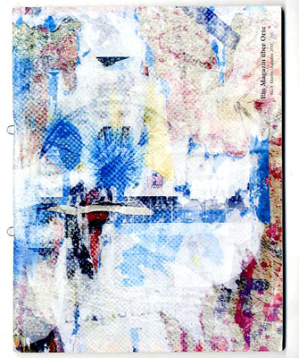 |
| Ein Magazin über Orte, no.8, 2011 |
| Ein Magazin über Orte |
| "Ein Magazin über Orte" (A Magazine about
Places) is published twice a year. It deals with a different location
in every issue. The magazine collects works of various authors in the
form of photographs, drawings and texts. |
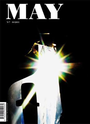 |
| May, no.7, 2011 |
| May |
| MAY, founded in 2009 by Catherine
Chevalier and Eva Svennung, is a bilingual (French/English) quarterly
publication based in Paris. Conceived as an experimental platform for
the publication of essays, exhibition reviews and interviews, MAY
proposes to examine matters pertaining to the field of contemporary
cultural production in the broader context. |
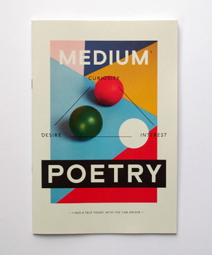 |
| Medium, no.1 |
| Medium |
| Today there was a guy leaning the wrong way in the
tube. It was not immediately noticeable. There was no one else
sitting nearby. No other passengers to compare him to. But then I did
notice that every time the carriage came to a stop, he leaned away
from the direction we were moving. Very slightly. Think about it.
You’re supposed to lean forward. In the direction you were moving
toward. Toward the point which the weight of your body was expecting
to reach. Now this guy, he leans the other way. Just slightly. As a
friend of mine would put it, he has a great sense of irony.
Definitely. That’s important in life. They say that Rothko, he killed
himself because he met the people who bought his art. No sense of
irony. Me neither I don’t have any sense of irony. I like to take
things at face value. Your wife she once told me that what led to the
demise of the Black Panthers, aside from the absence of trust, and a
murderous governmental incarceration campaign, it was their complete
lack of a sense of humor. It was only much later that I realized she
meant a murderous governmental incarceration campaign is actually a
lot worse than not having a sense of humor. But these ironies are lost
on me. Your sister and your wife they both say so. When I tell them
things I find funny, they rarely laugh. I’m not even going to mention
this guy in the tube to them. I recently told them about my bathroom
sink in this hotel room. Real bad design. Flat. Which meant the liquid
always accumulated in the corners. Instead of flowing down the drain.
You had to use your fingertips to fish out the shaved hair stubble
from the corners of the sink. Or it would just lie there. Waiting. You
know what's even funnier: you had to try and propel what you spat out
when you brushed your teeth towards the center of the sink. Or you’d
have mounds of mucus and toothpaste. Just drying in small heaps, here
and there. Hilarious. And speaking of heaps of mucus. Another thing
I’ll keep to myself – this was the funniest thing in years: I saw an
old couple smooching in the street the other day. How often do you see
that. Teenagers, yes. Or oldies arm in arm. But here you had oldies
with their tongues down each other's throats. Right there in the
pedestrian zone. Eighty years old maybe more. Couldn’t believe it. I
just stood there laughing. These oldies have no sense of humor either.
They pretended not to hear me. But I could tell they heard me
perfectly well. So now the carriage starts moving again, and I stand up,
knowing I'll exit at the next station. You see there are things I’m
less sure about. Are they funny or just poetic. Lately my eyeballs
scrunch as I close my eyes. A crunching sound. Brief, almost
imperceptible. The sound is a bit like high-tech mechanics when they
start aging. Wearing out. A whispering scrunching sound. Funny, or
lyrical? Now as I exit the carriage, I notice there’s vapor in the air
as I breathe, despite the high temperatures. It’s been like this all
week. Again, very odd and almost funny. In a tiny, barely noticeable
kind of way. Like the guy leaning the wrong way back there. As the doors
slam shut, I turn around to look for him. I want to see which
direction he's leaning in as the train departs. Before I can assess
his movements, he smiles and waves. I wave, but I fail to smile back.
It’s just not funny anymore. |
 |
| Megawords, no.16 |
| Megawords |
| Megawords is an independently
published experimental media project that takes the forms of a
photography magazine and related installation projects and public
events. We are interested in creating an on-going narrative that examines daily life through the documentation of our surroundings and experience. We do this by working with artists, photographers, designers, writers, musicians and creative people in a collaborative and direct manner to make a self-published, bi-annual printed magazine that offers an alternative viewpoint to the prevailing culture of emptiness, advertising and inauthenticity. In the magazine we seek depth, meaning and relevance. We speak with a voice free from commercialization and competing novelties. We look at how people live, how they face adversity, how they have fun, how they make and think about art and culture, how they build, and how they love. We do it without fear of showing the unpleasant or the unusual, or the imperfect, incomplete or impermanent. We are also interesting in using our our work to critique the authority and ownership of cultural exchange, and to expand the space within which this exchange happens. Who gets to design, decorate, and use public and institutional spaces? Who has the authority to define how and for whom our cities and our cultural institutions function? We insist that we all do, but that each of us must roll up our sleeves and literally make the spaces—both physical and imaginative —where we want to work, meet, think and play. We explore solutions to these questions by creating installations that are part gathering space, part event venue, part artist studio, and part store. By organizing lectures, workshops, music performances, screenings and readings in these spaces, we bring people from different disciplines, socio-economic backgrounds, and world views into one conversation. In the same way we shun commercialism and celebrity culture, we also deplore culture with a capital C, where the audience is expected to sit back passively, detached from an event that has the potential to be a profound communal experience. We seek a new and inclusive way of experiencing culture and we ask the audience to bee active participants instead of passive subjects. |
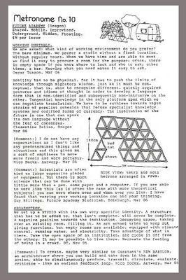 |
| Metronome, no.10 |
| Metronome |
| Metronome
(1996-2007) is an artists’ and writers’ organ that is both a
collective artwork and a research methodology. It was conceived in
1996 by Clémentine Deliss and has been researched and published for
over ten years in a number of cities and locations in the world
including Dakar, London, Berlin, Basel, Copenhagen, Oslo, Stockholm,
Malmö, Bergen, Frankfurt, Vienna, Biella, Edinburgh, Paris, Oregon,
and Tokyo. Acting as a critical alternative to conventional art
publishing, Metronome operates like a prologue or creative tangent to
an exhibition, generating new work and debates between artists and
thereby triggering short circuits between art scenes in different
locations. There is no editorial team or regular time structure to
Metronome. |
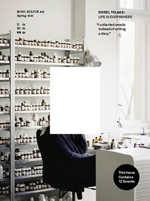 |
| mono.kultur, no.23, spring, 2010 |
| mono.kultur |
| mono.kultur is an independent interview magazine
from Berlin, established in 2005. Our concept is as beautiful as it
is simple: one issue, one person, one conversation. And thus, each
edition is dedicated exclusively to one artist from various genres,
such as music, film, literature, fine arts, fashion, containing one
very, very long Q/A interview – no more, no less. mono.kultur is being produced in close cooperation with and adapted to our interview partner in content as well as design, inviting different designers and contributors to curate each issue. Previous editions include Tilda Swinton and the Wu-Tang Clan and Miranda July and Dries van Noten and, and, and. mono.kultur is sold in specialized art bookstores worldwide. |
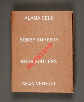 |
| Mossless, no.1, 2012 |
| Mossless |
| Mossless Issue 1 is a photography publication
that comes in a box featuring four young contemporary photographers,
each in their own full-colour, offset-printed book. The four
photographers in Issue 1 are Alana Celii, Bobby Doherty, Brea Souders
and Sean Vegezzi. As Susan Bright writes in the introductory essay, they
are "four very different contemporary photographers who look at
America with vivid and probing curiosity... ‘alone together’ in a
world of connectivity simultaneously tagging, reblogging, crowd
sourcing, networking and tumblr-ing their vision." |
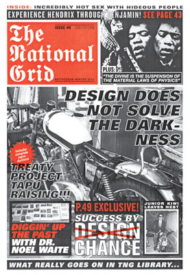 |
| National Grid, no.6 |
| National Grid |
| The National Grid is a New Zealand-based graphic
design fanzine operating loosely in the shadowy areas between
academia and professional practice, and between art and design. It is
edited, designed, and published by Luke Wood and Jonty Valentine. The
National Grid was initially set up (in 2006) to provide a platform and
point of distribution for certain sorts of projects and writing that
were considered to be untenable within our peculiar national context.
Each issue is printed in an edition of 500 and these are distributed
internationally. |
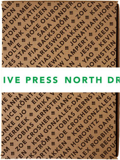 |
| North Drive Press, no.4 |
| North Drive Press |
| North Drive Press was founded by Matt
Keegan and Lizzy Lee in 2003. The name refers to the street (North
Drive) connecting the parallel blocks on which Matt and Lizzy lived as
kids. The impetus for creating NDP was to produce a mobile group exhibition. NDP #1:
Summerkit was released in the summer of 2004 and was distributed in a
brown vinyl sleeve. It contained large double-sided posters featuring
reproductions of works from emerging artists. Each side of the
posters functioned as self-contained shows; dotted lines around each
of the reproductions invited readers to cut out and rearrange the
images as they wished. In addition to the posters, a handful of loose
art multiples were included. A series of artist-to-artist interviews
and a transcript of a panel discussion rounded out this first issue. For NDP#5, artist and musician Sadie Laska helped with the process of inviting contributors. NDP#5 is the final installment of North Drive Press. We’ve been consistently amazed by the enthusiasm and inventiveness of our many contributors. Each year, with a varied cast of more than forty, we've been able to provide the support and editorial response necessary to compile this non-traditional publication. NDP #5 is a great note to end on: we've helped produce a dynamic assortment of artists’ multiples, from temporary tatoos to custom-made soap; and published a varied and compelling collection of interviews, panel discussions, and texts. We hope North Drive Press has added to the long, rich history of innovative, artist-made publications, and we hope our readers will be inspired to continue to investigate the exciting possibilities that non-traditional formats have to offer. |
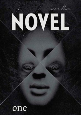 |
| Novel, no.1 |
| Novel |
| Novel draws together artists writing, texts and poetry that oscillate between modes of fiction and criticism. Disconnected from any unitary theme these texts coalesce around writing as a core material for artists that oscillates between script and transcript. Novel is distributed through events, readings and screenings which are staged at venues that become the loci for reading; curated with artworks and related films that augment the fictioning of a scenario. This scenario will be the summation of multiple experiences and anxieties that demands new forms of critical fiction. These new strategies require an active protagonist, a polymath who can amalgamate them with fluency. Fiction is not made up, it is based on everything we can learn or use; a zone in which all sources of knowledge are valid. |
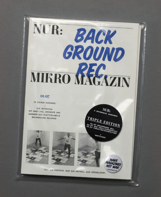 |
| NUR, no.1, 2007 |
| NUR |
| NUR is a German independent City Magazine
founded in 2007. It introduces young artists, musicians, designers and
writers from Duesseldorf. Every single issue is devoted to one story.
The first three issues were about “Background Records” (a music label),
“Das Knallchargenfest” (preprint of a chapter from an unfinished
novel) and “Paristokyopempelfort” (a graphic design studio). The first
issues were printed on a digital stencil machine at Extrapool in
Nijmegen, NL. Ji-Young Ahn and Johannes von Gross, both born in Bielefeld, Germany, in 1980. They studied Communication Design at University of Applied Siences in Duesseldorf and worked as freelancers for different studios and magazines since 2003. Ji-Young currently works as Deputy Art Director for NEON Magazin, Munich. Johannes currently works for Bureau Mirko Borsche, Munich. |
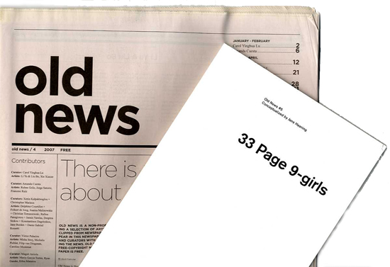 |
| Old News, no.4, 2007 and no.5 2010 |
| Old News |
| Old News is a project about information, media and recycled, reprinted news. It is a non-profit newspaper presenting a selection of articles, images and words clipped from newspapers. The articles have all been chosen by individual artists for the purpose of redistributing the news. Old News is a second-generation, copyright-free newspaper. The Old News newspaper is also for free. |
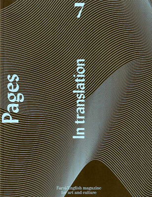 |
| Pages, no.7, 2009 |
| Pages |
| Pages was started in 2004 by artists Nasrin
Tabatabai and Babak Afrassiabi as an ongoing project, examining the
possibilities of interaction and reflection between various local
discourses and condition that may generate spaces of critique or
instances of critical practices. Pages project is defined through activities, such as the publication of a bilingual Farsi/English magazine, architectural proposals, video documentations and installation works. With a particular focus on the Iranian context, Pages emphasises on those artistic practices that communicate the specific conditions in which they are produced, those socio-political circumstances against which an artistic production is inevitably read as a discourse. Yet, the specificity of the Iranian situation has triggered discussions of a broader context. Addressing issues with regard to locally specific conditions can bring one closer to the reality of these issues, problematizing their common notions and triggering their re-articulation. Pages tries to constantly point to those intricacies and dissonances within and among local currents that give way to alternative chains of meanings, relations and coincidences. As such, Pages activities are taken as ongoing processes of research, which inevitably tend to undermine predefined and geographically bound notions of subjectivity and locality. Both the projects and the bilingual magazine undergo constant rethinking of their disposition in regard to the social and political contexts to which they refer. |
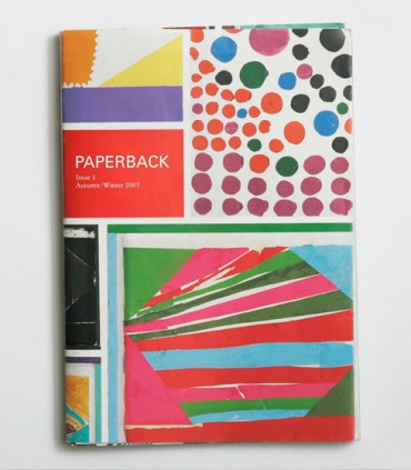 |
| Paperback, no.1, Autumn/Winter, 2007 |
| Paperback |
| Two issues were produced, largely by
three people who shared many of the same interests and ambitions. They
also shared a house in London where the magazine was produced in
bedrooms and a kitchen. The editors no longer share the same
hemisphere. The magazine didn't survive the move. |
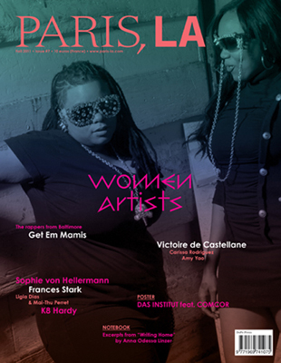 |
| Paris, L.A., no.7, fall, 2011 |
| Paris, L.A. |
| PARIS, LA is born of shared perspectives. It’s a
project, like a love story, that comes from the feeling of being in one
place and thinking about another. A place between two cities, between
scenes, between people, that exists only in the space of our
imagination. In Paris, dreaming of the Pacific. Speaking French in LA.
And it’s as true as a clear blue sky above us. |
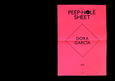 |
| Peep-Hole Sheet., no.3, Dora Garcia, Mad Marginal, winter, 2009 |
| Peep-Hole Sheet |
| Peep-Hole Sheet is a quarterly of writings by artists. Each issue is dedicated solely to one artist, who is invited to contribute with an unpublished text whose content is completely free in terms both of subject and format. The texts are published in their original language, with accompanying translations in English and Italian. All images are deliberately avoided. Peep-Hole Sheet is meant for those who believe artists are catalysts for ideas all around us, and who want to read their words without any filter. Over time it aspires to build up an anthology of writings that might open new perspectives for interpreting and understanding our times. Peep-Hole Sheet is published by Mousse Publishing. |
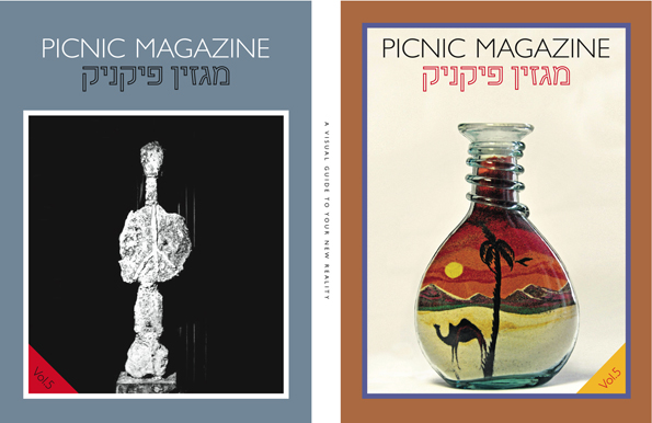 |
| Picnic Magazine, v.5 |
| Picnic Magazine |
| Picnic magazine is a visual guide to your new
reality, a highly inspiring envisioning magazine coming from the land of
milk and honey. |
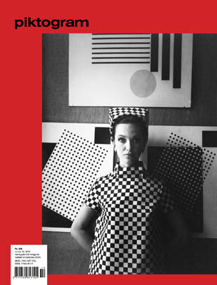 |
| Piktogram, no.16, 2010/2011 |
| Piktogram |
| Published in Poland, Piktogram Talking Pictures
Magazine is a bi-lingual (Polish-English) magazine that features a
mixture of artist-contributed, or found and previously unpublished,
visual material with texts from the fields of art, architecture, film,
design, science, and fiction. It confronts contemporary artistic ideas
with little-known, rediscovered phenomena created in a context of
Eastern Europe during communist era. Piktogram is an exhibition in
magazine form. It is now acquiring a new dimension, moving from printed
paper to 3D and into a new space – a post-industrial building in
Warsaw’s Kamionek neighbourhood. Following a six-year-long record of
ephemeral appropriations of such unexpected places as hotel rooms, the
Warsaw Stock Exchange, and movie theatres for exhibitions, Piktogram and
its alter ego, an informal organisation known as the Bureau of Loose
Associations, are opening a space for exhibitions, workshops, concerts,
screenings, lectures, dance parties, and brainstorming sessions. It will
be bundled with a space for projects associated with publishing, printing, recording and distribution – a bookstore-as-exhibition or rather an exhibition-as-bookstore. |
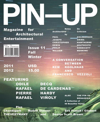 |
| Pin-Up, no.11, fall/winter, 2011/2012 |
| Pin-Up |
| PIN–UP is a magazine that captures
an architectural spirit, rather than focusing on technical details of
design, by featuring interviews with architects, designers, and
artists, and presenting work as an informal work in progress – a fun
assembly of ideas, stories and conversations, all paired with
cutting-edge photography and artwork. Both raw and glossy, the magazine
is a nimble mix of genres and themes, finding inspiration in the high
and the low by casting a refreshingly playful eye on rare
architectural gems, amazing interiors, smart design, and that
fascinating area where those areas connect with contemporary art. |
 |
| Looking at issue no.1 of The Plant Journal in Barcelona, May, 2011 |
| Plant Journal |
| Besides providing botanical contents in a simple, personal and familiar way; The Plant Journal offers
plant lovers a new look at greenery by featuring the works of many
creative people who share our love of plants. As a curious observer of
ordinary plants and other greenery, the magazine presents a monograph on
a specific plant; bringing together photographers, illustrators,
designers, musicians, writers and visual artists, both established and
emerging, from all over the world. These people share with The Plant Journal their unique perceptions and experiences of plants. |
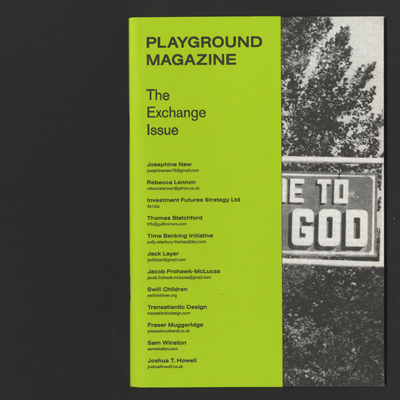 |
| Playground Magazine, no.6 |
| Playground Magazine |
| Playground Magazine (@playground_mag) was
initially created as a student magazine for the University of
Brighton’s arts faculty. It now takes the form of an independent arts
and culture publication, with themed issues that explore the processes
and systems of contemporary art, design and magazine production. |
 |
| Point d'ironie, special number, January, 2011, Pierre Reimer |
| Point d'ironie |
| Around 6 times per year, agnès b. and
Hans-Ulrich Obrist give carte blanche to an artist to appropriate
the space of the paper. An 8-page tabloid format, identical for
each artist. Repetition and difference. This is not a paper about art, each issue is created by an artist, architect, filmmaker, musician photographer, writer… 100,000 to 300,000 copies are available free of charge around the world (in bookshops, museums, galleries, schools, cafés, etc.), as well as in all of the agnès b. locations (France, Europe, USA, Asia). Idea: offer works of art on paper in the age of electronic communication–to touch, to read (or not), to exhibit, to frame, to archive, to throw away or wrap gifts with – destined to appear and to disappear. |
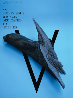 |
| Provence, issue V, 2010/2011 |
| Provence |
| The concept of free time was invented along with
industrialization—now it seems we are moving towards doing away with
it. “Turn your hobby into a career” is well known in itself as the
neo-liberal slogan. In this regard, the Post-Fordist working condition
and the world of contemporary art seem to go hand-in-hand, perfectly.
We are constantly at work: everywhere and anytime. Provence will provide you with violet, red, orange, yellow, green and pink, sunshine, blue sky, outdoor easels, ewer, fountain pens, the sound of the sea, edging shears, sailing shoes, lavender, picnics, wine, olives, brushes and bushes ... Provence is an eight–issue magazine dedicated to hobbies and delightful beauty. |
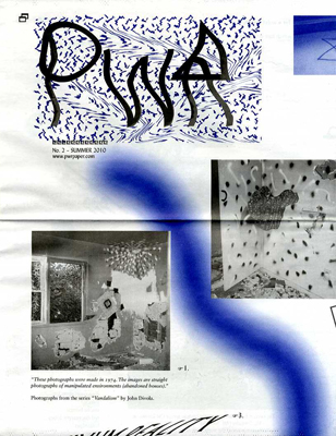 |
| PWR Paper, no.2, summer, 2010 |
| PWR Paper |
| PWR is an phuturist publication put together by Rasmus Svensson and Hanna Terese Nilsson. |
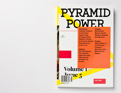 |
| Pyramid Power, v.1:no.5, fall, 2008 |
| Pyramid Power |
| Pyramid Power provides a printed space
for artists and writers to pursue experimental projects. These
projects often explicitly deconstruct the magazine form, extending
beyond the limits of mainstream art magazine structure. Focusing on
artists’ projects, critical writing and interviews of and between
artists, the magazine is also motivated by a desire to place emerging
artists on an equal footing with their more established counterparts.
What brings these artists together is a mutual belief in the critical
importance of thematizing form in their work, exploring how ideas of
site- specificity might play out in magazine format. Pyramid Power’s
eccentric perspective on the art world is visually embodied in the
balance it strikes between form and content—the magazine’s bold yet
considered presentation accentuates the richness of its artwork and
writing. |
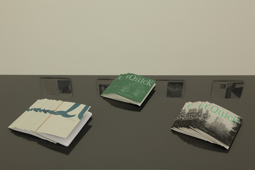 |
| Quick, nos.2-3, 2011 |
| Quick |
| Quick Magazine was a well known pocket-sized
“news weekly” published by Cowles Magazines, Inc. from 1949 to 1953.
On the cutesy backside covers folks were encouraged to “get Quick on
your newsstand an carry it in your pocket or your purse… and read it
wherever you are”. A new Quick Magazine was first published in November 2010. The artists´ magazine focuses on the exploration of ideas through images and strategies of appropriation. Each issue is done by an artist and presents a text. Quick also invites several artists to create small editions, that are realized in an circulation of 25 pieces. Quick Magazine is edited by: Arno Auer Design: Franziska Nast, Arno Auer |
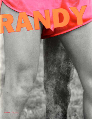 |
| Randy, no.1, 2010 |
| Randy |
| RANDY is a personal and nepotistic project by
A.K. Burns & Sophie Mörner. It is about the people close to us and
the people we have yet to meet. RANDY is a celebration and critique
of the queer arts. It is feminist and vag-centric because that is
a perspective we want to support. |
 |
| RRR, .001 |
| RRR |
| RRR Project: A publication that asks its
participants to take a moment from their daily routines and reconsider
their surroundings. Picking up old projects, abandoned ideas and
objects and reconsidering how they may used to benefit others. The
project is structured to inclusive, hailing family and friends from
various geographic and economic, as well as spanning a few
generations. The project hopes to evolve into a phase of more social
engagement and interaction between likeminded companies. We support
our family and friends. |
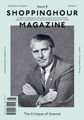 |
| Shoppinghour, no.8, spring, 2012 |
| Shoppinghour |
| Founded in 2008, Shoppinghour Magazine is a
London-based publication that has as its aim the reconstruction of a
culture mired in the nihilist vestiges of postmodernity. Through an
empowerment of the interdisciplinary potentialities that exist between
various forms of contemporary arts expression and theory, the ambition
is to help resuscitate the spirit of a society in dire need of
critique. Working closely with the magazine's designers to avoid
creating yet another consumer commodity, Shoppinghour is a gift to those
who share the critical reconstructive drive of the New Educators. |
 |
| Showpaper, no.110: Tod Seelie, July 26-Aug. 9, 2011; John Mejias; no.120: Casey Farnum |
| Showpaper |
| Showpaper is a free bi-weekly print-only
publication which lists and promotes every all-ages & DIY show in
the NYC / tri-state area. We spread the word about shows that would
otherwise slip under the radar, and about the all-ages scene in
general. Each issue also features a full color piece of art by a
contemporary artist . |
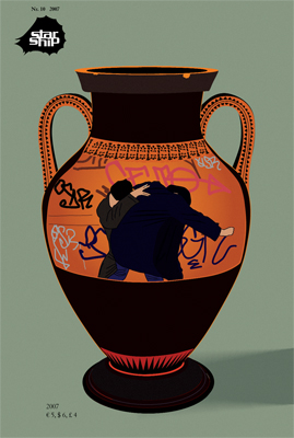 |
| Starship, no.10, 2007 |
| Starship |
STARSHIP is a
Berlin based art magazine founded in 1998 by Hans-Christian Dany,
Martin Ebner and Ariane Mueller (and Gunter Reski, until 2000).
STARSHIP is a magazine that permanently shifts forms and formats: it appears as a print magazine about once a year but also takes the shape of a gallery, a cinema space, a publishing house, or a production office, organizing exhibitions and concerts. STARSHIP is the collective art practice of its editors and serves as a collaborative platform for inviting other artists and writers. The city is very flat. The sun, now in winter coming in low, finds it‘s mirror at the highrises, owned by danish pension funds, creating a fake alpen-glow. Just now at the moment it amazes me, looking out of the window. Later in the evening spanish speaking travellers form our natural habitat. They sit in the subway, clinging to their beer bottles, freezing, talking about their relationships. During daytime they are looking for the same flats as our neighbours, whose Hartz 4 transfer money doesn‘t cover the rising rents anymore. The mythical cheap flats of Berlin. Flats to the contrary are scarce but the city is selling off other interesting real estate. Airports, churches, bunkers. The strategic planning of the city has stopped social housing ten years ago. The last master plan of Berlin works with scenarios, a negative, a neutral and a positive. The positive expects Berlin‘s population to stay stable. The others depict population losses. Tearing down blocks has come to a halt, though, since they can be sold in huge numbers to foreign funds. The average time frame of ownership is calculated with 18 months. I listen to the radio while typing this. A well known cologne gallery owner, who had moved to Berlin five years ago, gets interviewed. Ah ja, it is Armory show time. There are sixty collectors in Berlin and all of them are from West-Germany, he says and he wonders, why all of these newly created structures in Berlin have not resulted in collecting art. Since 1998 we are running an art magazine here. Later on other art magazines moved to Berlin or were newly established. Sometimes we meet other editors and we may sit and wonder if any of us reads what the others are writing. We imagine they set their themes randomly. I guess they suspect us to do the same. We would prefer not to have theme issues. But when addressing people to write and to contribute they inevitably ask for the theme of the next issue. We imagine a whole set of questions and suggestions, answers and proposals going back and forth between the things we see, we read, we write. |
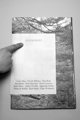 |
| Stupendous, no.2 |
| Stupendous |
| Established in late 2008, S T U P E N D O U S is
a randomly produced publication formerly stationed in New York, NY
and currently operating in the southeast corner of the Netherlands.
Also randomly thematic, S T U P E N D O U S remains
free of design constraints so it's format can suit it's theme. The
final result is ultimately informed by the submissions of its
contributors, the by-product of mutual collaboration. The inaugural issue’s focus consists of a reflection on family. From the byline: “Despite one’s efforts to be at the epicenter of art and culture, to be an individual, to learn a craft, or to succeed, part of who we are comes from somewhere more humble. For many, family and relatives contradict our individual identities. Stupendous #1 is dedicated to the people who we are forced to interact with, for the people we have to see, despite our feelings towards them: to our disliked and eccentric relatives”. The nineteen young artists involved enthusiastically chronicle their thieving grandfathers, gold-medalist uncles, stage-magician fathers, and the anxieties and experiences that surround such things, through an extensive spectrum of media. The subsequent installment takes a wide left into more remote territory. Receiving its germ from psychedelic cult oddities Lothar & The Hand People’s sophomore release Space Hymn, Stupendous #2 partially leaves behind the mythical science fiction landscape to consider void in itself and the nonmaterial world more broadly. Each of the twelve artists’ submissions is expanded into an oversized poster in order to evoke presence within the space they occupy. |
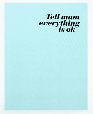 |
| Tell mum everything is ok, no.1 |
| Tell mum everything Is ok |
| "Tell mum everything is ok is a
collective revue based on a principle of an open participation, the
readers are also the one who « made » the revue by sending
submissions. Each issue is based on a different theme and shows a large
variety of works from established to unknown photographers. Published by the associative publishing house The Editions FP&CF (non-profit organization), Tell mum everything is ok is both in English and French. |
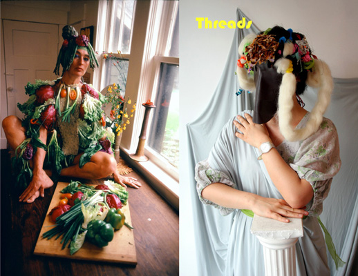 |
| Threads, no.1, 2009 |
| Threads |
| Threads is a self-produced zine-style publication
dedicated to a seamful and idiosyncratic vision of clothing and
wearable art edited by Jenn Brehm and Jennifer Sullivan. Past issues
included conceptual fashion shoots, interviews, travelogues, and
fashion-inspired art projects. Through collaborations, interviews,
photo documentaries, and performance, we looked at the accessibility
and versatility of fashion as an artistic medium. |
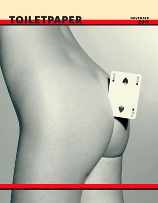 |
| Toilet Paper, November, 2011 |
| Toilet Paper |
| Toilet Paper is an artists' magazine created and
manufactured by Maurizio Cattelan and Pierpaolo Ferrari, born out of
a passion/obsession they both cultivate: images. Each picture springs
from an idea, often simple, and through a complex orchestration of
people it becomes the materialization of the artists' mental
outbursts. Ever since the first issue of June 2010, Toilet Paper has created a world that displays ambiguous narratives and a troubling imagination. The magazine contains no text but it combines the vernacular of commercial photography with twisted narrative tableaux and surrealistic imagery. The result is a publication that is a proper work of art which, through its wide distribution in form of a magazine, challenges the limits of our contemporary value system. Toilet Paper is published by the Deste Foundation. |
 |
| Triple Canopy |
| Triple Canopy is an online magazine, workspace,
and platform for editorial and curatorial activities. Working
collaboratively with writers, artists, and researchers, Triple Canopy
facilitates projects that engage the Internet’s specific
characteristics as a public forum and as a medium, one with its own
evolving practices of reading and viewing, economies of attention, and
modes of interaction. In doing so, Triple Canopy is charting an
expanded field of publication, drawing on the history of print culture
while acting as a hub for the exploration of emerging forms and the
public spaces constituted around them. |
 |
| umool umool, no.9, 2010 |
| umool umool |
| ‘umool umool’ is a magazine-formed project by Na
Kim. It experiments on several ideas, such as an overturn of
designers’ role, a tension in hierarchy of form and content, a virtual
possibility of autonomous work of designers and etc. For the latest issue, 10 projects are invited to describe the hidden destiny of the rejected project. Some of them simply show documentation of a denied proposal and allow others create an alternative story in it. Some assertively suggest a second life for the rejected work, rather than an ephemeral destiny. For those who would like to transmit these ghost projects into their own interpretation, only images of work are presented in the printed book. The description of each project is announced on the web page. |
 |
| _Quarterly, no.8: No Music Is Swing |
| _Quarterly |
| Utilizing the short run printed form, _
Quarterly investigates obsolescence through various themes. Beginning
in the Winter of 2008, _ Quarterly initiated itself as a long distance
project between New York and Los Angeles artists Jesse Hlebo and Justin
Sloane. Initially a newsprint only publication, _ Quarterly began with an all black cover, each one modifiable by ones own finger prints. Fittingly, the theme for this issue was adaptation. Since then topics have included superconsciousness, the violence of luxury, the sea, musical notation, hurricane Irene, rhythm, and revolutionary groups' response to oppression. _ Quarterly has collaborated with Grant Willing, Todd P, The Silent Barn, Showpaper, and Printed Matter. Additionally, _ Quarterly has been included in exhibitions worldwide including Tokyo, Seoul, Los Angeles, New York, Berlin, Amsterdam, Paris, Greece, and others. Currently, _ Quarterly is based in Brooklyn, NY. |
 |
| Useless, no.10, 2011 |
| Useless |
| USELESS was founded in 2004 by artist
Conrad Ventur in New York. Most of the contributions are performative
interviews and essays by and between artists, curators, writers and
other cultural producers. The focus has been on video, performance and
multi-disciplinary practices. It is printed with black and white ink
on large-format newspaper. |
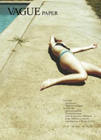  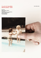 |
| Vague Paper, nos.6-8 |
| Vague Paper |
| 'Glorious. Who was it who said that
good taste and bad taste are two sides of the same groin? Well, if it
wasn’t me, it must’ve been VAGUE – a magazine so sexy, bold, elegant and
knowing that its casual motorway pile up of fine art, intelligent
fashion and gross out lifestyle features (tongue in chic, natch,
darling) puts it so far on the edge that it almost falls off. It's what
other fashion magazines wish they could be if they were allowed to stay
up late. And best of all, it’s printed on right cheap paper so your
fingers get dirty reading it.' -RUSSELL HERRON - Institute of
Contemporary Arts London |
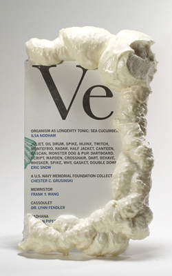 |
| Veneer, no.5, 2008 |
| Veneer |
| Veneer Magazine is printed on various
paper stocks using offset and letterpress printing techniques and
perfect bound with hot glue. 18 issues will be made in this way.
Subscribers to the edition receive all back issues and all future
issues. Depending on various circumstances surrounding production,
issues are also made available in retail environments. |
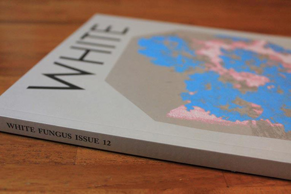 |
| White Fungus, no.12 |
| White Fungus |
| White Fungus is an art
magazine based in Taichung City, Taiwan. Founded by brothers Ron and
Mark Hanson in Wellington, in 2004, as a quasi political manifesto,
copies of the first issue were produced on a photocopier, wrapped in
Christmas paper and hurled anonymously through the entrances of
businesses throughout the city. Now a magazine featuring interviews,
writing on art, new music, history and politics, White Fungus
takes a dialogical approach to the work it covers. The name of the
publication comes from a can of “white fungus” the Hansons found in
their local supermarket in the industrial zone of Taichung City. Each
cover of White Fungus is derived from a scan of the can. Dispersed through the internet and inter-disciplinary art events, White Fungus is as much an experiment in distribution and dissemination as it is in art publishing. |
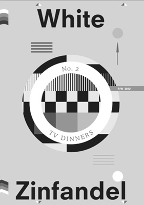 |
| White Zinfandel, no.2 |
| White Zinfandel |
| White Zinfandel is a biannual art
publication devoted to the visual manifestation of food and culture
produced within the lives of creative individuals. The publication
invites contributors to create experimental work based on the singular
constraint of a single food item or idea, with participants ranging
from emerging to established artists, photographers, designers,
architects and writers. The first issue of White Zinfandel was
inspired by the ethos of Gordon Matta Clark's FOOD restaurant—raw,
resourceful and a celebration of New York's downtown artist community
in the 1970s. For the second issue, we swung the pendulum in the
opposite direction. Rather than the singular and novel we were
inspired by the generic and banal found in the culinary artifact of
the TV Dinner. Each issue culminates with a dinner event that brings
together the contributors of the magazine and a collection of special
guests. |
 |
| Zug, no.2, 2011 |
| Zug |
| Innen, founded in 2006 by Hungarian
graphic designer Aaron Fabian, is an independent publisher promoting
Hungarian and international contemporary artists, offering
unconventional perspectives on art and contemporary trends. In 2010, Innen launched Zug Magazine, a biannual collection of selected contemporary artworks. Zug proved to be a great bridge builder between Hungarian and foreign artists, and continually widens its audience by raising attention to novelty trends. The publisher appreciates artistic freedom above all, that’s why each publication is a momentary picture book of personal, subjective depictions of our culture. |
Nema komentara:
Objavi komentar