
Glitch-animacijske anti-bajke. Glitch art goes big.
davidoreilly.com/
www.theexternalworld.com/
...U aktualnom je slučaju trebalo poslušati sud publike, a taj je bio na strani Vanjskog svijeta (External World, 2010), koji je potpisao irski autor David O'Reilly. Nekonvencionalnu reanimaciju opskurnog i poprilično bolesnog okruženja, koje trenutno svi dijelimo, apostrofirala je i članica žirija Tina Frank, inače austrijska videoumjetnica i grafička dizajnerica. Pritom je također uputila riječi pohvale japanskom dvojcu. Oba su ostvarenja, irsko i japansko, njezinu pozornost najvjerojatnije privukli zbog izrazito grafičkih shema u osnovi njihovih više ili manje apstraktnih priča. Irčevu je animiranu anti-bajku na dodjeli nagrada opisala kao krajnje ružnu i odbijajuću, no to je – kako je navela – nije spriječilo da joj dodijeli glavnu nagradu, i to zbog toga što se u znatnoj mjeri sprda s paradoksima opskurne svakidašnjice, šizofrene u svim smjerovima, dok virtualni protagonisti sliče dječjim TV-likovima. No, ispod njihove krinke kriju se bizarne kombinacije nasilja, svakojakih opačina i nadrealnih situacija, kojima se hrani recentno doba „novog nihilizma“. - Željko Kipke
Pictoplasma focus: David O'Reilly
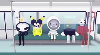
First turn off the lights and watch this film full screen if you haven't seen it already. We can talk later...
The External World
David O'Reilly is a film director, an artist and i'm not going to add that he's a genius because everybody's done that already, including me after i first saw his work atPictoplasma Berlin back in 2007. The External World had its world premiere at the Venice Film Festival in 2010 and was shown a few months later at Sundance. It has since won numerous awards. Another of his most admired short films, Please Say Something, received the Golden Bear at the 2009 Berlin International Film Festival. The film was the only animated film to win the title since Pixar's first short film.
But before i go any further, let me point you to Octocat. It's my favourite and I've watched it 4 times today. I can't get enough of the stupid voice ("Mmmh That looks like some chicken. Mmmh I'm just gonna eat. Mmmh, that's delicious!")
Octocat Adventures
O'Reilly's stripped down 3D animation films treat cute and/or bonker characters in a rather brutal way. He doesn't do adorable. he can at best stretch to bitter-sweet (see the video for U2's song I'll Go Crazy If I Don't Go Crazy Tonight.)
But animation is only one of the channels that O'Reilly is using to explore the utterly baffling. Check out #1 twitter @FREE_FACTS! if you dare. Or its tumblr pendant.

OFICAL #1 Tumblr Facts! 100% Free Real and true facts for u! New facts every day - always FREE!
David O'Reilly is going to give a talk in New York in early November as part of thePictoplasma conference. And because I've never been shy about professing my love for Pictoplasma, i'm going to do exactly what i did last year: run a series of interviews with some of the speakers in the run-up to the event.
O'Reilly's interview is the first one to go online but don't hold your breath! He's not one to reveal much!
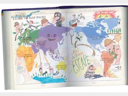
Doodles by the central character of Son of Rambow, 11-year-old schoolboy Will Proudfoot, created by David O'Reilly
I almost fell from my chair when i saw the list of awards your animations have received over only a few years. All of them are deserved of course but since you've shown your work at major movie festivals such as Sundance, Berlinale or the Venice festival, i've been wondering why you have never been tempted to adopt the super protective behavior of many film makers. Instead, you let anyone watch your films for free on the internet. Why not just put a trailer, an extract and ask people to pay if they want to see the whole film? What do you gain from putting your film online?
The idea with releasing things online is you hopefully gain an audience. You might make a little bit of money if you charge for your short film, but at the expense of potentially millions of eyeballs.
I've never been really protective about my short films, it always seemed normal to put them online and then move on to the next one. I had actually been making animations for years before ever entering a festival, I never saw the point of going to all the trouble of sending out DVDs and filling out forms. I also (correctly) thought most of them were really bad.
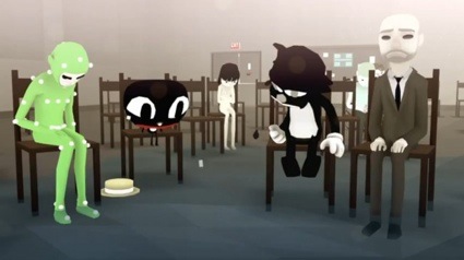
You work on both the story and the animation of your short films. Have you ever dreamt of collaborating with someone for the scenario part of a film? He or she would would come up with the story and you'd just illustrate it? And if you had your pick, who would that scenarist be?
I have been writing almost everything I do with Vernon Chatman for the last 2.5 years. He's a much more experienced writer than me and has taught me a lot but we're a good team. I'm not sure about illustrating someone else's script but I'd love to adapt Chris Ware's work, I think he is amazing.
Do you get to look at the work of artists working in other fields (painting, music, video, etc.) a lot and do you draw inspiration from them? Whose work do you admire?
I know a lot of geniuses whose work I really admire - Vernon, Jason Woliner, Steve Ellison, Willie Bensussen, Eric Wareheim, Tim Biskup, Adam Buxton, Garth Jennings, Jon Klassen, Gregg Turkington, Mr.Doob, Aaron Koblin and others.
Any advice you could give to young illustrators / students who would like to be as successful as you are?
I would not give any advice yet as there is usually a strong possibility I will be homeless every 6 months.
What are you going to present at Pictoplasma?
I will hopefully talk about the small projects that I do in-between the big ones. Ways to stay occupied when you are tired and feel useless, that kind of thing. Also secrets... many secrets.
Thanks David!
we-make-money-not-art.com/
3d animation is at a stage where many people have access to the tools but very few have any meaningful guidelines on how to use them. The problem is that there is simply too much power and very little control, essentially you get too much for free. Other forms of animation have benefited from their inherent limitations, but largely these do not exist with 3d.
This essay will mainly centre around my latest short film, Please Say Something, which won the Golden Bear for Best Short Film at the 2009 Berlinale. Though the award is irrelevant to this discussion, it nonetheless convinced me that my way of thinking about animation aesthetics and all the hidden theory behind it worked. Moreover, I never had to explain these elements of the film, either explicitly in the film itself or in promotional material surrounding it. As such this essay is not a guide to the film but more an analysis of my approach.
My central idea in constructing the world of the film was to prove that something totally artificial and unreal could still communicate emotion and hold cinematic truth. The film makes no effort to cover up the fact that it is a computer animation, it holds an array of artefacts which distance it from reality, which tie it closer to the software it came from. This idea is in direct opposition to all current trends in animation, which take the route of desperately trying to look real, usually by realistic lighting and rendering, or by forcing a hand-made or naive appearance. At the time of writing, this trend shows no apparent signs of ceasing.
Aesthetic harmony comes from laws. Some may be imposed by technical limitations, others by style, ability, budget or even arbitrarily. Coherence does not come by following specific ideas like ‘appealing’ shapes or certain colour combinations, but just by keeping one’s laws consistent. In 3d some laws are almost universally adhered to, such as not allowing objects intersect each other, while others are variable, like using high-detail models or low-detail ones. It’s futile to say one rule is wrong and another right, I feel such a claim it’s destined to be disproved. The Disney studio published several books on why their methods were the only way to create believability, yet it all falls flat when applied to something like South Park, which few could deny is just as absorbing material. This is why I feel the only way of understanding believability is through the idea of coherence.
In a film, the exact rules and limitations of its world can only ever truly be known to the filmmaker. All feelings, sounds, moods, characters, colours, shapes and so on should be immediately obvious to him or her. It’s always a good idea to lay down the aesthetic rules which permeate the world you are creating. The director who internalizes his world to a great degree and immerses him or her self in the colour and sounds and feelings of it will never have to think twice about decisions later on. Each little thing will seem obvious and will find its place neatly.
My short Please Say Something employed a very specific set of rules in its aesthetics. They are all centred around the idea of economy. One of the main problems with 3d animation is that it takes so long to learn and then to use, from constructing a world to rendering it. There are many knock on effects of this, mainly it prevents people from attempting to use it and employ it artistically, the process is very discouraging for the individual to go ahead and make their film. Simple changes can take hours to do, and very often the process is so rigid it doesn’t allow any changes at all.
My goal therefore was to shorten this production pipeline to a bare minimum. I removed the entire process of software rendering by using preview renders, which are essentially snapshots of what you see on the screen, they take a split second to be generated.
The second most obvious decision was to use simple geometry (or models) to describe the world, this made it much faster to create, change and animate. It must be understood that it’s actually extremely easy to make an object or character in 3d smooth, it literally takes the click of a button, but it’s one I didn’t deem necessary to push. In general I always feel that any filter that appears to easily add a lot of beauty to an image or 3d model should be avoided, it’s usually a sign that the base material isn’t that good in the first place. Filters are like makeup on a woman, they can make her look really beautiful, but you’re really more interested in what she’s like without it.
Thirdly I used flat shading, there are no light sources or realistic shadows in the entire film. This decision was not entirely based on economy, as I could’ve used basic shading, but the drama of the film is essentially told through verbal dialogue rather than lighting, so it simply wasn’t necessary.
There were many other small decisions in the film. One of the most obvious aesthetic results of using preview-renders was that the image appears aliased or jagged. Every pixel has a solid colour which belongs to an object in the scene. While this is intrinsically beautiful, most software and filters are made for working with anti-aliased, or smooth images. I will explain some examples of how this created some hurdles and how I found ways of working around them to retain the film’s aesthetic coherence.
Firstly I handicapped myself from using the blur filter, which is one of the most commonly employed effects of them all. The problem with it is that it destroys the aliased aesthetic and therefore affect coherence. This rule was generally easy to uphold, except for one scene; I made a reference to the film Funny Games by Michael Haneke, in which the Mouse character rewinds the film itself with a remote control. In Funny Games, the character who rewinds the film frequently comes into focus and winks at the camera, it’s a very distinctive shot and I needed to include the Mouse doing it to get across that it was a reference, I wasn’t just stealing the rewind plot-device.
The problem was I needed to use a focal blur, which was against my rule of no blurs. The alternative I came up with was to use multiples of the scene which, when layered over each other, act like a blur, but crucially allow the pixels to stay aliased.
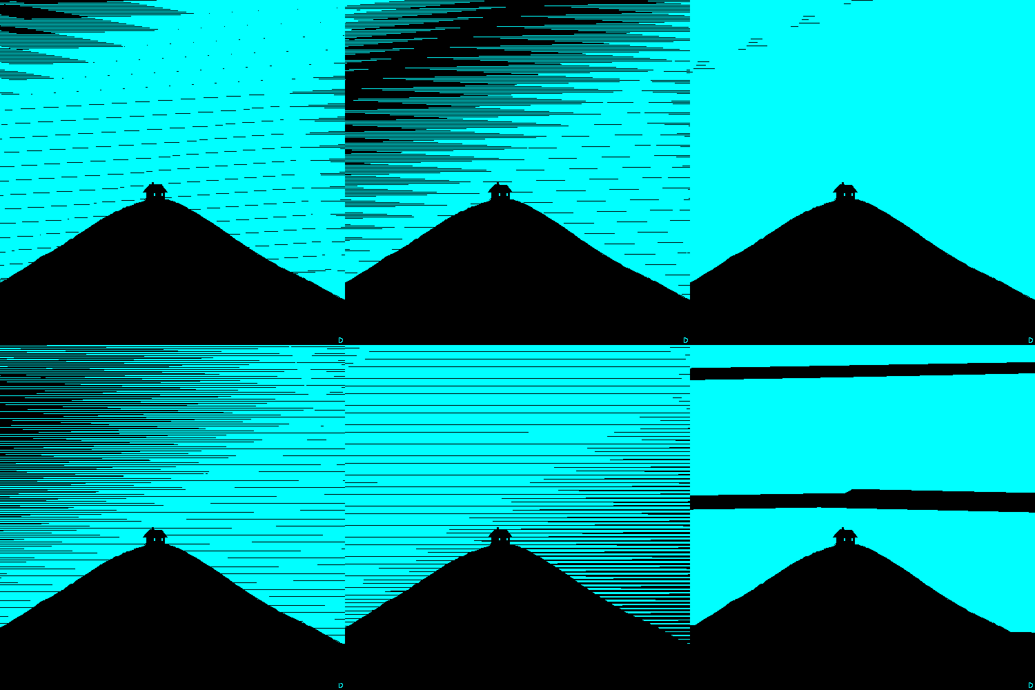
Another rule was using no fades in the film.[2] The nature of the fade is that it changes the opacity of the pixels, but the aliased aesthetic calls for every pixel to be solid and pure. There are a few instances where I wanted a fade but didn’t want to change my rule, so I found a way of fading something out pixel by pixel in a way that reads like an opacity change, the effect looks like this:
These are just a few examples of the hurdles one encounters in keeping a 3d world consistent and coherent. There are new ones in every project I encounter and they always force one to think outside the box and very often to use software in ways it wasn’t built to be used. The end result may not always be beautiful, but it will be consistent, and although it may not look realistic, it can still feel realistic.
Media which have an obsession with surface style are music videos, advertising and fashion. Their inherent aim is to stand out, to promote an identity, rather than pursue a vision, with only a small number of exceptions. The individuals making these works are often obsessed with their own industry and are viciously aware of being ripped-off or having their style bitten, as it were. Of course, originality is possible in any medium, and we all wish to create something new, something different and interesting, but this cannot be achieved by simply enforcing a look, it has to work from the ground up.
A short note on using few aesthetic rules: if the work is not bolstered by strong execution it may become copied or imitated. There is always discussion about what constitutes a rip off, particularly in the world of commercial animation, however I don’t believe it’s a subjective thing. A rip off occurs when the aesthetic rules of a work are copied by another. Aesthetic rules can be defined and therefore compared.
The aesthetic rules defining Please Say Something are specific and can be listed, these are: aliased pixels, use of isometric (flat) perspective mixed with normal perspective, elements which intentionally break the safe area, no texture maps (all colour was applied by painting the geometry directly), the use of completely synthetic voices and animation on 2ʼs, or every second frame. Naturally what rules you make are just as important as what you avoid using, these were primarily: no motion blur, no focal blur, no ray tracing or complex shading, no mesh-smooth, no handheld camera, no vignettes, no glow, no fades, no crossfades, wipes or transitions.
An understanding of aesthetics gives the filmmaker the ability to observe a film both broadly and in detail and understand it. It allows him or her to make any kind of world believable by knowing exactly what works and doesn’t work, and rather than feeling things seem wrong, to be able to point them out specifically. Finally, knowledge of aesthetics is an essential key to originality. When we are forced to examine our aesthetic choices we lead ourselves to new ways of thinking and new ideas. Those who aren’t fully conscious of the aesthetic fabric of their worlds will revert to default decision making, essentially to the common doctrine, or mediocrity.
The fact is that there is so much possibility in 3d software to create original worlds there is simply no excuse to try and recreate other ones. To get there I feel we should forget everything about the idea of right or wrong, of beauty and ugliness, and focus on the idea of coherence.
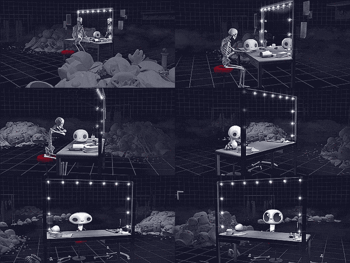
The External World
D. OReilly
BASIC ANIMATION AESTHETICS
For the purposes of talking about animation, aesthetics are simply any of the elements that make up the world of a film, the building blocks of images and sounds. The importance of animation aesthetics is such a subtle yet vitally important one. It might seem superficial to discuss these things, especially because cinema is so much more to do with content and story than a pure aesthetic experience, but nonetheless the visual nature of animation calls for debate on the subject. There is a continuous raft of animation, both commercial and independent, which looks the same, and I don’t believe it has to be so. The more we think about the subject the more playful and interesting computer animation becomes, the medium feels to me like a recently opened Pandora’s box which is still being examined, understood and tamed.
Equally, we can often explain why a story works or doesn’t work, but the way pixels mix on the screen is just beyond our verbal grasp. Despite this we know that some things can just feel wrong in an image, even if we can’t explain why. An animation can seem simultaneously real and unreal. Bad aesthetics can make a film say things it’s not supposed to, look unprofessional and disengaging. Attention to aesthetics gains an audience’s trust, makes them forget they are watching a film and by extension feel any emotion you can think of. My goal is thus to explain why certain things work and others don’t.3d animation is at a stage where many people have access to the tools but very few have any meaningful guidelines on how to use them. The problem is that there is simply too much power and very little control, essentially you get too much for free. Other forms of animation have benefited from their inherent limitations, but largely these do not exist with 3d.
This essay will mainly centre around my latest short film, Please Say Something, which won the Golden Bear for Best Short Film at the 2009 Berlinale. Though the award is irrelevant to this discussion, it nonetheless convinced me that my way of thinking about animation aesthetics and all the hidden theory behind it worked. Moreover, I never had to explain these elements of the film, either explicitly in the film itself or in promotional material surrounding it. As such this essay is not a guide to the film but more an analysis of my approach.
My central idea in constructing the world of the film was to prove that something totally artificial and unreal could still communicate emotion and hold cinematic truth. The film makes no effort to cover up the fact that it is a computer animation, it holds an array of artefacts which distance it from reality, which tie it closer to the software it came from. This idea is in direct opposition to all current trends in animation, which take the route of desperately trying to look real, usually by realistic lighting and rendering, or by forcing a hand-made or naive appearance. At the time of writing, this trend shows no apparent signs of ceasing.
AESTHETIC COHERENCE
‘A
phenomenon is created truthfully in a work of art through the attempt
to rebuild the entire living structure of its inner connections.’ – Andrei Tarkovsky
My central belief is that the key to aesthetics is coherence. In 3d we essentially create artificial models of worlds, I contend that what makes these worlds believable is simply how coherent they
are; how all the elements tie together under a set of rules which
govern them consistently. This coherence spreads to all areas of a film;
dialogue, design, sound, music, movement etc. Together they create a
feedback-loop which reaffirms that what we are looking at is true. The
human eye wants this aesthetic harmony.
The interesting thing is that the sense of reality in animation can be whatever you want it to be. The rules governing an animated world can be totally arbitrary and artificial as long as they are kept consistent, just as a lie repeated often enough becomes truth. If something in a world seems too out of place, if it breaks or overextends these rules, believability evaporates.[1] For this reason that we can look at a very simple, basic animation style and find it just as absorbing as if it was filmed world-class actors in an elaborate set. Even if animation is technically bad, but consistently bad, it will be coherent and thus potentially believable. It also explains why a live action film can be just as effective in black and white as well as in colour.Aesthetic harmony comes from laws. Some may be imposed by technical limitations, others by style, ability, budget or even arbitrarily. Coherence does not come by following specific ideas like ‘appealing’ shapes or certain colour combinations, but just by keeping one’s laws consistent. In 3d some laws are almost universally adhered to, such as not allowing objects intersect each other, while others are variable, like using high-detail models or low-detail ones. It’s futile to say one rule is wrong and another right, I feel such a claim it’s destined to be disproved. The Disney studio published several books on why their methods were the only way to create believability, yet it all falls flat when applied to something like South Park, which few could deny is just as absorbing material. This is why I feel the only way of understanding believability is through the idea of coherence.
In a film, the exact rules and limitations of its world can only ever truly be known to the filmmaker. All feelings, sounds, moods, characters, colours, shapes and so on should be immediately obvious to him or her. It’s always a good idea to lay down the aesthetic rules which permeate the world you are creating. The director who internalizes his world to a great degree and immerses him or her self in the colour and sounds and feelings of it will never have to think twice about decisions later on. Each little thing will seem obvious and will find its place neatly.
My short Please Say Something employed a very specific set of rules in its aesthetics. They are all centred around the idea of economy. One of the main problems with 3d animation is that it takes so long to learn and then to use, from constructing a world to rendering it. There are many knock on effects of this, mainly it prevents people from attempting to use it and employ it artistically, the process is very discouraging for the individual to go ahead and make their film. Simple changes can take hours to do, and very often the process is so rigid it doesn’t allow any changes at all.
My goal therefore was to shorten this production pipeline to a bare minimum. I removed the entire process of software rendering by using preview renders, which are essentially snapshots of what you see on the screen, they take a split second to be generated.
The second most obvious decision was to use simple geometry (or models) to describe the world, this made it much faster to create, change and animate. It must be understood that it’s actually extremely easy to make an object or character in 3d smooth, it literally takes the click of a button, but it’s one I didn’t deem necessary to push. In general I always feel that any filter that appears to easily add a lot of beauty to an image or 3d model should be avoided, it’s usually a sign that the base material isn’t that good in the first place. Filters are like makeup on a woman, they can make her look really beautiful, but you’re really more interested in what she’s like without it.
Thirdly I used flat shading, there are no light sources or realistic shadows in the entire film. This decision was not entirely based on economy, as I could’ve used basic shading, but the drama of the film is essentially told through verbal dialogue rather than lighting, so it simply wasn’t necessary.
There were many other small decisions in the film. One of the most obvious aesthetic results of using preview-renders was that the image appears aliased or jagged. Every pixel has a solid colour which belongs to an object in the scene. While this is intrinsically beautiful, most software and filters are made for working with anti-aliased, or smooth images. I will explain some examples of how this created some hurdles and how I found ways of working around them to retain the film’s aesthetic coherence.
Firstly I handicapped myself from using the blur filter, which is one of the most commonly employed effects of them all. The problem with it is that it destroys the aliased aesthetic and therefore affect coherence. This rule was generally easy to uphold, except for one scene; I made a reference to the film Funny Games by Michael Haneke, in which the Mouse character rewinds the film itself with a remote control. In Funny Games, the character who rewinds the film frequently comes into focus and winks at the camera, it’s a very distinctive shot and I needed to include the Mouse doing it to get across that it was a reference, I wasn’t just stealing the rewind plot-device.
The problem was I needed to use a focal blur, which was against my rule of no blurs. The alternative I came up with was to use multiples of the scene which, when layered over each other, act like a blur, but crucially allow the pixels to stay aliased.
Another rule was using no fades in the film.[2] The nature of the fade is that it changes the opacity of the pixels, but the aliased aesthetic calls for every pixel to be solid and pure. There are a few instances where I wanted a fade but didn’t want to change my rule, so I found a way of fading something out pixel by pixel in a way that reads like an opacity change, the effect looks like this:
A last
example was that I decided to animate everything on 2ʼs, or every second
frame. We are used to seeing extremely smooth 3d animation (on 1ʻs, or
movement in every frame). This was one of the main advantages of the
technology in the beginning, that you would get all these in-between
frames for free, whereas in classical animation every frame would have
to be drawn individually. The eye will happily
accept movement on 2ʻs but only if there is a static or slowly moving
camera, if the camera is moving to much it makes the animation look
choppy and unusual. In the end of the film I had one shot where I needed
a moving camera, so I briefly had to break the rule and animate on
every frame.
These are just a few examples of the hurdles one encounters in keeping a 3d world consistent and coherent. There are new ones in every project I encounter and they always force one to think outside the box and very often to use software in ways it wasn’t built to be used. The end result may not always be beautiful, but it will be consistent, and although it may not look realistic, it can still feel realistic.
A NOTE ON STYLE
‘A
preoccupation with originality of form is more or less a fruitless
thing. A truly original person with a truly original mind will not be
able to function in the old form and will simply do something different. Others had much better think of the form as being some sort of classical tradition and try to work within it.’ – Stanley Kubrick
Style can simply be understood as a
filmmaker’s unconscious aesthetic preferences. Their leaning towards
certain kinds of worlds because they seem more authentic or pure, or
because through their knowledge and experience they can recreate them
faithfully. Filmmakers are usually not aware of their style
because to them what they are doing is natural and obvious. To use a
certain colour scheme or camera angle is simply because it’s the only way to do it.
Style is a by-product of following one’s ideals, not an ingredient,
it’s something which comes out of a project, not goes into it. Style is
often misinterpreted as a way to create an identity by superficially
changing the look of one’s work. The aesthetic choices in these works
have little or nothing to do with content and everything to do with
looking different or current. This kind of thinking may be better
defined as surface style.Media which have an obsession with surface style are music videos, advertising and fashion. Their inherent aim is to stand out, to promote an identity, rather than pursue a vision, with only a small number of exceptions. The individuals making these works are often obsessed with their own industry and are viciously aware of being ripped-off or having their style bitten, as it were. Of course, originality is possible in any medium, and we all wish to create something new, something different and interesting, but this cannot be achieved by simply enforcing a look, it has to work from the ground up.
A NOTE ON SIMPLICITY
‘Everything as simple as possible, but not simpler.’ – Albert Einstein
The aesthetic rules defining a world should
be as few as possible (but no fewer). The more elemental and simple an
environment, the more exciting and visually rewarding it is when we
introduce changes to it. For example if a film uses every colour of the
spectrum all the time, it loses the power to use it creatively over
time.
Simplicity in this light does not necessarily refer to visual detail
or complexity, only the amount of aesthetic rules it allows. As such,
Michelangelo’s David would have very simple aesthetics: pure white
marble, use of exact, bold shapes and large scale. Although a committee
might have agreed some more colours would be nice, or perhaps a mix of
different marbles, it sticks to its simplicity. The idea of aesthetic
simplicity produces the quality of elegance. The more rules we allow the more this elegance is compromised.A short note on using few aesthetic rules: if the work is not bolstered by strong execution it may become copied or imitated. There is always discussion about what constitutes a rip off, particularly in the world of commercial animation, however I don’t believe it’s a subjective thing. A rip off occurs when the aesthetic rules of a work are copied by another. Aesthetic rules can be defined and therefore compared.
The aesthetic rules defining Please Say Something are specific and can be listed, these are: aliased pixels, use of isometric (flat) perspective mixed with normal perspective, elements which intentionally break the safe area, no texture maps (all colour was applied by painting the geometry directly), the use of completely synthetic voices and animation on 2ʼs, or every second frame. Naturally what rules you make are just as important as what you avoid using, these were primarily: no motion blur, no focal blur, no ray tracing or complex shading, no mesh-smooth, no handheld camera, no vignettes, no glow, no fades, no crossfades, wipes or transitions.
CONCLUSION
This was a basic introduction to my way of
creating animation and my model for examining it. It’s broad enough to
apply to any form of animation, extending to things like special effects
and video games, but specific enough to isolate and describe details.
The technology of 3d animation is developing at a blinding speed, new
tools and techniques are being added every year, and it is only a few
films which survive this development and manage to appear undated. There
is an effect relating to all this invention, lets call it the rapidly expanding aesthetic library,
which every animator and digital artist possesses internally. Each year
what passes for 3d realism gets slowly refined, people’s internal
library gets updated and suddenly everything before starts looking dated
and even stylized. An audience of nonprofessionals has the same
internal library, it’s just updated over longer periods of time. 3d
animation that once would stun an audience with its realism now barely
has any effect, or looks wrong and out of place. A small aesthetic
discrepancy may only be seen by one person in an audience, but we know
from experience that in a few years others will notice it, and in
ten-fifteen years audiences will find it blindingly obvious and laugh at
it. Of course one can pass off bad aesthetics in the present, one can
dazzle audiences with new effects and technology, but the fact is that
cinematic history is an aesthetic pedant. It’s very selective about what
it keeps and what it forgets.An understanding of aesthetics gives the filmmaker the ability to observe a film both broadly and in detail and understand it. It allows him or her to make any kind of world believable by knowing exactly what works and doesn’t work, and rather than feeling things seem wrong, to be able to point them out specifically. Finally, knowledge of aesthetics is an essential key to originality. When we are forced to examine our aesthetic choices we lead ourselves to new ways of thinking and new ideas. Those who aren’t fully conscious of the aesthetic fabric of their worlds will revert to default decision making, essentially to the common doctrine, or mediocrity.
The fact is that there is so much possibility in 3d software to create original worlds there is simply no excuse to try and recreate other ones. To get there I feel we should forget everything about the idea of right or wrong, of beauty and ugliness, and focus on the idea of coherence.
David O´Reilly´s talk at the Pictoplasma animation festival
I was back in Berlin on Saturday just in time to get some provision for the retina atPictoplasma Animation Festival. The highlight of the event for me was David O´Reilly´s talk.
This guy must be what you´d call a genius. After having seen a long string of animation from talented artists during the Pictoplasma screenings, i was starting to get a bit dizzy because of all that cuteness overload. Enters David O´Reilly, not exactly as cheerful as the little penguins and singing bunnies we had just seen, but humble and honest enough to make you like his dark side much more than any peppy character.

Ident (watch it)
Here are some notes from his talk:
The Irish Berlin-based artist has worked for 7 years in the animation world but it´s only for two years that he calls himself a filmmaker. It all started in a rather classical way: he went to school to learn about animation and drawing. He was actually more interested in drawing but realized quite quickly that not many people give a damn about drawing so he had to turn to Plan B: animation.
His first break in animation came very very fast. He was not too stimulated by the school´s animation course, felt out of synch with the rest of his class, etc. So he did something that many students are probably doing: he sent an email to his heroes, the guys from Shynola who are famous for never hiring anyone from the outside. He simply asked them to have a look at his work. He never really thought they would even write him back. They did. In their message they told him that his shorts were the best things they had ever been sent. What he sent were three animations (here´s a link to one of them) which he showed us while apologizing: they look a bit old for him now (not for us, thanks!) Besides, a promo campaign used a very similar character a few years ago and David's comment on this was "I guess that´s what happens when you make super simple characters."
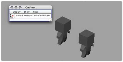
He left school and started to work for both Shynola and Studio AKA. While at Studio AKA he was doing some 2D and 3D designs (they didn´t know he was able to do some animation), he would only create animation at Shynola (who in turn were unaware that he was a good designer).
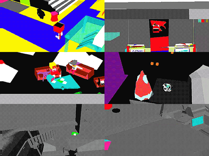
In 2005, he decided to learn everything again and start from scratch. That´s when he realized RGBXYZ which he calls "an angry work". The animation is made of five sequences totaling 15 minutes.
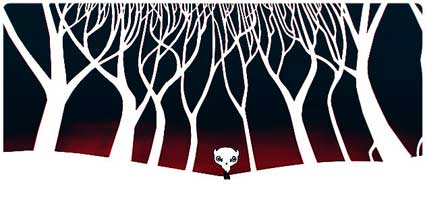
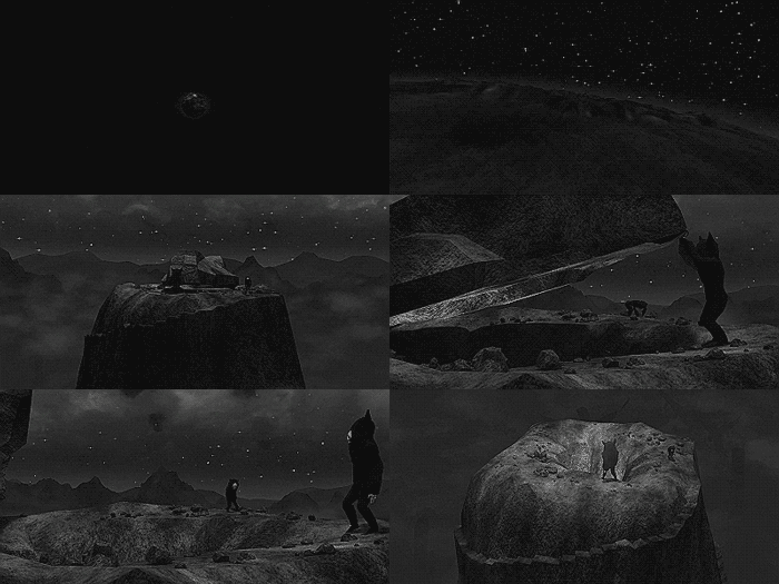
WOFL
In 2006, he went to work at Fabrica, the Benetton communication research center situated in Treviso (Italy). They asked him to do a test to prove that he could do some animation. He came up with the eerie and gorgeous WOFL. Fabrica didn´t like it too much but many other people did and the work soon appeared in mags and DVDs.
Uploaded by makecurves
Next Fabrica asked him to create a small ambient animation for the Benetton stores and as a provocation he made a short animation in which animals are shot in the head one after the other.
One of his best moments at Fabrica was when he found a space used mainly to screen corporate cinema movies, he befriended the security guy and would lock himself with stacks of movies which have influenced his later works. The movies were more the Ingmar Bergman, Andrzej Żuławski or Gus Van Sant kind than Pixar.
After that he collaborated with Garth Jennings, one of the directors of sci-fi movieThe Hitchhiker's Guide to the Galaxy.
O´Reilly created some scenes in a toilet cubicle and some illustrations for the pages of the Holy Bible seen in Jennings' movie Son of Rambow.
The animation director ended his talk by showing us his latest film which he had just finished working on a few hours before. Serial Entoptics started with a mood, a feeling that David wanted to convey. he didn´t do any storyboard, he just followed what he calls a "punk method" even if the result doesn't look punk at all.
If you´re in London, you'll get a chance to see the movie and hear David O´Reilly at3Rooms on November 27.
I'll leave you with the video he made for Venetian Snares:
If you´re in London, you'll get a chance to see the movie and hear David O´Reilly at3Rooms on November 27.
I'll leave you with the video he made for Venetian Snares:
Video for Venetian Snares' Szamar Madar title
David O'Reilly: Adventure Time

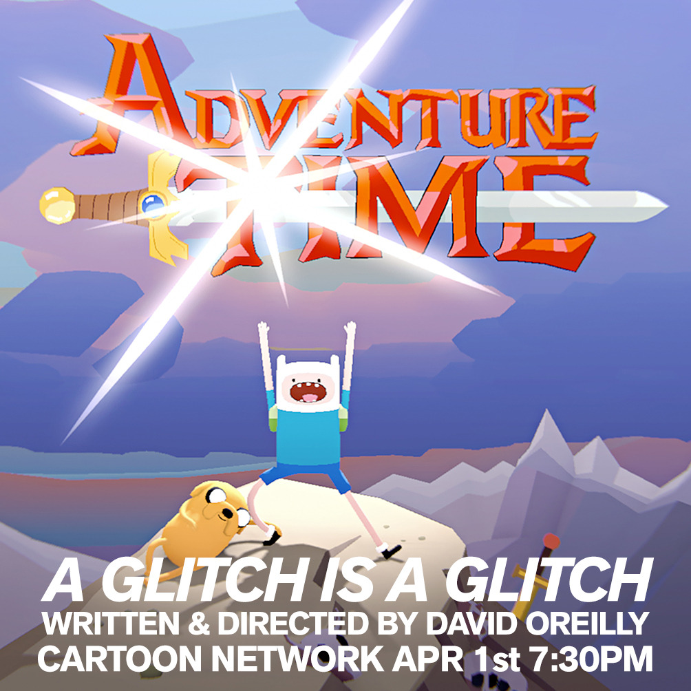
When we first heard that David O'Reilly was writing, directing and producing an episode of 'Adventure Time' we naturally assumed it was one of his numerous online hoaxes. Even the shows creator Pendleton Ward got in on it the joke trying to quell the rumours...
As it turned out it was all true and David's episode 'A Glitch Is A Glitch' premiered on April 1st, a suitable date given David's preoccupation with pranks and online japery.
The episode sees the Ice King unleash a computer virus to delete everyone in Ooo except himself and Princess Bubblegum. The virus is hidden in an video email (a floppy disc tied to a breeze block) sent by the Ice King to Finn and Jake. The disturbing video of a girl gagging herself with her own hair was released as a cryptic teaser throughDavid's Vimeo channel a few days prior to the Cartoon Network premiere with no hint it was from the looming 'Adventure Time' episode.
Whilst 'A Glitch Is A Glitch' isn't our favourite episode (although it is pretty amazingly weird) it's great to see a show like 'Adventure Time' and a channel like Cartoon Network get behind an awesome visual artist like David O'Reilly a let them run wild. The entire episode, even a re-working of the opening titles, was crafted in O'Reilly's inimitable glitchy style with his intentionally crude lo-fi digital imagery and dark sense of humour which may not appeal to your typical Cartoon Network viewer. Whilst the episode might not be to everyone's taste, this off-beat experiment is a real treat for animation fans and hopefully the start of future collaborations between the show and other guest directors who can put their own unique stamp on subsequent episodes.
Glitch Art Goes Big
I love outsider art and creative détournement, and so when something as innovative and unsettling as ‘data-moshing‘ and ‘glitch art‘ grew, I took notice. It may have been the inevitable combination of remix culture, hacking/programming, and the new aesthetic, but it definitely makes for some some interestingly (and intentionally) bad art.
Not every artistic endeavor gets recuperated by the mainstream (it sometimes feels as though they are randomly selected), but rather than kvetch about it when they do, it’s interesting to see in what way they are utilized. Glitch art is so jarring, often painful to watch and surely more challenging to create, that I am genuinely surprised that anyone would actually want glitches in their corporate Matrix.
But two pop-culture franchises have utilized it within the last few weeks. The first was the brilliant episode of Adventure Time, “A Glitch is a Glitch“, in which the villainous and buffoonish Ice King shortsightedly releases a virus to corrupt and destroy the entire Land of Ooo. David O’Reilly 3D-animated and beautifully cel-shaded this version of the show soon erupts into a digital blast of violent audio-visual noise, the fusillade of blocky blips and colorful streaks making one wonder if this is all the artifacting of O’Reilly’s exploration, or your subpar download speed. This episode also features an original 8-bit outro theme written by Flying Lotus. - disinfo.com/
David O’Reilly Interview: Please Say Something
The following is an interview with David O’Reilly and Motionographer regarding his short film, Please Say Something.
Where did the idea and story behind Please Say Something come from? When you are generating ideas, how do you know you’ve struck a good one and decide to persue it?
DO: I wanted to do an update (or destruction) of the cat and mouse genre of cartoons, but have a genuinely good story which people connected with. I learned a lot of hard lessons doing experimental narratives and decided it was time for a simple story. I know I have a good idea when I’ll give up everything else to work on it. When you have no budget or deadline you have to be totally in love with the idea.
The digitally raw style in all of your shorts—Please Say Something, Octocat—is very authentic. Can you tell us a little about how you develop the look of the work?
DO: I can only speak for PSS; the look came about from the idea of economy. I wanted to make something in 3d but the fastest way possible and with no decoration whatsoever. Practically it meant no texture maps, motion blur, reflections, filters and so on. I wanted to see how far you could strip it down without being cold and minimalist. This way of working was entirely influenced by Bresson’s ideas on authenticity, whereby no images should have any power or value except through their position and relation.
Timing and framing key moments between characters is a huge part in your storytelling structure. Did you always know PSS would be comprised of 23 episodes of 25 seconds each? (Why 25 seconds, by the way?)
DO: They were originally 30 seconds and had a more elaborate gap between them, but it was ultimately distracting and interrupted the flow. The reason for the format was just a personal rule. I think if you create restrictions, even abstract ones, you’re brain will work harder to overcome them and be creative.
You seem to be into tagging. Even the title cards in PSS have tags. Care to comment?
DO: Tagging is an amazing phenomenon. I suppose I was influenced by seeing talks on the semantic web idea, where everything in the world is tagged and categorized. Tags are a way of adding value to something and I used them to explain certain story elements.
The sound design in PSS is incredible. Did you have a clear idea of what you’d do with sound design as you were animating?
DO: Yes, I’m not always specific about audio but when I was writing this I was heavily into Ryoji Ikeda’s work, and I really wanted to recreate that artificial precision, it was very much in tune with what I wanted visually. Props to David for creating the voices and Bram for the Music.
In Understanding Comics, Scott McCloud says (I’m paraphrasing here) that it’s easier for readers to emotionally connect with simply rendered characters. Do you find that to be true of animation, and is that why you chose to render PSS using simple geometry, shading and lighting?
DO: McCloud basically says that detail objectifies characters, while cartooning leads to viewer identification & subjectivity. My goal however was not cartooning but making designs more generic and expressionless. My central belief is that being neutral with aesthetics is more important than being appealing, which is a strong line of thought in cinema but rarely seen in animation. I didn’t want to use animal characters until I saw Jason (John Arne Sæterøy) use them in a sincere way.
Along the lines of the previous question: Although the singular forms used in PSS are simple, the entire universe of PSS is complex. You show the passage of time, weather phenomenon, altered states of consciousness—did you find yourself having to throttle back your visual vocabulary? Was it difficult, in other words, to stay within the aesthetic of the film(s)?
DO: The visual vocabulary was very strict, I literally wrote a list of rules down before I started animating, so it was easy enough to play within that.
What’s next for you? Inventing a future space religion? Cross breeding more cats and octopus?
DO: I’ve fallen in love with storytelling after years of experimentation, and I’m going to keep writing and telling bigger ones. By the way thank you to motionographer readers for supporting the original post, I was genuinely surprised you all liked it
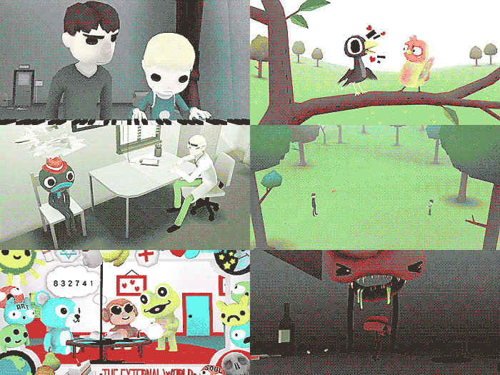
THE EXTERNAL WORLD (2011) 17:00
A boy learns to play piano
A boy learns to play piano
????? (2009) 0:54
????? ?????? ? ????? ?
????? ?????? ? ????? ?
RGBXYZ (2008) 12:30
A boy finds adventure in the big city *preview only
A boy finds adventure in the big city *preview only
WOFL2106 (2006) 3:15
A wolf finds it’s dead mother.
A wolf finds it’s dead mother.
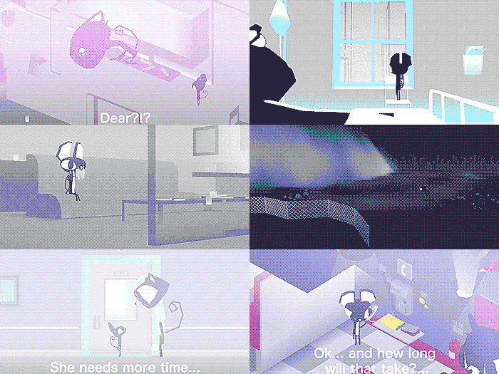
PLEASE SAY SOMETHING (2009) 10:00
A troubled relationship between a Cat & Mouse
A troubled relationship between a Cat & Mouse
OCTOCAT ADVENTURE (2008) 5:45
Octocat searches for his parents
Octocat searches for his parents
SERIAL ENTOPTICS (2007) 11:00
???? *trailer only.
???? *trailer only.
IDENT (2005) 1:00
+
GENKI STORY (2011) 1:00
Animation sequence for Tim & Eric
Animation sequence for Tim & Eric
U2 – CRAZY (2009)
Music video for U2
Music video for U2
When You’re Smiling… - Opening animation (2009)
Intro to 2009 Pictoplasma Conference
Intro to 2009 Pictoplasma Conference
SON OF RAMBOW
Animation sequences (2007)
Animation sequences (2007)
Blog:
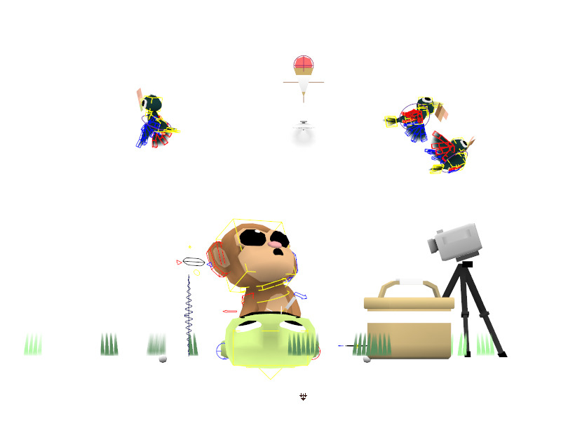
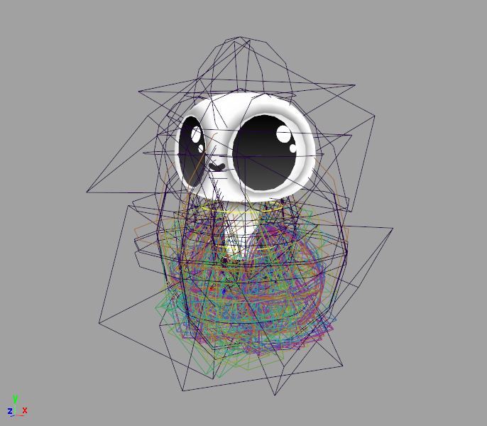
I’ve decided to release all 65 character rigs from my short film The External World as a free download. You can use and modify them in any way you like as long as it’s for a non-commercial purpose. Showreels, short films, indie games, all that stuff is cool - just give credit. If it’s web based - include a link to my site.
I’m releasing these without a how-to (or support of any kind) but it should be very straight forward. They are extremely low-weight and easy to animate with, all are compatible with versions of Maya after 2010. Extra controls are available from the channel box when you select the head/hands/feet controls. Most if not all have FK/IK switching. Some have facial controls, others don’t. These were custom built for whatever scenes they appeared in, but they have a lot of range and potential to do other stuff.
If you make something cool - tweet it at me, or post it on my facebook page. Excited to see what you guys come up with!
 tsun-doge:
I recently rewatched Please Say Something and it is still really really good
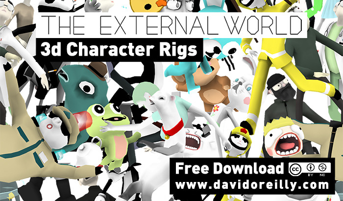
I’ve decided to release all 65 character rigs from my short film The External World as a free download. You can use and modify them in any way you like as long as it’s for a non-commercial purpose. Showreels, short films, indie games, all that stuff is cool - just give credit. If it’s web based - include a link to my site.
I’m releasing these without a how-to (or support of any kind) but it should be very straight forward. They are extremely low-weight and easy to animate with, all are compatible with versions of Maya after 2010. Extra controls are available from the channel box when you select the head/hands/feet controls. Most if not all have FK/IK switching. Some have facial controls, others don’t. These were custom built for whatever scenes they appeared in, but they have a lot of range and potential to do other stuff.
If you make something cool - tweet it at me, or post it on my facebook page. Excited to see what you guys come up with!
Im finally releasing this film online. Please share it liberally!
Some background info for anyone interested:
RGB XYZ was my first short film. I started it back in 2004 and finished it in 2007 between other stuff. I released parts of it online under the (stupid) name Chuck C. Clint III. A few people might remember that Cartoon Brew covered it back then. A friend entered it to the Berlin Film Festival on my behalf so I took it offline as per the rules. It premiered there in 2008 and won a special mention. This was the first time I had a film in a festival and my mind was blown. Most festivals rejected it but it went on to win around 5 other awards.
Even though parts (all) of this are hard to watch, it was a huge learning experience for me. I established a lot of things that I developed later on, like realtime rendering, mixing ortho & perspective, playing with subtitles, and more broadly trying to bring emotion out of as few polygons as possible. There was an extremely short-run home made DVD of it which is out in the wild.
 charcoalfeathers:
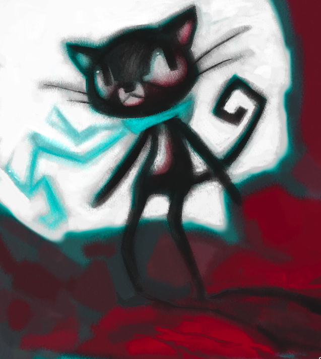
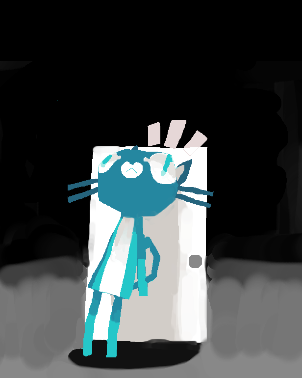
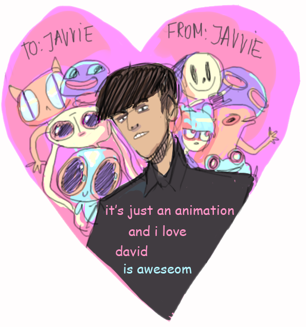
Fan art I made for David Oreilly’s short film “Please Say Something”(via charcoalfeathers)

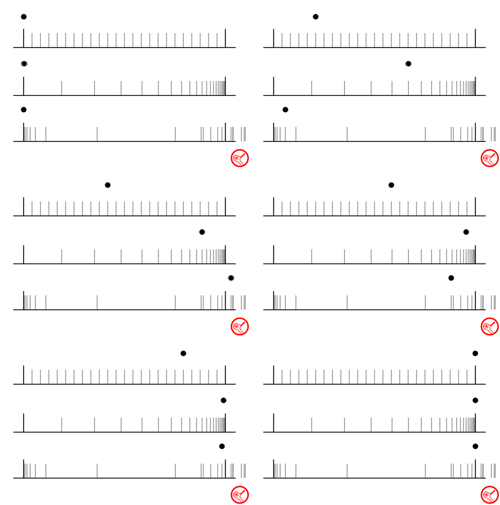
This is a simple motion-diagram thing I made when talking about animation to non-animators.
Here’s more material from my theory lectures. I made these clips to analyze various timing styles by showing the exact frame overlap of each animation. The clips on the left basically isolate the motion and allow us to see and compare it clearly - without design, color or sound distracting our brains.
My last post showed how motion-contrast was something that evolved over time. These examples show how motion, as it’s own aesthetic, eventually branched out into different schools of timing. Each one is a refined method of representing movement in a stylized way. They don’t strive towards realism, their beauty is in how unrealistic they are while still communicating ideas. They are all solutions to the same problem: how does a character get from one place to another.
Animation schools are extremely dogmatic about teaching essentially Disney timing, the 3d animation we see in the cinema is just a continuation of these old principles. There’s nothing inherently wrong with that, but theres so much else to explore. A lot of (dumb) people dismiss South Park’s animation, but it’s an education in minimalism. Richard Williams’s style (the 2nd clip) is obsessively smooth and floaty. Anime uses very few drawings and feels choppy and solid.
Hopefully this shows you that animation is basically music, theres entire genres of motion if you look deep enough.
Not sure if this is interesting for you guys.
Around 6 years ago (gasp) I did a bunch of lectures on animation theory. One subject was how textures of movement have evolved over the years, alongside the more obvious progression of design.
I made these videos to illustrate more clearly how contrast in timing was something that has a clear progression from the 30s to the 90s. The timechart below each clip represents relative change in space between drawings - from the ultra linear early animation - to the soft bouncing of Classic era Disney - to the exaggerated Warner Bros style, brought to it’s peak by John K (in my opinion).
Sorry about the quality on these gifs. I’ll post more stuff like this if theres any interest.
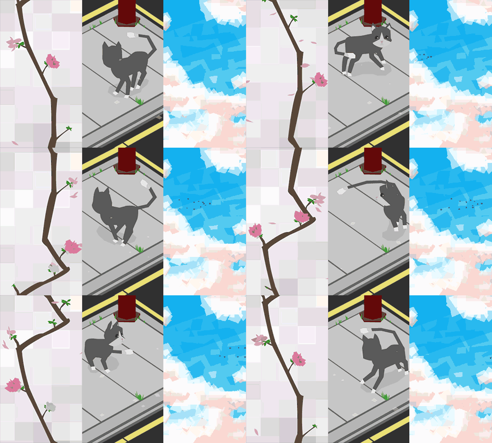 Part of the stuff I did for IDDA from a couple years ago. Animated wallpapers for use in futuristic cellphones. Collaboration between me & Nelson Boles.
I did some motion tests on the unmade Merryman project. This is one of my paintings separated into layers and applied to geometry. The goal was to create that early disney background-painting style in 3 dimensions. The grass & dust were the only things generated from scratch, though they’re hard to see at this resolution…the last image is a higher res video still.
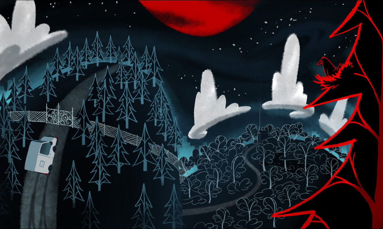 Heres another night time one. The layout is all over the place…I was still figuring out a lot of stuff.
 Another painting I did on the ‘Merryman’ project
These were paintings of bowerbird structures. These actually exist in real life. Click for hi-res.
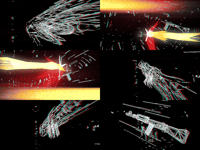
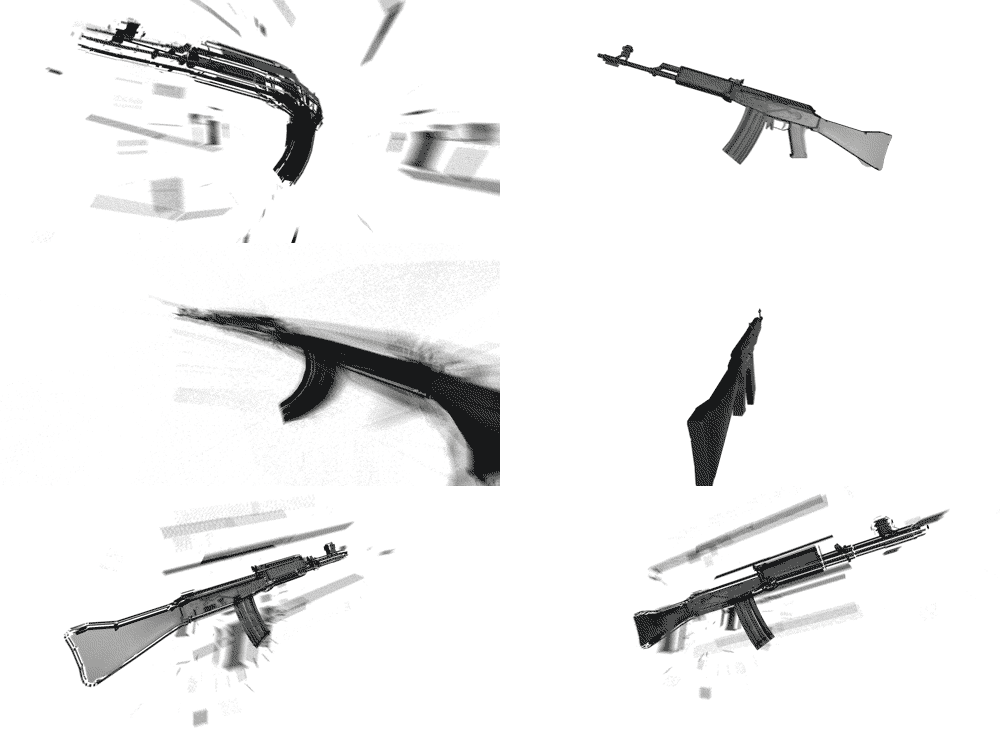 An exploding gun thing I did for MIA in 2009 now in gif form
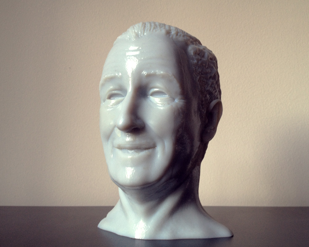 I just received this HUGE print of my Walt Disney Head! A massive thank you to Renee and the folks at Instructables.com for sending me this!
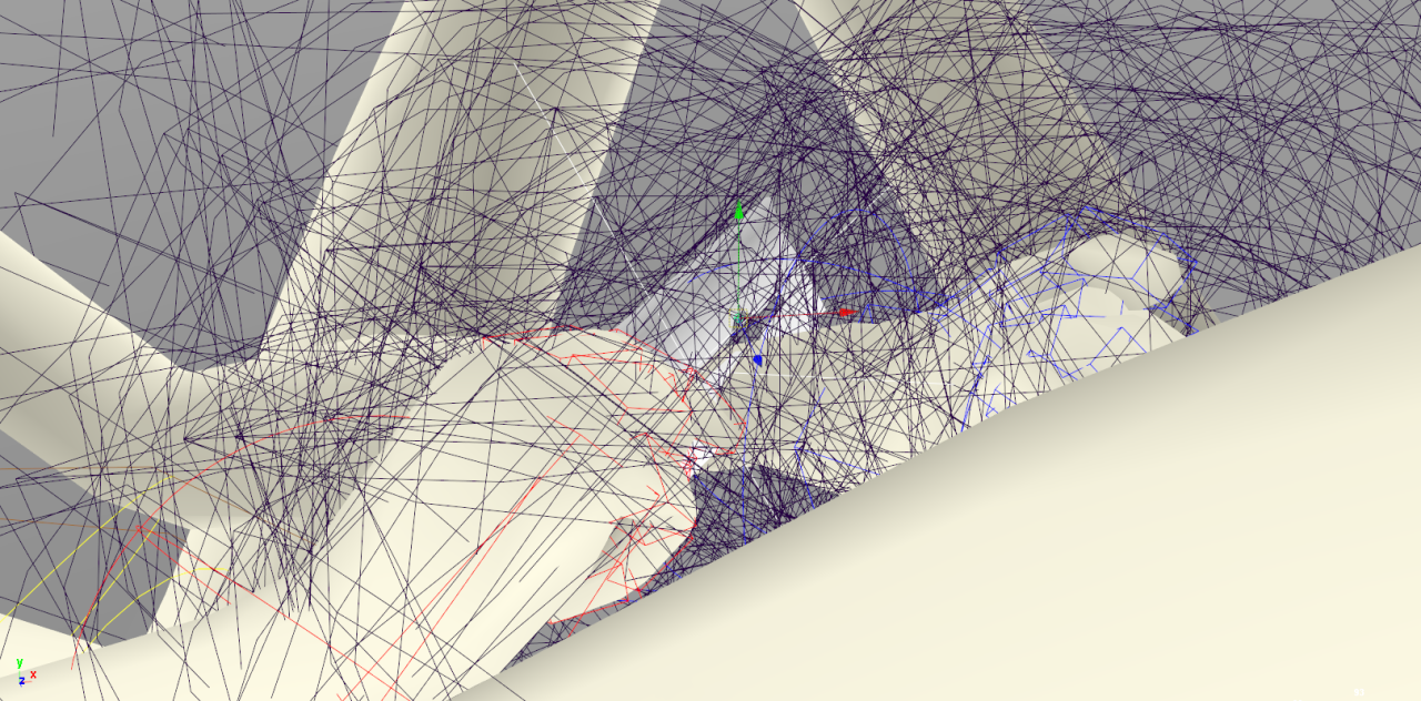
I originally modelled this for the ????? short. The 3d model can still be downloaded via here.
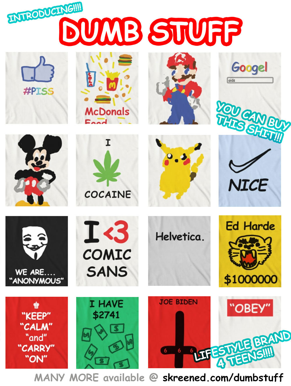 Hey friends! I just launched this project. It’s my new “lifestyle brand” for TEENS! There are currently 40 designs which you can order right now, head over to http://wearedumb.com & tell your friends!
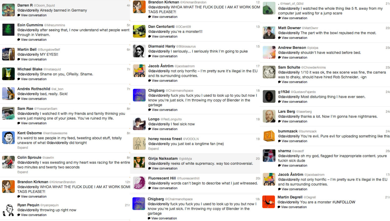 This is just SOME of the negative feedback I received for posting ‘the puppy video’ last night. I am deeply sorry to my fans/followers for making this thing and causing such a reaction. I didn’t mean for this to happen.
(edit)
If you really want to see this thing here’s the current link. I will probably get taken off youtube very soon…I just warn you, it isn’t easy to stomach.
http://www.youtube.com/watch?v=TeaMPF5eHg8
The top image here has a gradient which counteracts twitter’s one. It makes your background a flat shade of gray. It will look something like this…
I also included one with a fake Verified icon and “FOLLOWS YOU” graphics for laffs. You may need to slide these to the left or right depending on the length of your username.
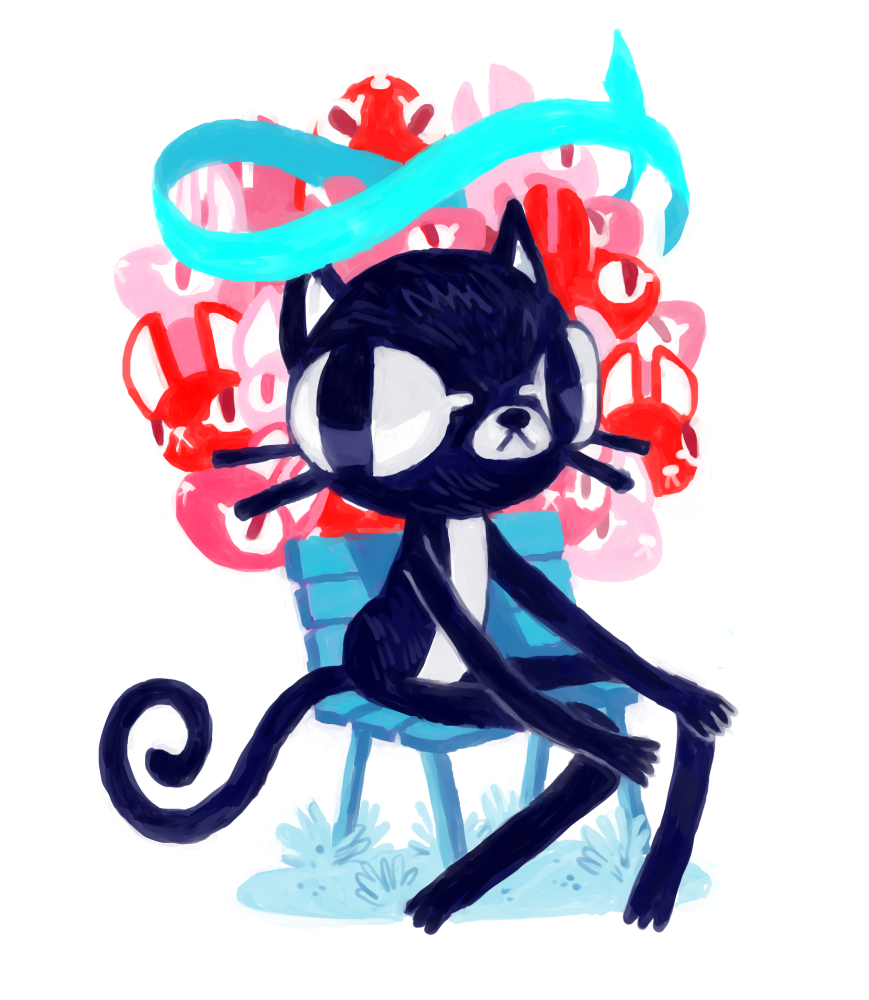
As you know if you follow me (OBLIGATORY LINK) my avatar is this character who changes mood depending on how hyperactive/depressed I am. I wont be able to change between these anymore so here they are together.
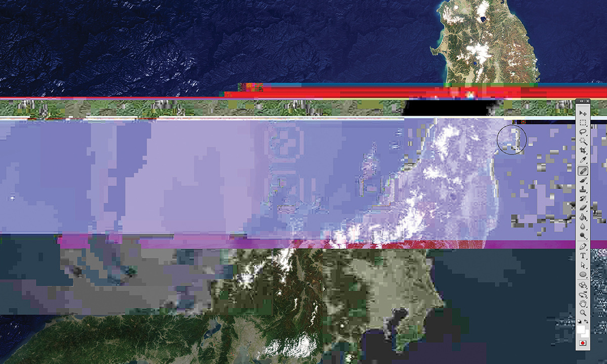 This is one of the illustrations I did last year for the Creators Aid book. It was sold to benefit victims of the tsunami.
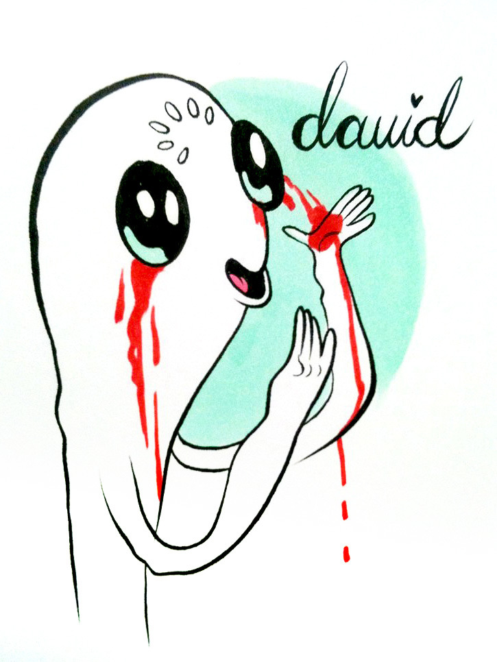 One of my favorite artists MARLO MEEKINS did this super cool painting of my twitter avatar. Her work is so amazing - check out her tumblr here.
++++++++++++++++
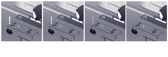


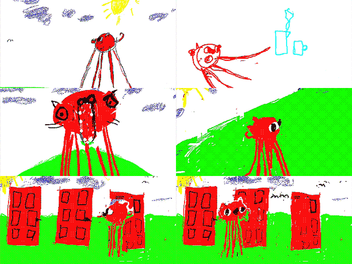
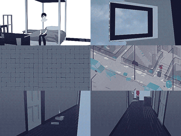

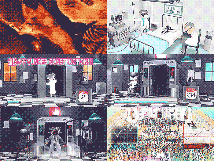
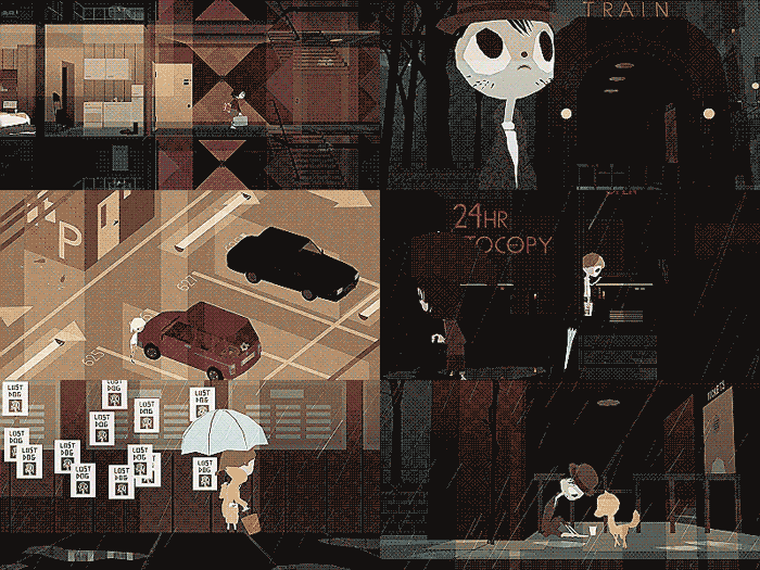
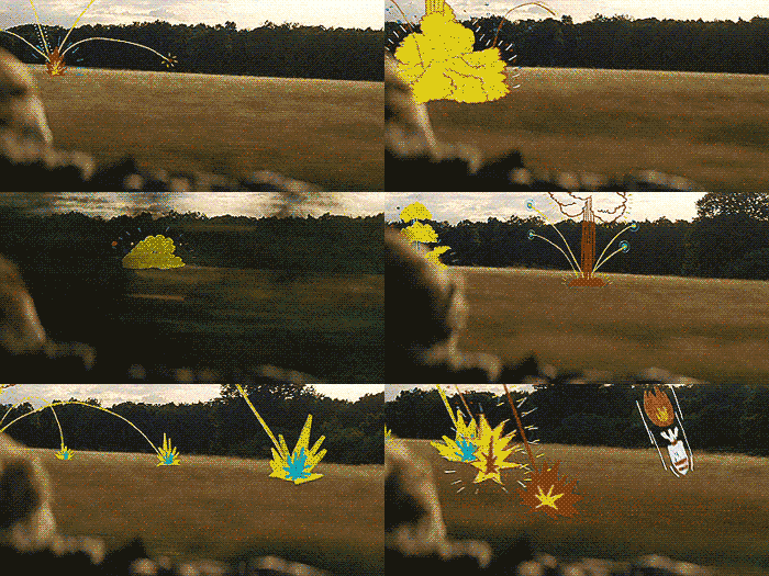

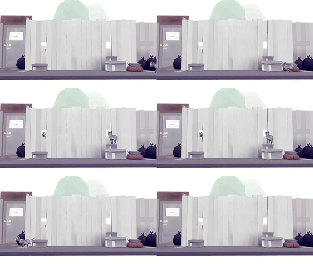 Cat portal scene from

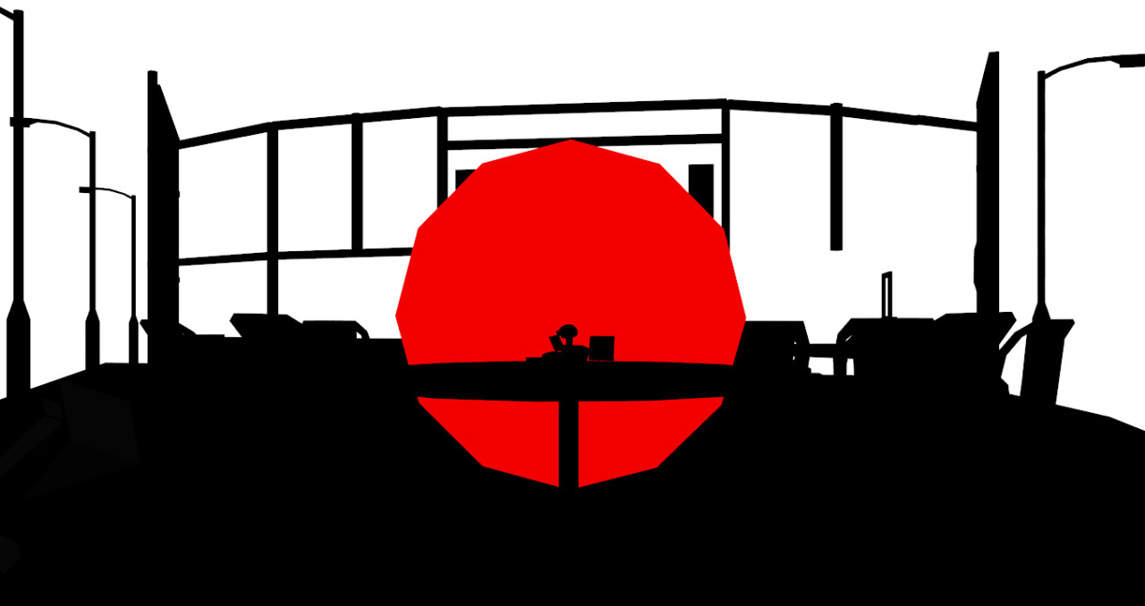
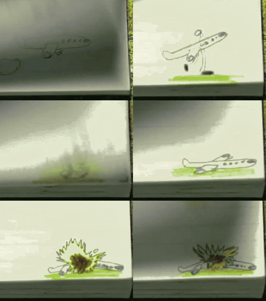 one of the flipbooks I did for the film
 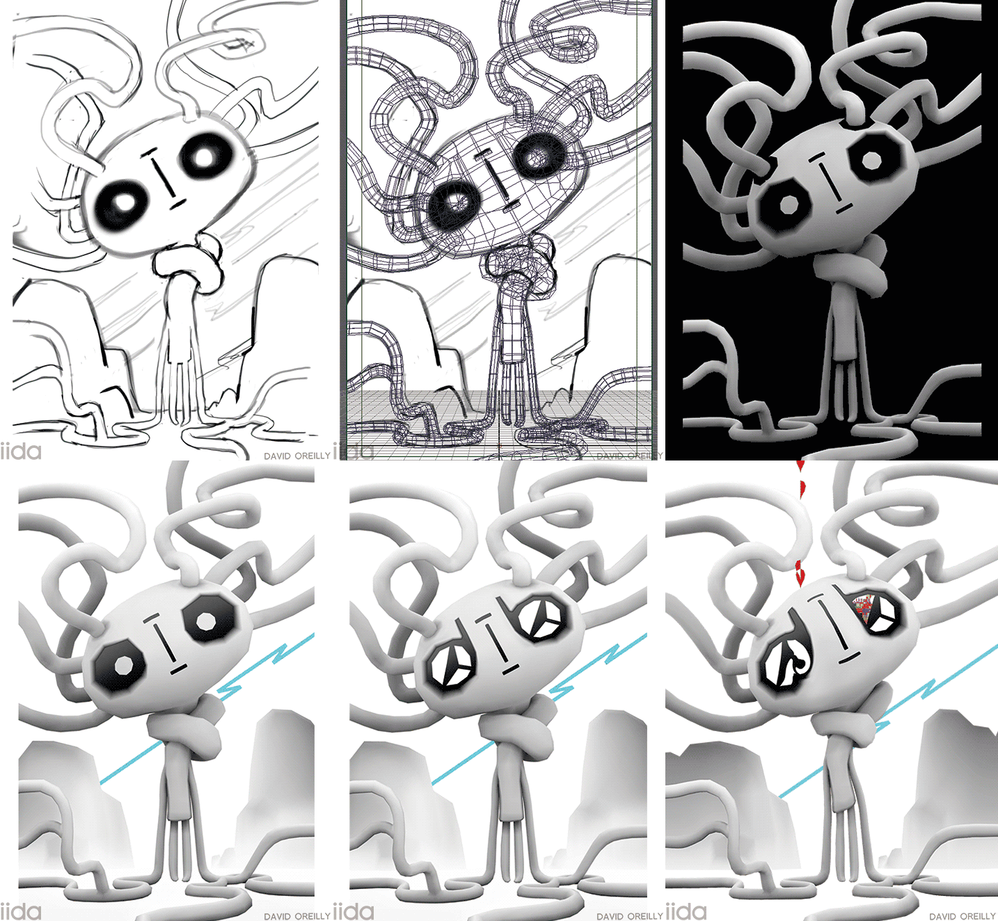 Here’s a little work in progress on that phone cover I did
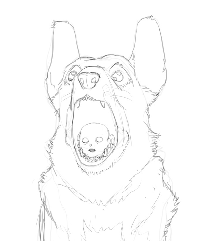
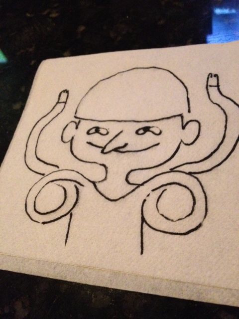 This is a drawing
 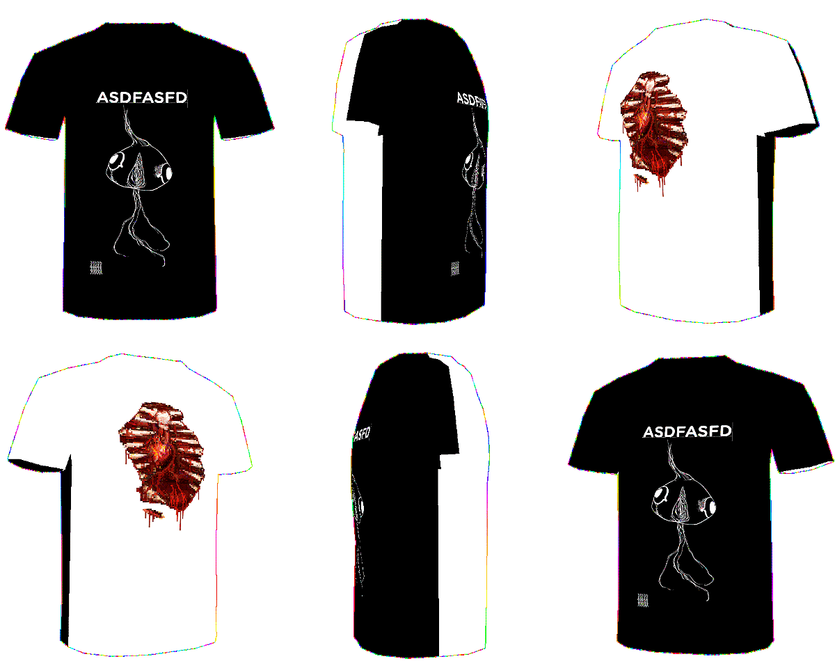 Hey friends! I made some tshirts with my pals at
Nema komentara:
Objavi komentar